In this world full of clutter, minimalism is something people prefer more these days in their life – to keep things simple and nice.
But coming out of personal life, minimalism has become a great approach to design website these days too. This is one of the most buzz web design trend in 2019 you could say.
And it is justifiable. As you know, more is not always good. If your work gets done in less, why go for more?
People basically like simple and nice webpages that carries the right information – simple!
There’s no point of overcrowding your webpage with unnecessary stuff just to make it look full – that doesn’t help.
The good news is, an increasing number of web designers has agreed with this concept and they have happily accepted this influential web design approach. Implementing this approach to websites, they’re already getting good results.
However, beside providing the right information in as ‘less’ possible, you also need to take care of the UX (user experience). A good UX demands eye-catchy and beautiful presentation of information in simpler elements/blocks.
So, presenting right information in “less” but also in a eye-catchy or gorgeous way could get a little tricky to balance.
Now, that’s where I expect to be of help.
I’d like to demonstrate how can you design your website with ‘less’ ensuring the full functionality and having a great UI, with appropriate examples.
Let’s get into looking at some of the best minimalist website design examples in 2019.
Table of Contents
To Start Off, Let’s Clear Out Minimalism Approach in Web Design
We all know what minimalism is in regular life, right? It’s just cutting down unnecessary stuff to focus on those that really matter.
The basic concept is same in case of web design.
It is to cut down unnecessary elements (or insert less element at the beginning) to simply web pages, which helps focusing more on the actually intended content, both for the designer and user.
But, it doesn’t mean you’d cut down elements blindly. You gotta be careful about functionality. Just trying to cut stuff, you are not supposed to hurt the actual intention on a webpage.
Rather, you should only get rid of those stuff that does not hurt the functionality of a webpage (and also doesn’t add any significant value), and focus more on those that has to do something with functionality.
So basically, keep it simple, clutter free, focus on only the necessaries, and keep it functional – that the basic approach of minimalism in web design.
Best Aspects of Minimalist Web Design
So, what makes minimalist web design so popular among both the designers and the users? Here are some aspects in which I believe minimalism clicks most –
Creates a win-win situation for both the designer. Since the approach is to cut unnecessary content from a webpage, it saves a lot of time and effort of the designer.
In the same time, users get to browse a clutter free webpage where they can easily find what they were looking for, so they’re happy too.
These websites load faster that non-minimalist website, as there are less things to load. This is a crucial thing for a webmaster in regards of SEO and number of visitors that bounces. A fast loading website is great, both for SEO and reducing bounce rate.
On the other hand, users have a better experience on a website that is blistering fast, too!
Let’s the users focus on the content. Minimalist web design solves a great problem of modern world – distraction. Often users go to a website for a reason and ends up getting distracted by some other content of the webpage.
That is definitely not the case of minimalist websites. So users are more comfortable browsing them.
Gets better conversion for shopping website owners. As I said earlier, these websites let’s users focus on the actual content and they do not get distracted to anything else – Which is very important to shopping websites to get more sales.
Minimalist website make users focus on the product or service that is being promoted which tends to get better conversion in terms of sales.
Secrets to Design A Great Minimal Webpage
Now that you’re really motivated to imply minimalism on your website, how do you do so?
Well, here are few secrets (with examples) to design a effective minimal webpage.
1. Use Whitespace To Stand Out Focus Content
This is the most simple, yet one of the most effective secret trick (because most people overlook it) to imply minimalism on websites.
Whitespace in web pages (which is also known as negative space) allows users to naturally focus on the intended content of a webpage by reducing the noise.
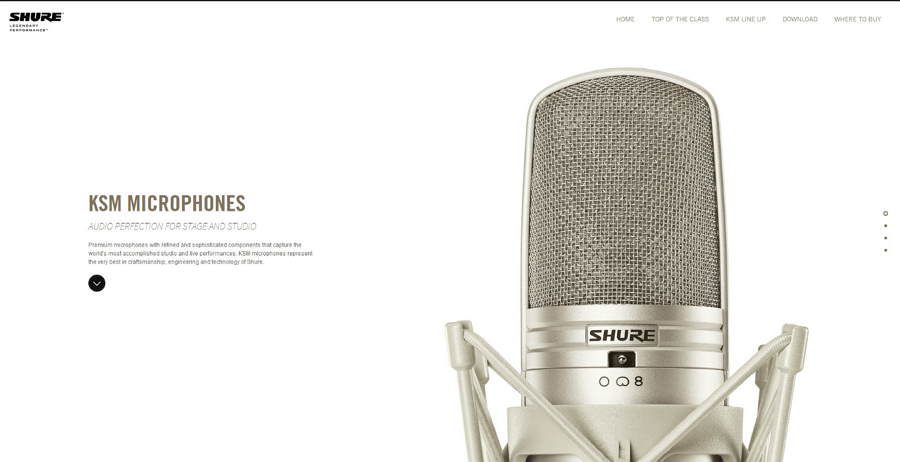
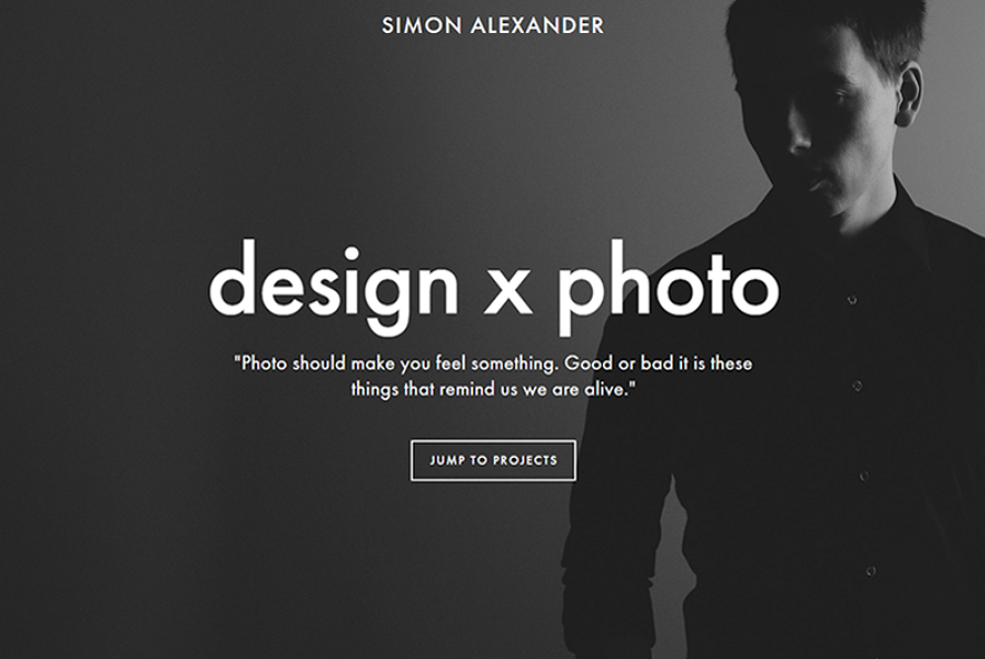
Look at this website below. If you visited this webpage, would you focus on anything rather than the microphone?
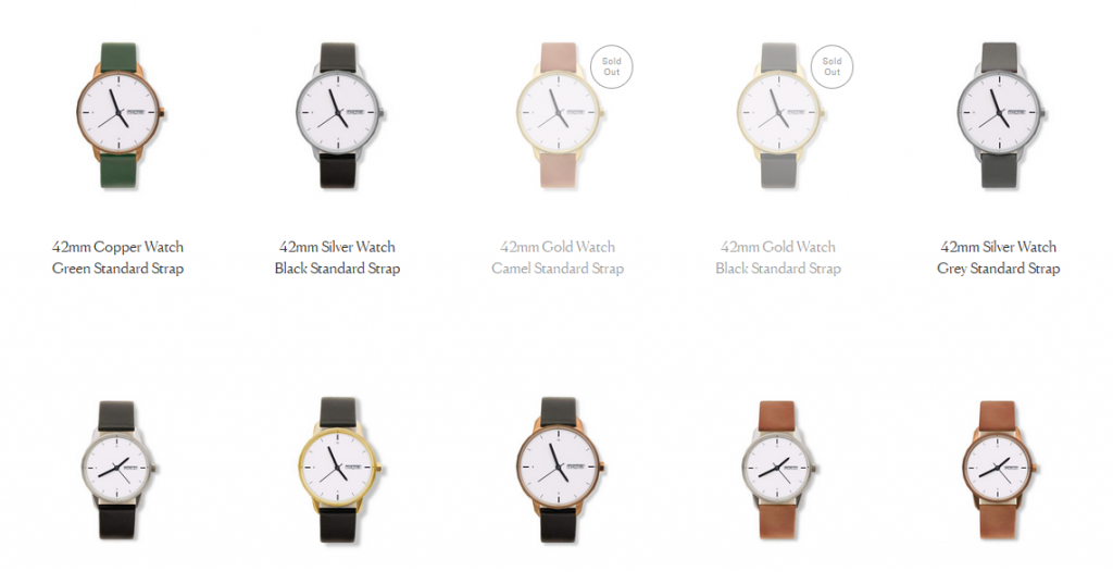
And anything other than the beautiful watches, in this case?
Such kinda focus on your product will definitely get you a lot more sales than usual.
And if you have info sharing blog site, this’ll work great for you too. People are more comfortable reading web articles that have enough whitespace in them so they don’t get lost in between lines.
Would anyone get distracted or lost in an article that has such white space?
So no matter what type of website you have, blog or shopping or other, having white space always helps lot to get intended action done by users.
2. Make Effective Use of Colors to Make Web Pages Attractive
Simple and bright colors will do two things for you – make your website visually appealing, and help you divide interface functions. Having the correct color scheme can affect your visitor’s subconscious mind accordingly.
Here’s some rule of thumb to follow when it comes to choosing colors for your webpage –
Use Simple & Constant Color Schemes
By simple, I don’t tell you that you have to use only one color or black and white combination. If your website theme requires, you can use vibrant color like purple even.
The catch here is to be constant and make the right combination. You have to use purple? Great! But choose a subtle & supporting color to purple as secondary color.
You can take only one color and make different designs out of it by changing color opacity, using color gradients and adding color shapes and so.
Also, be sure to be constant with your color scheme throughout the entire webpage, possibly the website.
Look how spotify used the vibrant color purple of their theme to design a beautiful minimal website –

The key here was the background image color shade – which was matched wisely to base color.
And obviously, black and white color combination is great to design minimal website which can be fashionable too –
Use Color Contrast To Design Eye-Catchy Minimalist Website
As I just said above, to design a minimal website, you don’t have to stick with black & white color only. It’s about choosing the right color scheme and combination.
What do you think? Could you use Purple-ish and light green color together in a webpage to keep it still minimal yet damn eye-catchy?
If your answer is “No” then you’re wrong my friend. “Panic” showed us how we can do so –
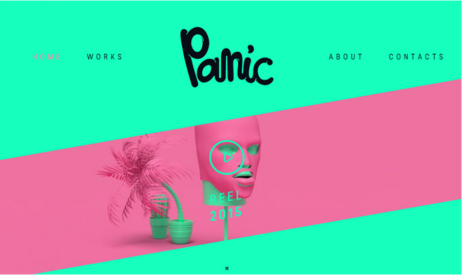
See? Isn’t that website still minimal looking yet having such vibrant color which is amazing eye catcher? The secret is choosing the color combination and implication areas smartly.
Use Color Block to Divide Interface Functions – Great Look & More Functionality
Designing a website minimally and still keeping it functional could be contradictory to each other sometimes. When trying to cut element for minimalisity, we get in the risk of hurting the functionality.
Color block could be smart solution here. This lets you kill two birds in one bullet – Improve the pages’ functionality by bringing more into less, also lets you play with various colors to make the webpage look catchy.
Here’s a great example of color blocks –
3. Fonts & Typography
Just like color, well-crafted interface texts, font and typography is a very important factor to design a minimal, appealing, nice looking website.
You have to choose font wisely here. Minimal doesn’t mean you have to choose only very formal and subtle font. You can go for fancy fonts like ‘comic sans’, ‘handwriting’ and so if that complements your theme.
Again, the combination is important. Also, sticking to the same font throughout the whole page is highly recommended. Choose your winner and stick with it.
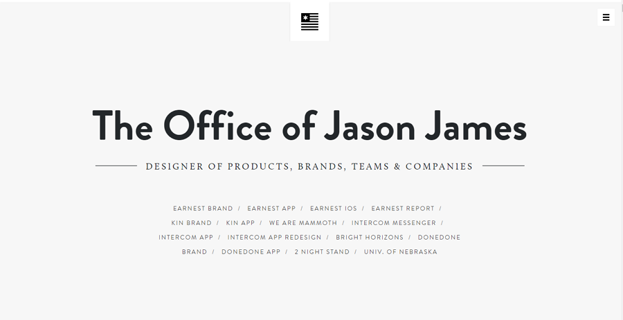
However, you should cut the text to as less possible. If something can be said in one word, don’t waste another on it. The lesser text a webpage has, the more minimal it’ll look. So cut down extra words that doesn’t hurt the functionality.
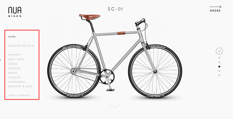
Look at “Nua Bikes’” website. How effectively they’ve cut down unnecessary words –
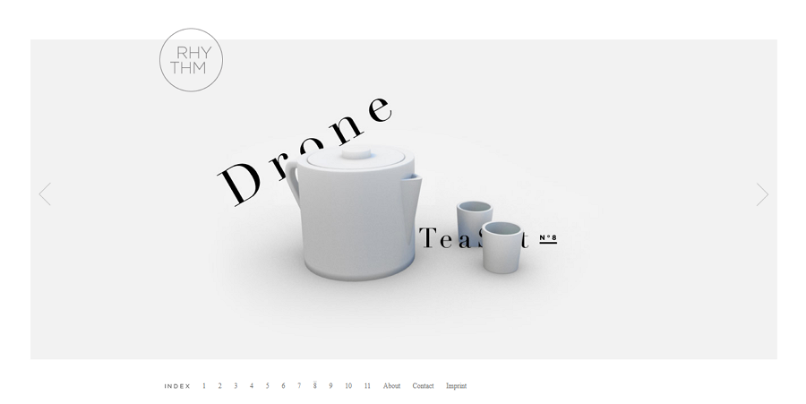
Also, you can play around with font size, line spacing and so to create subtle designs and styles with the same font. Look at this one –
4. Simply Webpage With Intuitive Grids
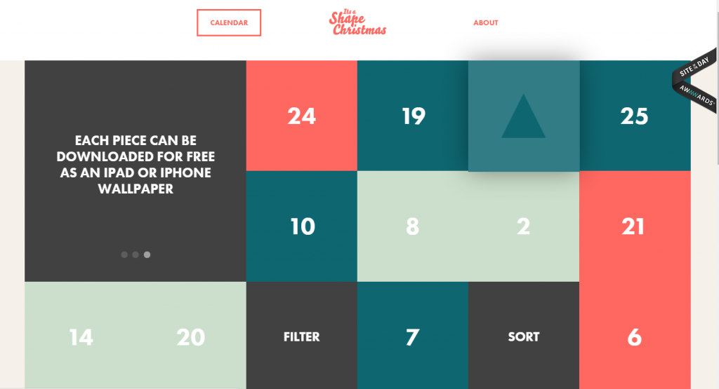
Remember I recommended using color blocks? Another similar idea to improve functionality while sticking to minimalism could be the use of grids.
Look at this one –
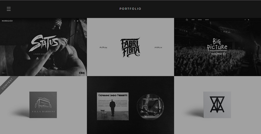
How smartly they’ve categorized different section in grids! This improves the functionality of this webpage a whole lot for a user.
One can easily choose any of these category which are self explanatory with similar themed text to the category supported by image, rather than navigating from navigation bar in traditional websites.
If there’s no scope to use intuitive grids that I just discussed, you better stick with the navigation bar. But make sure you design it with complementary colors to the webpage so it enhances the minimal look along with of being great functionality.
Here, they’ve designed the navigation bar with the same color of the buttons of the page, which looks great and complements the overall theme.
6. Other Ideas To Enhance the Look & Functionality While Being Minimal
You can use progressive disclosure technique to guide your visitors, instead of just icons which sometimes can be hard to understand.
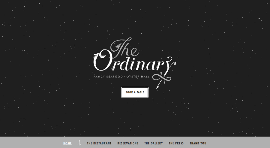
Another trending website design approach is flat web design, which looks even more minimal and can be effective in restaurant and similar websites where you don’t have much to navigate and write on the homepage.
You can use these design approach together to create a mix that serves both the purpose –
Also, it’s important to plan out your minimal web pages look before you start. Choose a type of theme that complements the purpose of your website.
If yours’ one is a online shopping website, choose the color, icons, typography of your page according to the products you’re promoting.
Finally, focus on tiny details. Since there’ll be less stuff on this page, so every little mismatch or error will be highlighted and dull the beauty of the page.
So, when you’re cutting stuff, it’s very important to focus in details of the stuff you’re keeping.
And, be creative. There’s actually no real hard and fast rule to design a minimal looking website. So there’s a lot of scope to bring your creativity in play to create more in less.
Wrap Up:
Hopefully you had a good idea of the concept “Minimalistic Web Design” and also the subtle underlying facts that make a minimal yet functional and beautiful looking website.
However, these point are just overviews of these tricks or facts. There’s lot of scope to improvise in every step to create such a beautiful minimal websites shown as example here.
And that’s the point. It takes expertise and experience to create such minimal yet functional websites. You know, there goes a lot behind such a website that can be done by experts only.
That’s where GoGetSpace web design team can help. We have a great team full of experts in web designing. These guys are prominent web designers who have experience of designing hundred plus website of every type.
If you think you want help, you can reach out to these guys from this page.
Cheers.

