Today I hope to give you some actionable advice regarding how to design your landing page. Advice that if implemented should lead positive results and help you avoid the trap of mediocre results.
Now I can’t claim to be an expert. Most of my digital experience is entrepreneurial rather than professional. However, years ago I did use the same ideas to create a successful tutoring business. My tutoring was not too bad, but my ability to convert my website visitors was even better. Since then I’ve started Tuggl, which at the current rate will be the world’s largest local shopping search engine by the end of the year. In the last two and half years, we’ve had almost a million users and these ideas are among those that have helped us get there.
In essence my advice can be ‘boiled down’ to two formulas. One comes to us from the Golden Age of magazine advertising and other I developed years ago when I was a regular reader of Jakob Nielsen’s web usability blog.
Table of Contents
The Classic AIDA Formula for Landing Page Design
Before the web existed, people read newspapers and magazines. To make their work easier, advertising executives working with those media, created several formulas to help them design advertising campaigns that enticed the reader, and lead to profitable action taking.
One of those formulas is represented by the acronym AIDA.
Although designed for magazine advertising, I find it works perfectly when applied to the web. Not only does it help you plan out your textual copy, but it’s also a great way to help you think about interactive elements.

A – Attention
The first element in the formula is attention. The first thing you have to do on any website’s landing page (or magazine in the old days), is getting the user’s attention. You might do this with an eye-catching graphic located at the focal-point (more on that soon) or a statement that your reader can’t ignore in a stronger, bolder type font.
I – Interest
Next you need to pique the user’s interest. You might do this by explaining something useful or interesting about your product, or suggesting what problems it solves or how it solves them.
D – Decision
Some say the D is for ‘desire’, but personally I think decision makes more sense. Once the person is interested, we need to make them decide that they want, what you have to offer. A key way you do this is by handling objections that would otherwise lead to the decision that they don’t want to proceed. This often includes things like offering a free trial, explaining your money back policy, guaranteeing that their data will never be shared – essentially, handling all the objections that in the old days a salesperson would be trained to handle.
A – Action
The final A is for action. On the web this is as important if not more so than it ever was in the magazine advertising world. Once the user has decided they want to make a purchase or use your service, you need to make it easy and unambiguous as to do that. Too often making purchases or signing up for a product is left as a guessing game – which invariably loses sales and results. Make the route to taking action your most desired action obvious for the user.
Focal Point, Focal Path and Action Point
The second formula is one I made up, so whether it works or not is not scientifically proven.

The focal point is the first thing a user sees. This means it also corresponds to the Attention part of AIDA. A good focal point is clear and unique and in the old days it would be in the top left quadrant of the page. However that is an old idea that came from newspaper and magazine days, these days user behaviour has changed and you can use almost any area that’s clearly visible when the user first sees the page.
Next you need a focal path. This is just the line (or several lines) that join the focal point with what’s coming next, the action point.
Finally once the user’s eye has tracked along the focal path and consumed your items of interest and decision, you want them to take action. So the focal path should track towards an action point – and yes the action point in this formula, is the location on the page where you place your action element from the AIDA formula.
Let’s See it in Action
So far we’ve been all talk. Now let’s see if these ideas match up to what real companies do.
Example 1 – Basecamp.com
When it comes to designing high conversion landing pages, the folks at Basecamp are legends. They’ve been optimising landing pages for years, each new one looks like a work of art, but like all true art, behind the facade, it’s pretty much all science.

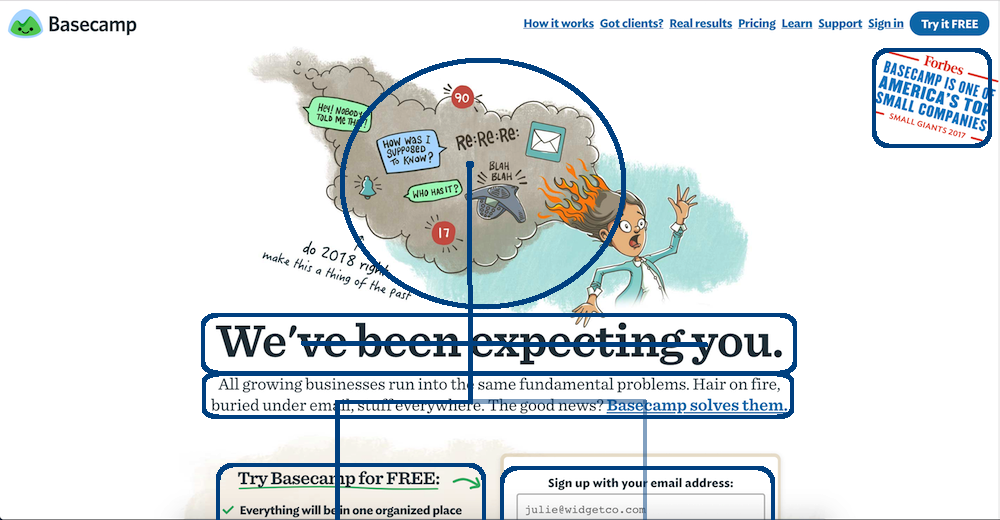
The focal point is very obvious here. The lower part of the image draws your attention, and the focal path leads downwards towards the text. Unlike some of the later examples the thing that grabs your attention (as in Attention in AIDA) is not the focal point, but what appears further down along the focal path. The words “We’ve been expecting you” are classically attention grabbing – they tell you nothing about the product, or why you should signup, they can solve only one purpose – to grab your attention.
But it doesn’t end there. If you eye tracks along the obvious downward path, you see a little snippet that catches your interest, “all growing businesses run into the same ….”. It’s a great way to catch interest, empathise with the user. Tell them you know their problems – don’t tell them how you’ll solve them yet, just let them know you care about what troubles them and you have them interested.
Now that you have the user’s attention and interest, the real work begins. Formulating a decision. Product management software is so common, and Basecamp know it, so they don’t take this step lightly. The entire rest of the page focuses on helping you move to the decision. However the most important factor is kept right at the top: “Try Basecamp for FREE”. As a user when you’re deciding to sign up, you know the whole time that it’s free to try. When the user knows that, they’re so much likely to sign-up.
Now it gets interesting. The focal path branches out. The clearer and more obvious path continue downwards to the left. But a secondary, less prominent but still very visible path leads to the Action Point down and to the right.
If you visit the site you’ll see that following the primary focal path take you along a journey that helps convert you to a signup. But importantly, you’re never in doubt as to how to sign up, as the action point – the signup widget – was within view as you scrolled down. Since you how and where to sign up, the moment the other content has resulted in a Decision, you know where to go, no extra thinking required.
Example 2 – Intercom.com
Intercom provides a range of products that help with customer service. They’re another company that has obviously spent a lot of time honing their landing pages.

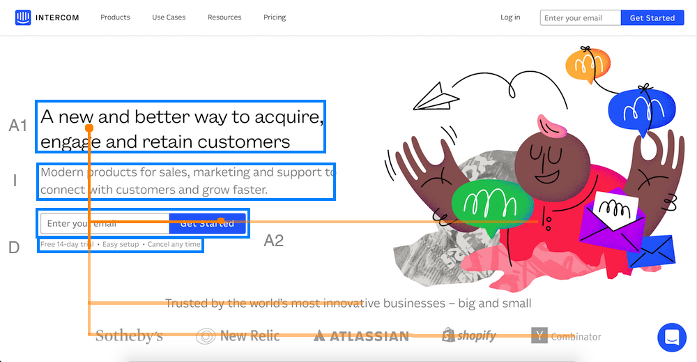
This one is much simpler. Although they have a large and prominent graphic to the right. It’s not the focal point. It’s designed in a way that leads your eye to the heading: “A new and better way to acquire …”. You can see how cleverly the graphic is designed to not be the focal point. If your eye does hit that first, the paper aeroplane and it’s trailing line are designed to quickly draw your attention back to the heading – which is designed to grab your attention and possibly also pique your interest at the same time.
From there the focal path is very obvious. Straight down, but with your line-of-sight splaying out to the right. As your eye moves along, items designed to help you come to a decision and action will appear in front of you.
The text that explains “free trial, easy setup and cancel anytime”, along with the list of companies using the software are all designed to de-risk your decision and lead to a signup.
Finally the action point is clear and prominent, so when you do decide to sign up, you’re not guessing how.
Note: you could argue that the image is actually the focal point, and that the focal path extends right to left and hits the heading. If so it doesn’t change the fact that the different elements of A-I-D-A all appear along the focal path.
Example 3 – Udemy.com
Udemy is a well known online education provider. I actually chose this, because for the most part it’s not in my opinion a great landing page – but it does have one incredibly well chosen component, its focal point.

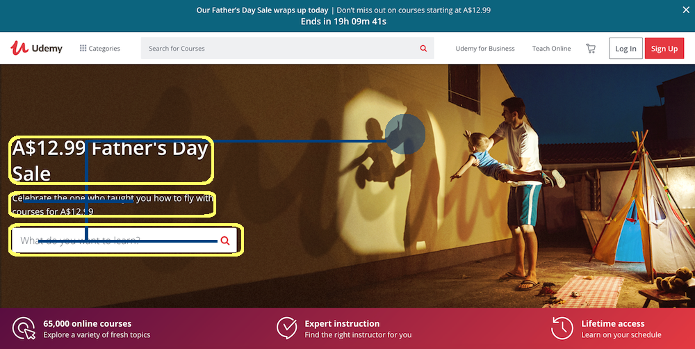
See the picture of the father and son on their landing page. See where they’re pointing, and how they’re both looking at the same spot on the wall. Notice how you can’t look anywhere else on the page. In
The focal path is subtle. It tracks left from the focal point and is enhanced by the repeating shadow of the cursive U. Notice how once again (like the paper aeroplane on the Intercom website) how a decorative element is designed to lead your eye to the important text.
Well the rest of the analysis won’t show you anything new so I’ll leave this one here. Just wanted to show you a brilliant focal point in action, and give you a chance to reflect on how you might incorporate something similar into your own landing pages.
Good luck!
I won’t pretend that these little formulas will solve all your problems, but they will help you get started. Instead of a blank canvas of landing page with ten thousand equally good layout options, we’ve now reduced the number of variables to a manageable level. Naturally, this is only the beginning of the topic. But as with anything, the first step of finishing the race is to know where the starting line is. When it comes to landing pages, if you fill in the seven blanks A – I – D – A and Focal-Point – Focal-Path – Action-Point, not only will you show up fresh and ready at the starting line, you might even get a little head start on your competition.

