UX?
Not familiar with that term? Well, it means User Experience, which is abbreviated as UX.
If I explain it further, it means the experience a user has by browsing your website.
How easily one can find what they were looking for? Can they easily navigate to different categories pages? Did they have to face any problem reading what you wrote? Was the content presented in a good way?
Combining all those answers, you can predict how good of a time they had browsing your website, which basically is UX.
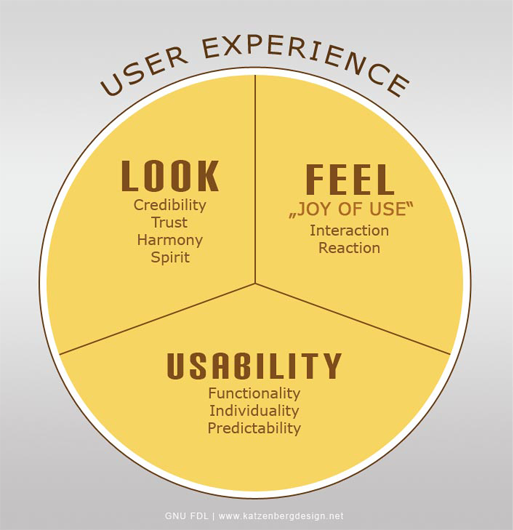
This infographic above gives you a better demonstration of the elements that combine to create a UX.
It starts with the look. Some website catches the eye on the first impression and they just look authoritative. Look at Forbes‘s website, how clean and authoritative it looks at the very first glance.

And then there are some that look horrible.
Ugh!!!
Then there is the Joy that a user feel browsing your website. How easily that can interact your website, their subconscious reaction to your site etc.
Finally, the functionality and usability of your website that plays a significant role in constructing UX.
How easily they can navigate through pages of your website, did they find what they were looking for? Could they predict some stuff of your website?
So overall, these 3 elements play the big role in determining the experience a user has browsing your website.
Now, the fact about UX design is, when it’s done right, the design or the effort behind it won’t be noticed usually.
People will seamlessly move between web elements. They’ll feel the joy but they may not notice the “effort” behind such good UX design.
But, if done poorly, it’ll be noticed right away.
Visitors will sense that something is wrong about the website, they won’t feel much comfort browsing it, they’ll become frustrated and confused, and your business may suffer.
So you can already understand how important is it to design your site for a good user experience.
A B2B research firm Clutch, did a research on this fact. According to them, enhancing website UX is the top priority for 16% of small businesses.
Why?
The answer is given by another experiment.
ESPN.com’s Head of Digital Media, John Kosner understood the importance of good UX. So trying to improve that, he incorporated a series of user suggestions into the brand’s website.
The result? A massive 35% revenue increase from the improved user experience.
So, motivated to bring UX design good practices into actions for a better result to your business?
If yes, here are 7 Web Design tips that’ll help you improve your website’s UX:
● Allow white space
● Create appealing calls to action
● Use bullets
● Choose original images
● Write targeted headlines
● Improve page speed
● Stay consistent
Let’s see how these 7 web design practices can help you get a more user-friendly website for a better UX –
Table of Contents
1. Allow White Space
White space, also known as negative space, is one of the key element to designing a good website.
A margin around content makes the image and text blocks stand out on the page. You can highlight what you want to.
Crazy Egg, which is a conversion tool, did a research and found out that titles and texts with white space increase user attention by 20%.
Now, why so?
That’s because, this white space gives a “breathing room” to the users. It’s what makes your website feel open and easy to use. A content with enough white space makes it attractive and most importantly, readable.
However, you have to have a balance here. The balance of valuable content against white space. You can not cut out valuable content to increase white space.
This statement is more significant in the case of the content lying above the fold (the area immediately visible before scrolling).
The key to having this balance is to identify the most important elements, and allocate it adequate space — while avoiding page clutter by cutting down unnecessary elements.
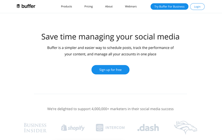
Take Buffer.com’s home screen as an example here. It is mostly white space with an explanatory subheader, the value proposition of the tool, and finally a call to action.
This clarity and openness of this page welcome visitors to explore further.
2. Create Appealing Calls to Action
Call-to-action buttons give users a clear direction of “what’s next” after a piece of information. These are a bold button with active and influencing words that help users navigate your site by encouraging the next step.
You need have enough and necessary Call-to-Action buttons in your website to help users drive through your website easily. Guide them well with these buttons, and encourage them to take actions that you want them to take.
Now, when creating Call-to-Action buttons, have in mind the impact of the color on user psychology.
As per color psychology, applying different hues are responsible to evoke different feelings and thus, different results from web visitors.
This is true in offline content too, not only the internet. Color has its impact on our decisions everywhere.
Here’s the result of an experiment to support my statement.
Sitepoint, had a CTA button that was colored red initially, which they converted to green. Something like this –

The result? 34% increase in the number of conversions
Another thing that can affect the conversion of your CTA button is the words used. The best practice is to use actionable, emotive, time-sensitive and powerful words, which are likely to see better conversion rates.
3. Use Bullet Points & Highlighters
Sometimes it gets really hard to find out desired or key information from a wall of texts, we all have faced that.
A great website UX intends to make information gathering easy and which is why, there should be bullet points and other highlighter tools (bold, italic, underlined, bigger text) on it that highlights the key stuff.
That’ll help people find the key offerings, benefits, and solutions of your product or offering quicker and effortlessly.
If you’re showcasing a product of yours, don’t write paragraphs on why it is so awesome. Rather, highlight the key values, and then a little description of that under that point.
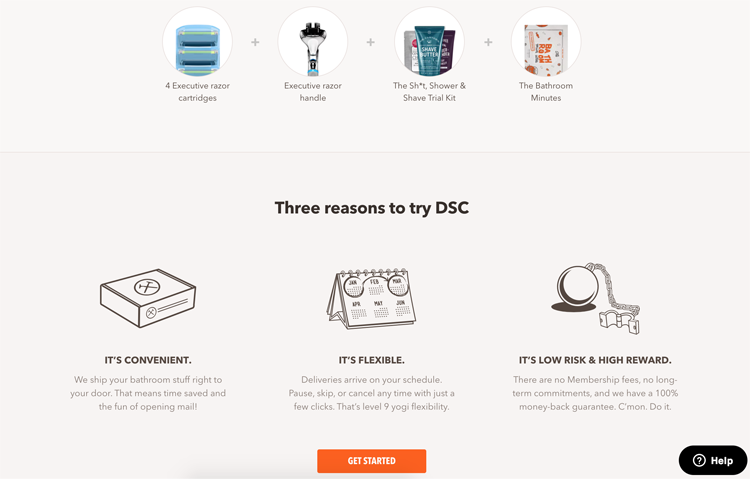
Look at how the dollar shave club does it. They point out their 3 major benefits of subscribing the monthly package, and describes those in short and sweet.
Also, using bullet point and other highlighters saves a lot of space which you needed to describe in details without those, thus create white space to give more breathing space and improve your website’s readability.
However, you can improvise a little further. Instead of using simple circles and boxes used in conventional bullet points, you can use icons that represent the text.
The after ones look much better, don’t they?
4. Choose Original Images
Today’s internet users are savvy judges, to be honest. They can easily identify generic photos, which they quickly ignore, and you become less trustworthy to them.
That’s why, it’s a good practice to avoid stock photography, especially in the cases of displaying a product online.
When you’re displaying a product on your website, you should use original high-quality images of that product, rather than iconic and generic images.
You know, high-quality photos are great determinants of conversion in case of online shopping websites.
MDG Advertisement did a study where they discovered that 67% of consumer thinks that high-quality original photos are a major determinant of an online purchase decision— even higher than ratings and reviews.
Another study by VWO, a conversion optimization platform, shows that when you replace stock photos with genuine images or a service or product, it can increase conversions by a minimum of 45%.
So bottom line – you should use high-quality original images.
5. Write Targeted Headlines
The first thing users notice about your content is probably the headline. That’s why it should be aligned with your customer’s desire (what they are looking for) from that webpage.
Using the keywords, or the most pointy words of the page in your title helps your audience to get an idea of the contents of the page right off the bat. It attracts the right audience and certainly entices further content consumption.
A development firm, Anadea uses their most key term, “Custom Software Development for Web & Mobile” as the highlighted heading.
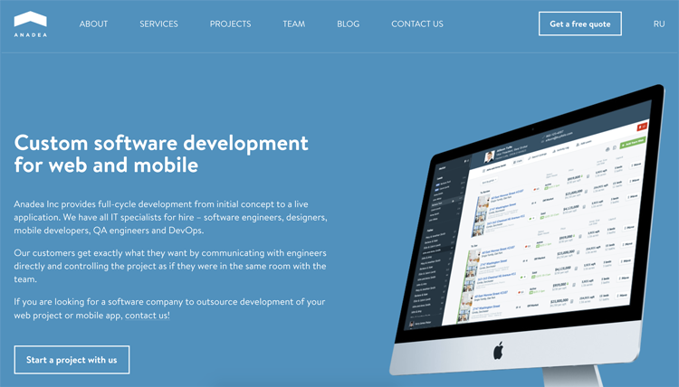
This does two things – connects the right audience right off the bat, and clears out what in the page, so the users won’t have to read the entire page to find out what’s going on – which is all a great UX is about – effortlessness.
For additional benefit, when you use the key terms in headlines, it gives you a good SEO advantage. Google tends to rank those websites higher that has the most targeted headline with the topic – as they take it as a signal of relevancy.
So it’s like hitting two birds with one stone.
6. Improve Page Speed
Page speed or website speed has been becoming a significant factor from multiple perspectives in today’s advance and competitive internet.
Website speed is one major factor google considers before giving a site a good rank, and it’s obviously much important for the experience a user has with a website.
Every other website expects a consistently fast, frictionless, smooth online experience.
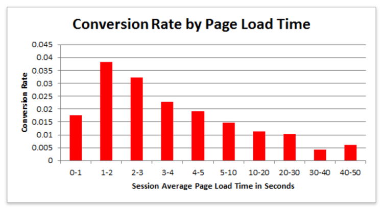
Econsultancy suggests that, if a webpage takes more than 3 seconds to load, 40% of people are likely to hit the back button.
Pages loading within 1–2 seconds will see the greatest conversions.
And it’s not only about conversion from the website owner perspective, if we want to give our users a seamless browsing experience aka good user experience, we need to make a fast loading website for them, so they can use the website much more efficiently.
So optimize your website for fast loading on both desktop and mobile devices.
You can use the free services from Google for assessing your website and mobile website speed. They’re free to use and they are good guides to help you with the process.
7. Stay Consistent Throughout The Website
Visual consistency is essential to a coherent website experience.
Users should feel like they’re home when they’re navigating from one page to another in your website. Any inconsistency or drastic change may confuse the visitor and come in the way of their possibility to proceed.
Ensure these things are consistent throughout the website, for seamless user experience –
● Colors
● Fonts
● Design elements
● Button sizes
● Spacing
● Illustration styles
If you can make the users feel like they’re still home with a consistent design of your website, they’ll happily navigate by themselves to see more content of your website.
The Wrap Up:
A great user experience creates a win-win situation for both the parties – website owner and the user.
If a user stays more time on a particular website (make that happen with good UX), Google is likely to rank that website higher, as Google gives great importance to a users experience with a website.
And if your website is an online shopping one – then the more time user happily spends on your website, the more sales you’re likely to get.
On the other hand, when a user finds your website friendly, they enjoy browsing it (so they win too), and likely to come back to your website in future (which is again your indirect win as a website owner).
So it’s worth to invest time and money to design a great UX to make your site contemporary, functional, and relevant to the potential customer.
And if you need a hand with that, we have an expert team sitting here to help you, gives us a buzz.

