Coming in 2019, online shopping is more popular than ever, and it’ll continue its dominance in the coming period.
It is so convenient that people are shifting towards ordering online even when they have the opportunity to go to the physical shop and buy the product.
That is why every business is considering having an online shop even when they have an established physical store – which is the right thing to do.
Now in physical store, you get the help of many tools to do more sales like – the salesforce with great convincing ability, the nice interior of your shop that sets a class and so on.
But in online, you don’t have any of these. So what’s your best bet?
Your best bet is to invest in creating and designing your E-commerce Website visually beautiful that pleases the eye, also a website that is greatly functional.
In another article, we covered how to create a visually beautiful e-commerce website, where we discussed the best practices to create so.
Now it comes to functionality, which I think is even more important.
Designing Your E-commerce Website need to be effective as what it’s supposed to do. Your users should not have a hard time finding something or browsing your website, which can impact sales.
But along with the basic stuff, there is some more additional functionality you can add to your website that’ll generate more sales for you.
So let’s look at all these best practices in terms of functionality to create a great e-commerce website.
Table of Contents
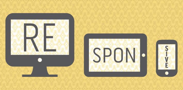
Go Responsive
The SimilarWeb’s The State of Mobile Web in the US 2015 Report suggests that all the consumer traffic that leading US websites get, 56 of them is now from mobile devices.
That means you need to optimize your website for mobiles to capture the bigger share of traffic in the right away (give them a good experience browsing your site from mobile devices).
And that’ll generate more sales for you, so more revenue to your business.
Making your website responsive is not a daunting task either these days. Purchasing a theme that optimizes itself for mobile, tablets or desktop devices will do the job.
If your website is on WordPress, you’ll get responsive themes for just 50$. So what advantages could you get spending this 50$?
- Designing your E-commerce website as Responsive or mobile friendl is a significant ranking factor in Google.
- Mobile usage is on the rise, and you can get take advantage of that with a mobile-friendly website.
- 61% of people have a better impression of brands when they have a good experience browsing from mobile devices.
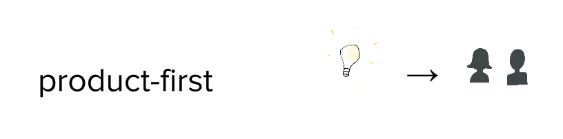
Products First
The heart of your e-commerce website is products. Showcase them in an attractive and functional way.
High-Quality Photography
A study from IRCE shows that 75% of the online shoppers state high-quality images of a product as the most influential element in making their buying decision, while another study by them tells that larger image increase sales by 9%.
And that is easily understandable. Looks always create the first impression in a human being (be honest, same happened when fall for your girlfriend too).

Online, when there’s no scope of touching or viewing the product in person, images are the only thing that customer relies on to see what they’re about to purchase.
You’ve got no other way but to be professional here. Ensure your product photography guy does a great job. Adequate light, good focus, a hint of creativity can result in some great quality images of your product.

Your product photography needs to be clean & professional so that it makes your products look like worth buying.
Search Functionality
Most of the e-commerce store features thousands of products which makes it tough for anyone to find out his/her desired product/product type from this long list.
To solve this problem, you need to have a good search and filtering functionality.
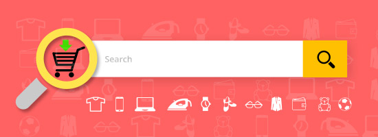
There should be text search box option (which is pretty basic, I know). But where you can really shine is how good you can categorize your products and create a hierarchy.
You should try to insert as many filters possible so your website becomes easy to navigate and one can easily find what they were looking for using those filters.
Highlight The Best Sellers
You and I both know that you have only a “few” winning horses. Why not let them run more races for ya?

Yes, I’m talking about the best selling products. You should highlight the best selling products with badges and other similar elements.
This adds social proof and credibility to those products and they sale even more. It’s a proof that people are already buying this product in a huge deal – means it’s a good product. This assurance gets those products even more sales.
Mark Out The Stock Out Items
Just like you marked out the best selling products, you should similarly mark out the stock out items too.
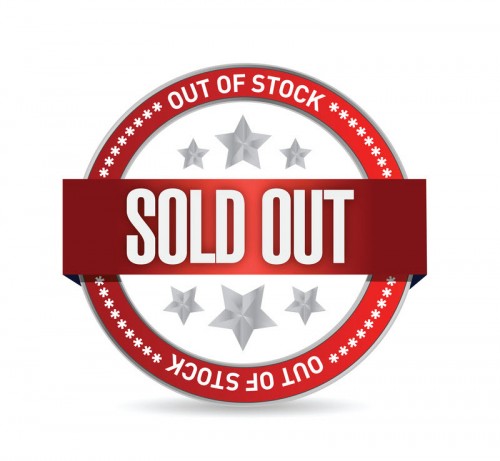
Because it’s really frustrating for a customer to spend all his/her time to find a product that is out of stock.
I myself get pretty angry when I like a product from the catalog, then click on the product to order it and see that it’s stock out – not a good practice at all.
You should rather clarify it right in the catalog.
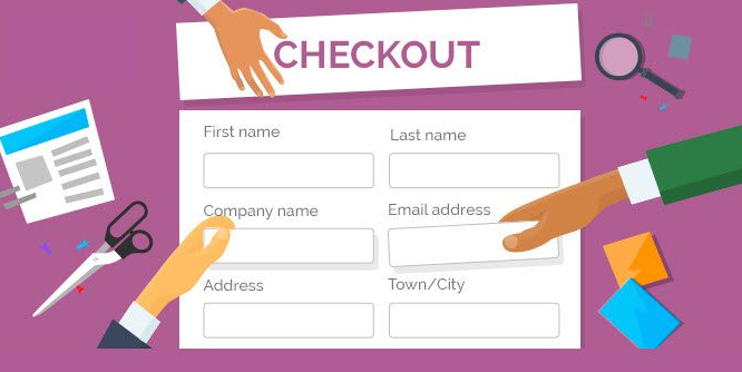
Provide All the Necessary Information Right in One Place
Designing Your E-commerce Website requires that all the information that is needed to make a buying decision is right there in one place and easily accessible. A customer should never have to look around for product specification or colors available or certainly not price.
You know your business better so you know which information your customer needs to make a buying decision. But listed here are some common information categories –
● Price
● Measurements
● Available Colors
● Buying options (set menu)
● Materials used
● Technical information
● Returns policy
● Included extras
Also, make sure they’re right in front of the eye thus easily accessible. Some site has this information but they’re difficult to find – not a good practice.
Be Easily Reachable
Be available to contact at every page of your website. Physical address, email address, phone number and all other necessary information needed to reach you should be there on the home page, contact page (obviously), and in the footer of every page.

Verifiable contact details reassure your potential customers about your authenticity and they know that they can reach out on any issues.
This information should be on the pages and places I mentioned –
● Physical address
● Phone number
● Email address
● Postal address
● Social media account links
All About Shopping Cart
There are some great practices about shopping cart that many don’t bring into game, let’s see those –
Congratulate them on Purchase, Give the Feedback
You know, little things can have a big impact sometimes.
As little thing as congratulating your customer on every new ‘add-to-cart’ with a pop-up window, and inviting them to keep shopping can really motivate them to go on and buy another product.

And you wanna take that chance. Establish this congratulating mechanism that builds their confidence in your company and motivates them to purchase more, and see the magic.
Make Things Look Familiar
Look, it’s most probably not the first online purchase of your potential customer. They probably have bought other stuff online already, and they know how this process works and how different dashboard and payment pages look.
Do not improvise too much here.
Improvising here is not likely to get you any significant result, in fact probably no result. Rather, keep these sensitive pages in a traditional look like most other shopping websites look.
Doing otherwise could confuse and alienate your customers and influence trust issues and they may abandon the purchase getting afraid of their money and information getting compromised.
Remember, certain shopping cart best practices have been around because they work.
And I recommend having an SSL for your website (which is not design related, however), as it shows a green “secure” text in the navigation bar in payment and other pages, which builds trust.
Abandonment Scenario
In many cases, buyers abandon the buying process in the middle of it (mostly short of making payment) for some reason, which is known as shopping cart abandonment.
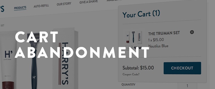
Now, though you’ve lost a potential customer here who was just about to make payment. I feel sorry for you. Here’s a little stat that shows you’re not the only one that faces this –

However, you could still win something from here. There is a mechanism that registers this abandoned sales, which is a great thing to have on your website.
You can collect all the information why sales are getting abandoned, see if they’re getting abandoned in a particular step or not (thus take action to figure out what’s wrong in that step) and get valuable information of your potential customer to retarget him/her.
Marketing Aspect
Be a Storyteller
Denise Lee Yohn, who’s the author of What Great Brands Do, tells that –
To create sustainable, valuable customer relationships, great brands don’t sell customers on contracts—rather they seduce them with connections.
Memorable, emotional, Impactful connections lead to true brand loyalty.

To do the same thing in your business, you can suddenly become a storyteller. Tell them about your journey – why you started, what are your visions, what makes you different than other businesses and why should they choose you and so on.
Telling the story from your personal perspective influences a personal connection which can get you sales in short term and a loyal customer in the long-term.
Twitter Works Great
Constant Contact and CMB conducted a study where they found out that “50% of brand followers are more likely to buy from a brand after following them on Twitter.”

Means, half of your followers be already your follower, but they’re likely to “Purchase” from you after seeing your activity, shares on Twitter, which probably gives them the push they needed.
Most of the businesses take facebook appearance seriously, which is great, but Twitter is better for making personal connections through mentions, also instantaneously dealing with any customer complaints or queries upon mentions and so.
So be active on Twitter.
Design Forms to Capture Leads
Email marketing is still a great option to reach out to your customers directly with recent happenings of your business and offers and discounts offered, and you can also track their click in this marketing channel.
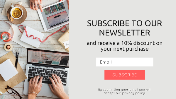
Also, not only the email, but having their first and last name will also allow you to personalize those emails you send to them.
So design subscriber opt-in form that asks for a prospects email address and first name, and place it to the appropriate places of your website.
However, make sure to give them something in return to make it worth their while. You can offer something like a coupon or eBook and tell them they’ll get it in their email after they input it. This can increase the number of new subscribers in a great deal.
Provide Information
Be informative enough so that it helps your customer in every way possible to make the purchase. The goal here is to make it easy for the customers to take the purchasing decision, which needs the information listed below –
● Information about returns and warranties
● Delivery information
● Sizing charts
● Frequently asked questions
Reviews
Reviews can make your business, or break your business.
Well, I was a bit dramatic there! Reviews probably won’t break your business completely, but too many bad ones might hurt your reputation.
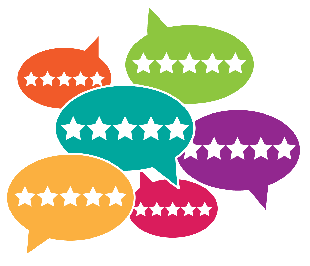
However, many ask if they should keep the review option on the product page or not. I think they should.
Because good reviews are great testimonials of your product, and that is a powerful tool to convince a potential customer as that’s coming from a neutral person, who’s not related to your business.
A potential customer is likely to believe their words more than yours and make the purchase happily.
However, there could be some bad ones, I know. But you’ve got to deal with them. Whenever there’s a bad review, get back to him/her as quickly as possible to figure out what’s wrong, and see if you can solve the problem or not.
If you think you can’t, you may consider giving them a refund, and keep the conversation on that page to show other people that you seriously you take your customers and you’re ready to refund them, if they’re not happy.
Because look, good reputation is something that can bring you a thousand more sales, which is great compensator of losing money of a single sale.
And dealing with bad reviews openly gives a subtle message to your customers that how open and honest you are.
So from both perspective, reviews will do good to your business, so keep them on the page.
Final Words
Bring this good practices to your e-commerce website and see what good they bring to you. After all, building a great e-store is about experimenting and finding out the best for yourself.
If you need an expert hand bringing all these practices to your business, our expert team can help. Give us a buzz.

