Congratulations that you’ve decided to create an e-commerce website for your business because this market is growing rapidly and expected to top $4 trillion by 2020 in retail e-commerce sales, which is equal to USA’s total debt (lol).

Now if you’re going to creating an e-commerce website, you better create it great. You know, it is pretty similar to spending money on the interior and exterior design of your physical store.
The impact that classy & functional interior design of a store creates on the customer, the similar impact it creates online with the design & functionality of your e-commerce website.
Consider your virtual storefront as the face of your business, and the way it looks will affect brand perception and buyer’s behavior.
And since there is no salesman you can have online, designing the website great is your only chance to entice the customers to purchase.
Now there are two major aspects of designing a great e-commerce store – Visual & Functionality.
Your online store should look great and appealing, also it should be as functional and simple to use as a customer can desire – so they easily do what they intend to do.
However, this article is going to focus on the visual aspects, and I’ll cover the technical and functionality aspects in another piece.
So let’s look at some best practices to bring in the game, when you want to make your virtual store beautiful to look at –
Table of Contents
Let’s Make Your Website Visually Beautiful
Let’s make it simple for you – if you want to hold your customers in your website and make them see what you have to offer – you’ve got to make it a pleasurable experience for them.
And it all starts will eye-pleasing your website looks.
But by no means, I say that getting your customers attention is about having a flashy and loud website.
Rather you need to design your website in such a way that it gives a sense of trust, professionalism, reliability and it should obviously speak for your brand values. That’s the basic concept.
Nice colors and easy-read text are just the beginning in this process. There are many other elements you need to consider to actualize this concept – let’s have a look at them.
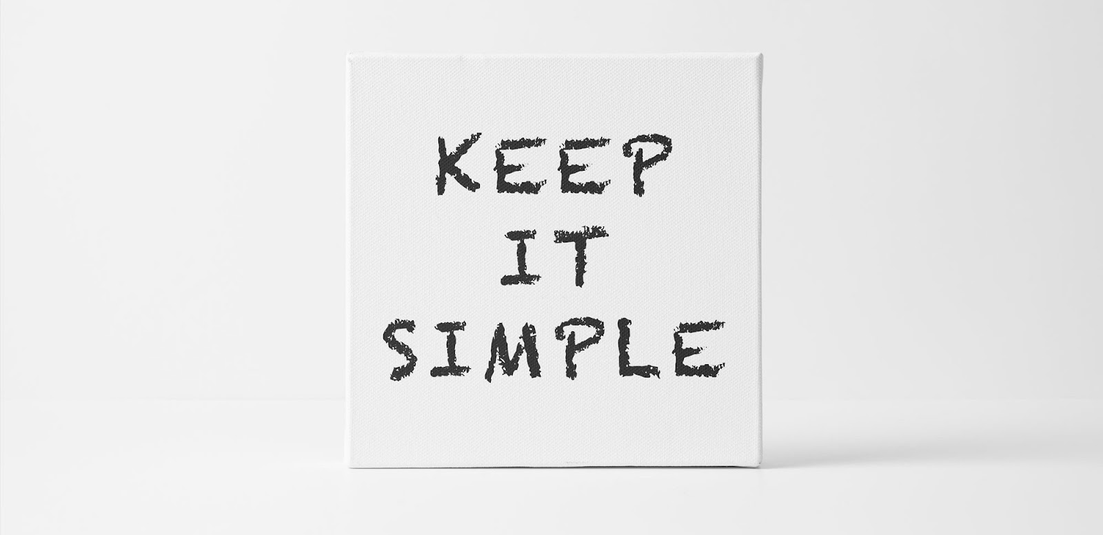
1. Simplicity is the Key – Keep it Minimal
Coming it 2019, our life already is a mess and we feel it in every sphere of our life that how important it is to keep things simple. Same goes with the internet.
Why does your customer visit your website? To look for something.
You need to ensure that he/she gets it as quickly as possible. The more mess and clutter you have on your webpage, the more time and stress they’ll have to deal with. This can make them frustrated, they may change their mind thus and you might lose a sale.
Now how to keep it simple?
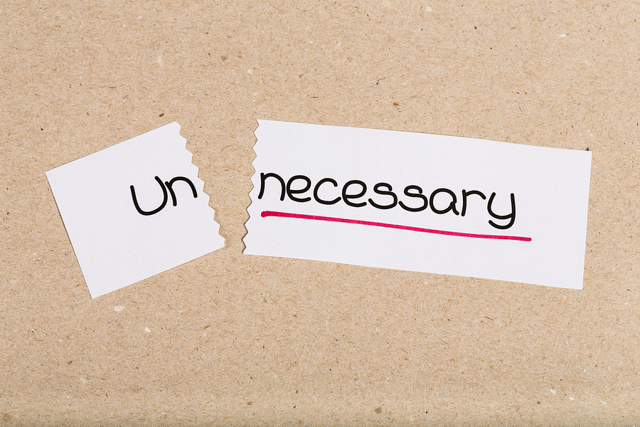
The first step to this process is identifying the necessary and unnecessary elements of a webpage.
When we’re designing it, we can often get overwhelmed and insert elements just trying to make the page look good, not considering the functionality perspective, and that’s okay – we all do it.
What you have to do is, when making the plan to design a particular page, you have to think from the functionality perspective, after (or before) thinking from the design perspective.
Thus you can identify every element’s both perspectives, and that you’ll have the idea by yourself that which elements are necessary and which elements are rather unnecessary, or less necessary.
Then cut off the unnecessary or less necessary items, simple. You get a simple yet nice looking and functional webpage.
If you want to learn more about designing simple and minimal websites, click the linked text which will take you to another piece I had written solely on designing minimalist website.
Simple Color and Typeface to Design Simple Websites
Color is a very important element in designing websites, especially in designing e-commerce websites where there’s scope for marketing. That’s because, color psychology has a lot to do with marketing.
Some color gives an essence of comfort, some excite, some catches attention. So it’s recommended to choose according to the expected action.
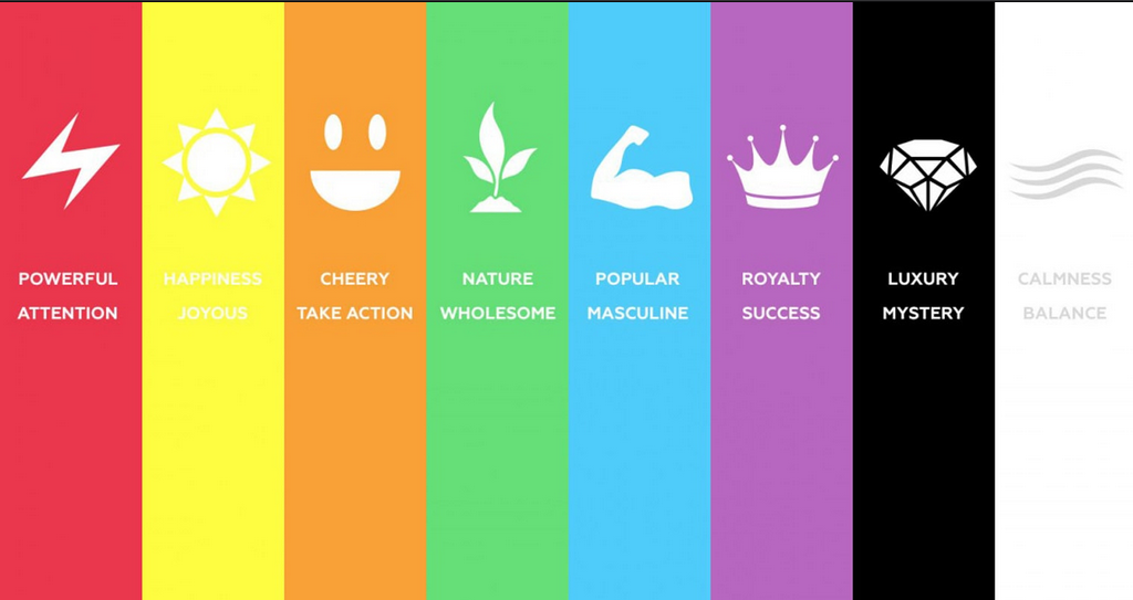
It’s good to avoid using too vibrant color all over the place. You may use them only when you need to get the attention on something.
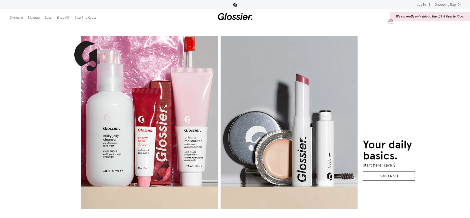
Also, it’s suggested to stay aligned with your brands’ theme color. This consistency helps you to get a bigger place in your customers’ subconscious mind.
See how Nike does it.
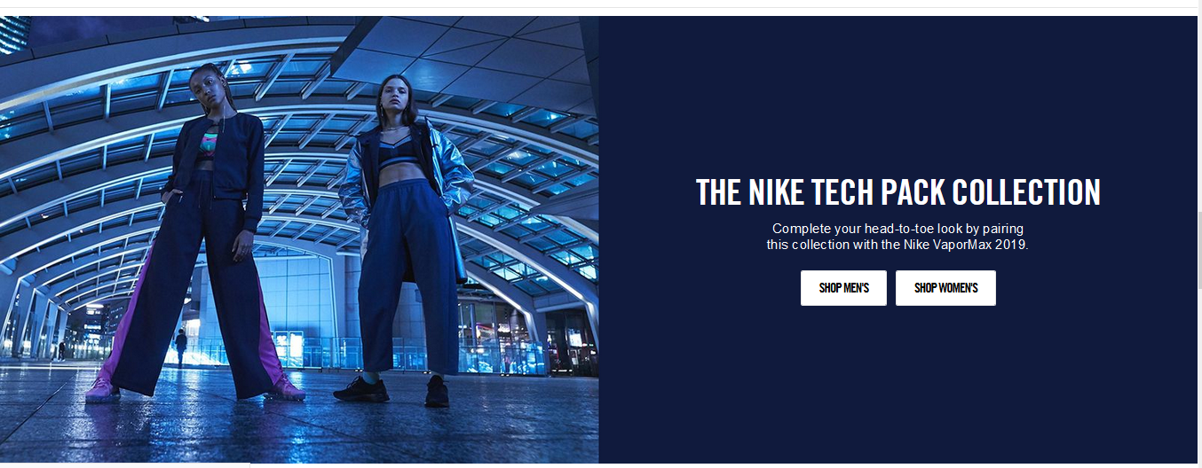
They could choose any color in the world to color this dark blue box, rather the stuck to their logo and brands theme color – dark blue.
About the typefaces – first, make sure they’re easily readable, then play with that.
By playing, I mean I saw many online stores that go with pretty informal looking fonts like comic sans, handwriting and so – and that’s completely fine.
There are some business types that complement these informal and fancy looking fonts.
Take women’s beauty product selling website for example. You have all the freedom to use a fancy & stylish looking font here, and you better do so – because that complements the store.
But if you think you want to play safe, you can any day go with formal and popular fonts like sans serif, Georgia and so.
So just 2 things to keep in mind here –
- It better be easily readable
- It should complement the business type well.
Then again, do not make things ‘not-simple’ trying to go too fancy.
2. Visual Hierarchy
The design is very much about the communication, where visual hierarchy is about influencing the user experience by creating a consistent flow with website elements like these –
Color
Subtle and not too vibrant color like ash or white is great to be used as the background color of a website, whereas contrasting and dominant colors like red or black are great for grabbing attention – thus a great fit for call-to-action and other emphasizing elements.
So you gotta pick a color combo which you need to be sticking with all the time to create a color hierarchy through the website.
Remember I told about picking a color that compliments your brands’ theme color?
So what combination would you pick if your brand theme color was black?
I’d pick white as the background and black for the call to action buttons with white text.
So did Nike –
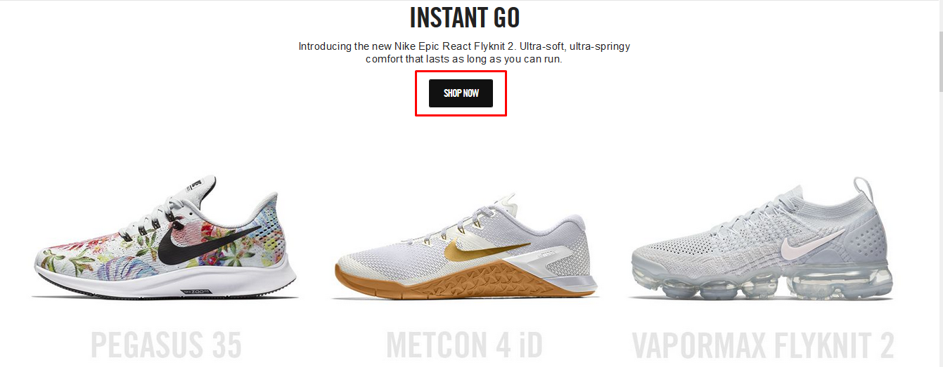
Most importantly, you gotta stick with this combination to create the color hierarchy I were talking about. If you visit Nike’s website, you’ll see this combination in their whole website.
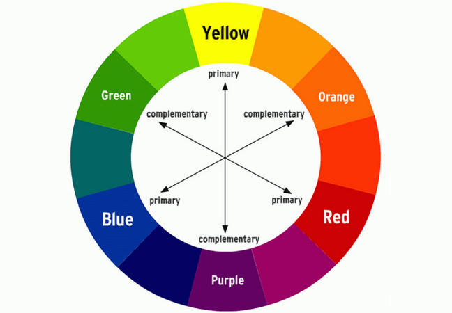
Here’s a color wheel for you that’ll help you to pick complementary color shades for your brand’s primary color –
Size
I do not need to tell you that big things are always noticed first. But does that mean you’ll enlarge most of the elements on your webpage?
Heck no.
Rather you’ve got to set a style here too – by having a pattern of which things you usually enlarge.
Okay, explained simply – for e-commerce websites, you can use larger images and text to showcase a featured or promotion product.
So that, whenever your customer lands in a new page, and see something bigger than usual, it automatically sits in the back of their mind that it is a promotional or featured product, which will make them more interested about that.
But what about a page where you do not have any promotional or featured product to showcase? What do you make large?
Ideally, nothing! Enlarging something unusual will break that pattern of yours.
Position
Another important aspect to consider to create a hierarchy in an e-commerce website.
Where you position your element creates a style on your webpage. We can use white space and proximity to separate the content that we want to emphasize on than the other ones.
If there’s a lot of content that you have to keep in your webpage, the smart idea to create a hierarchy by spacing out the low-hierarchy information away from the elements you want to focus on using whitespace. Easy!
3. Keep it Consistent
As they say –
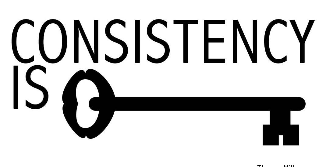
You need to figure out your style and then stick to it throughout the whole website.
Your consistency in the style will take its place in the user’s subconscious mind, so that whenever they’ll think of this certain aesthetic, they’ll remember of you.
However, you should also keep in mind that the writing tone matters a lot too, so keep that consistent too, and also do not forget the background as well.
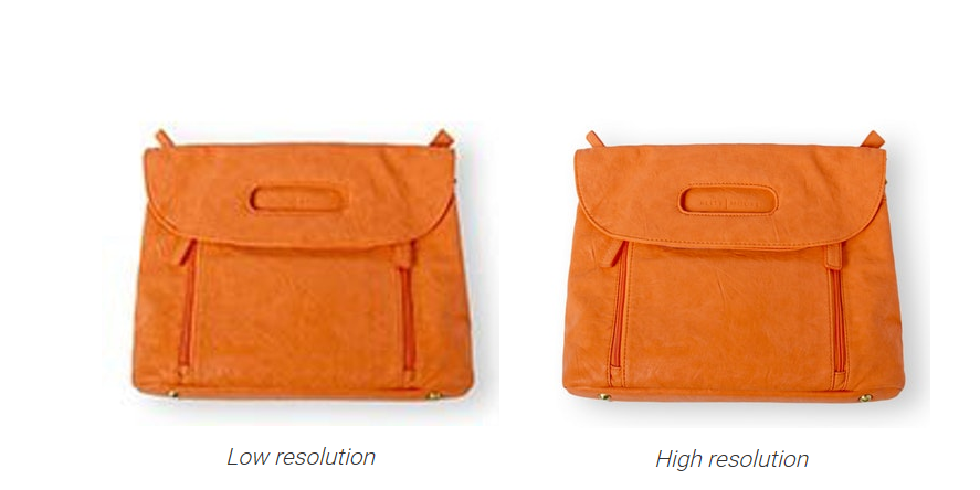
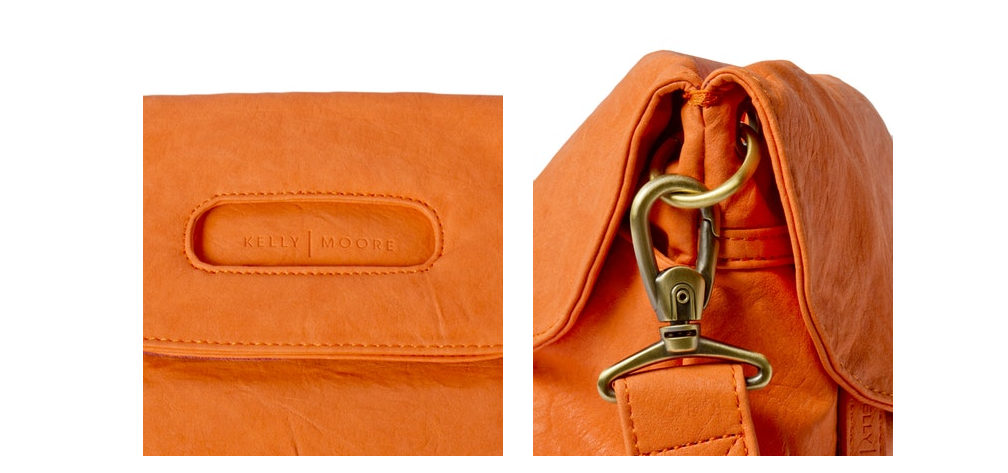
4. Use High-Quality Original Images
I can not tell enough about the importance of high-quality images in e-commerce websites. Every website needs great quality images, but it is more significant and more impactful on e-commerce websites.
According to the IRCE report, 75% of the online shoppers think that high-quality image is the most influential element to them when making a purchase decision online.
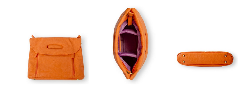
They also say that 66% of the people think that it’s very important to show alternative views of product apart from the front view.
Another 61% states the ability to zoom a picture as a very important feature.
Another study by Visual Website Optimizer tells that larger image increases the sale by 9%.
Need any more stat to understand the importance of large, high-quality images on your site?
Now, there are some actionable tips I want to list to do great on image section –
- Use images of good resolution.
- Use as large image possible.
- Provide images of all the views of the product taken from different angle.
- Keep the zooming function there.
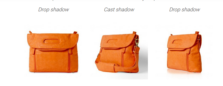
- Use a background that complements the image, never ever some color that looks same as the product color and creates conflict
- Images with drop shadows look great.
- Use original images, not always stock photos.
- If possible, use 360-degree images that people can look around to get the most complete view of the product.
Wrap Up:
So there you have it. Some of the best practices to design your e-commerce website beautifully that attracts more sales. In another piece, I’ll cover the best practices to make your e-commerce website more functional.
Till then, if you want an expert hand to make your e-commerce website more beautiful, we have a team consisting of experienced experts. Consider giving a buzz.

