Don’t you sometimes land on a website and think – wow, this website looks great!
But have you ever thought and could figure out why that website feels that nice? Did you think – That website has a nice usage of white space and well-matched sans-serif and serif fonts!
Nope, only designers think that way.
You as a user just enjoyed staying on the website.
But if you had to think from the designer perspective, that’s when you had to post-mortem every element to find out the hidden magic.
You know, there’s something more to good design than making it just look right. You could follow all the design rules with surgical precision … and people may still not like it.
It’s about finding that hidden magic, it’s about knowing that underlying fact which makes the difference.
Table of Contents
Form, function, and feel
Good design is not just about the looks of a website; it’s also the functionality – how it works.
The website should create a nice flow while you browse it – that’s where it feels good to your audience.
However, a website is not a machine and there’s no rule of thumb or recipe to design a website great. There’s basically no way to automate the process.
Your design needs something more than following rules – feel! You, first of all, have to feel the context, and plan and design your elements according to that.
If we want our audience to connect with our website, we need it to reach new levels of interaction with them.
We have some aspects here that could be the secret to that underlying magic that connects your audience with your website.
What are those?
Make Your Design More “Human”
Do you like to be greeted by a robot that says automated text every time? Cause I don’t.
Now when someone enters your website looking for any information, what greets them is your website design and looks. You want to make this greeting as human-friendly as possible.
That’ll give you the advantage right off the bat in the process of connecting your audience, and you’ll make a good impression there.
Now, what does making your design more human mean?
Well, you want to design your website around people’s possible actions and the way your visitors expect your website to work for them.
They should not have to guess what’s next, after landing to your website.
You can solve some common problems that kill visitors’ time, to improve your visitors’ user experience.
Problems like these –
Where am I?
If your website design layout is not consistent, people might feel lost on your website.
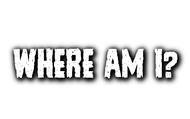
And when they can’t figure out what to do, they’ll always find the exit button on their browser, which you do not want. Make your design layout consistent.
You should not (or can not) change the layout too often between pages or move the navigation. There should be a common pattern throughout the entire website so your visitors can easily get used your website’s interface.
Is it clickable?
Elements that you think might need interaction with a user need to be stand out in some way and clearly visible. The color of Buttons, links and other some items should be different than the body content to make them clearly visible.
I can’t read it!
What’s the point of writing for your audience if they can’t read it? You need to have this in mind that you’re designing your website typography for the human eye.
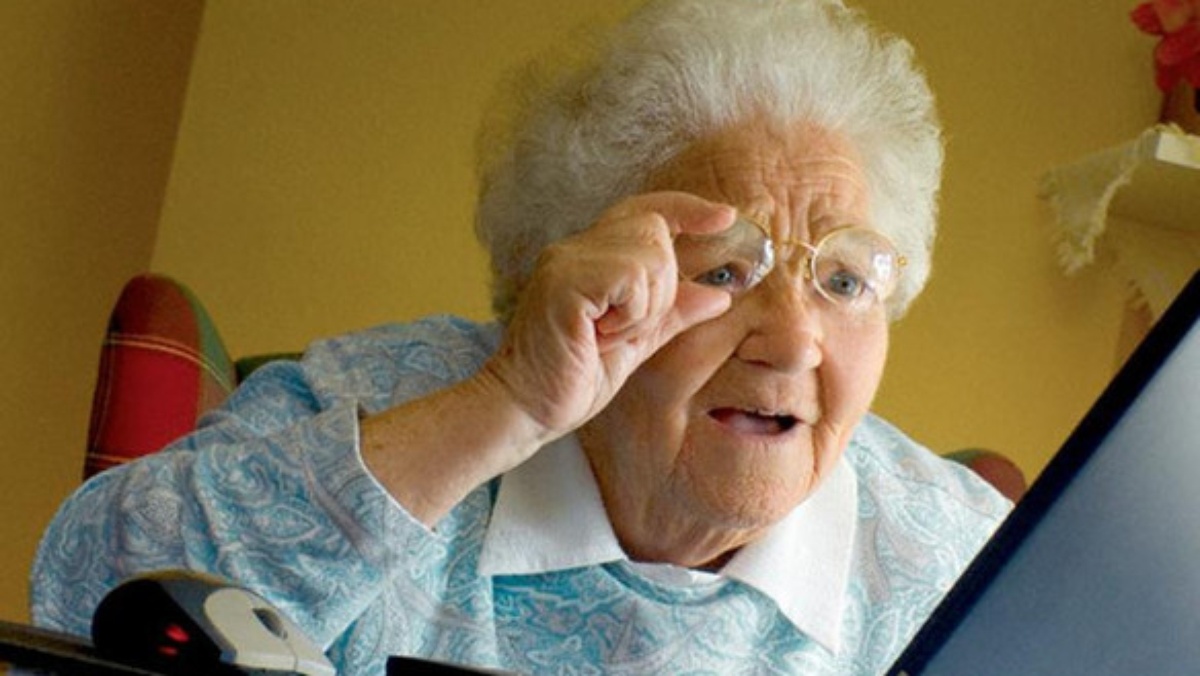
So you need to have large enough font and the color contrast between the text color and the background needs to be clear enough.
If you think your targeted audience is the aged group of people who have less viewing power, you may even enlarge the font and add more contrast to make it comfortable for them to read.
Basically, needs over aesthetic.
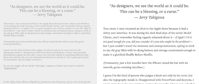
Take this sample piece of content from Medium.com for example, that is displayed in two different versions. The right-sided version has clear spaces between lines and high-contrast between font color and background color.
While the one on the left side has the same content with the same font type, but the spacing is not good, the font is too small and the contrast is low too.
So you tell me which one is easier to read?
To make your design more human-friendly, you should try to get to know your typical visitors and understand their behavior. Solve their common problems to make the website more usable for them.
Bring Emotion Into Your design
We can’t disagree that we all get influenced by emotion in many of the decisions we take. So does our website audience, so we should not avoid emotions when designing our websites.
We can affect the way our audience feels about our service, brand or product by using specific color, shapes, fonts, icons or photos.
You can see how big brands like Apple, Starbucks or Target are always utilizing this emotion aspect.
Apple takes a lot of effort and money to design their product to look sexy, sleek and modern, and design is I believe, one of the most significant factors in Apple’s huge success.
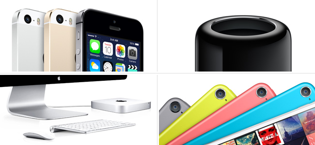
It just feels nice when you use any Apple’s product with consistent rounded corners and smooth, nice-to-touch surfaces, right? This type of feeling creates emotion in our mind for that brand and we become committed to it.
How can we do similar in our website design?
Give your brand a soul and build according to that
Firstly, choose how you want your audience to feel about your website, then focus on aligning all the elements with that and be consistent.
Want your website to be on the humorous and light-hearted side?
Consider using smooth shapes, funny character, fancy fonts like comic sans, joyful colors like sky blue, orange and so – and put some light jokes here and there.
But let’s say you’re running a sports car blog. Will this approach of above do it for you then?
No, because if you want your audience to associate with your brand this time, you need to make them feel cool, not humorous.
So this time you want to use angular shapes, vibrant and strong color like red, tough characters, sexy women, stylish fonts like lobster and so on.
You got the main idea here? It’s about staying consistent with your theme throughout the website to build your brand in their subconscious mind.
Look at how MailChimp builds their light-hearted emotion with the light color and humor with the funny cartoon chimp mascot.
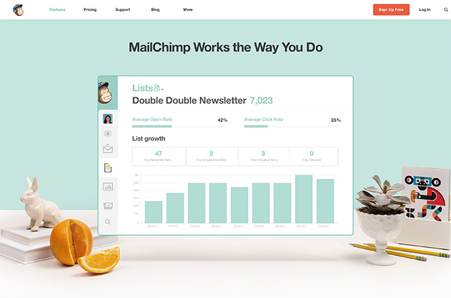
A perfect demonstration of what I just said.
Surprise Your Visitors
Studies suggest that people tend to remember things better and pay more attention to something when they get their feelings associated with it. You want to take that chance by surprising your visitors with something positive, which they didn’t expect.

Just showing a simple “Thank you” message when they take any action, can help to make interesting parallax scrolling effects. Or you could employ animations on the cursor hovering over some elements.
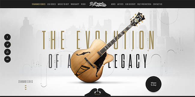
Dangelicoguitars.com have brought this into practice very well. They use custom designed pages and parallax scrolling effects to make exploring their website enjoyable for visitors.
Creative 404 Pages!
How do you feel when you go to a website and find that it’s not working? Or what about getting a 404 page saying ‘sorry we could not find what you were looking for’?
You feel confused, disappointed, or frustrated, and don’t know what to do next.
We need to solve both of these problems so someone coming to our website don’t have to face the same scenario.
Firstly, we need to create a good 404 page. Your 404 page doesn’t always have to be boring, like most other websites. You can make it funny and interactive even by being creative.
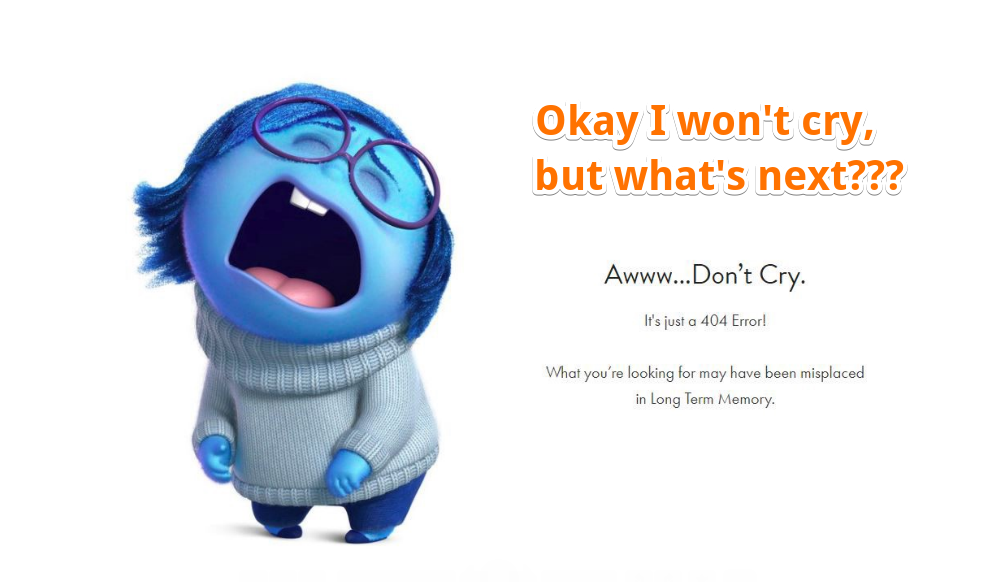
Look at some great 404 pages here –
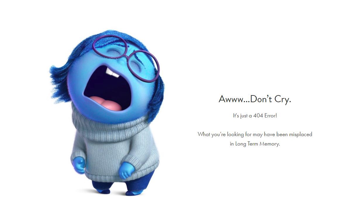
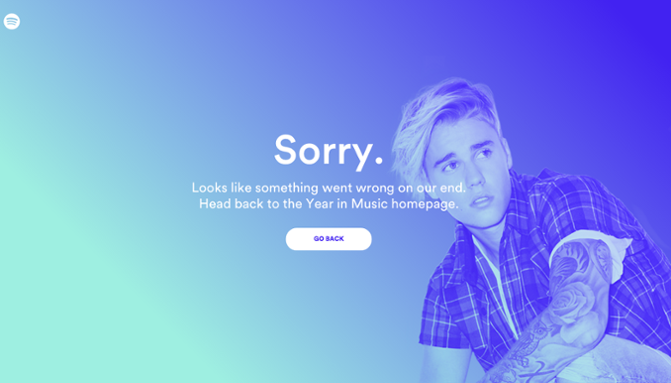
Ain’t that cute? Would you be still frustrated after seeing such a cute picture? (However, there’s something wrong they did here, which I’m about to tell in a minute)
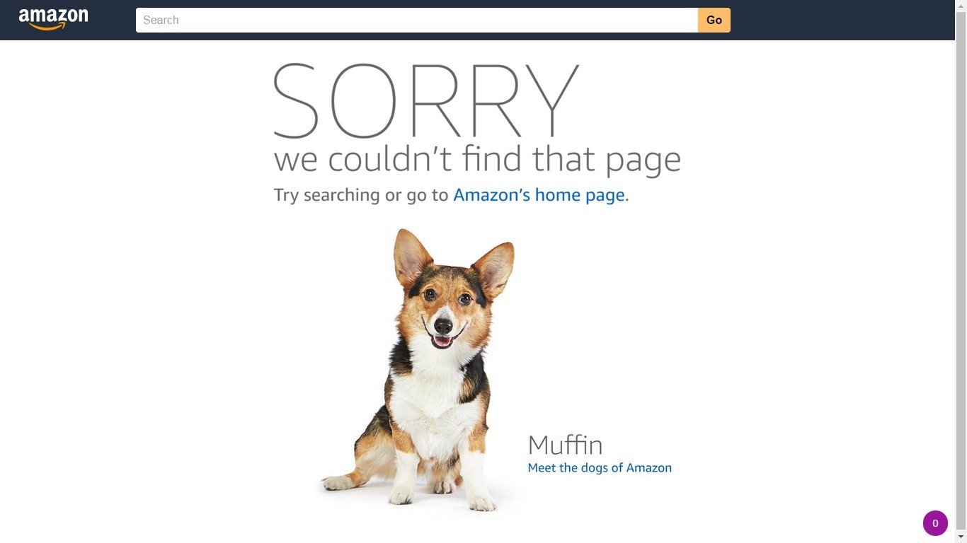
Look what Amazon did here. They introduce their dogs to frustrated people’s of 404 page to make their day. Don’t you love dogs? Cause we all do!
This dude here took the game a step further. He introduced a little web game in his 404 pages, like google chrome’s dinosaur game in offline mode. Dude, you’re going places!
Alright, apart from making it funny and interactive, another thing you need to do is making it functional. By making it functional I mean telling people what’s next.
They ideally should not have to head over to their address bar and manually navigate back to the homepage. You should include “Go back” button or something like that to help them with their next action.
Above I showed you some creative 404 pages, and in the first one, you can see that they missed it, they didn’t give any clue whatsoever about ‘what’s next’.
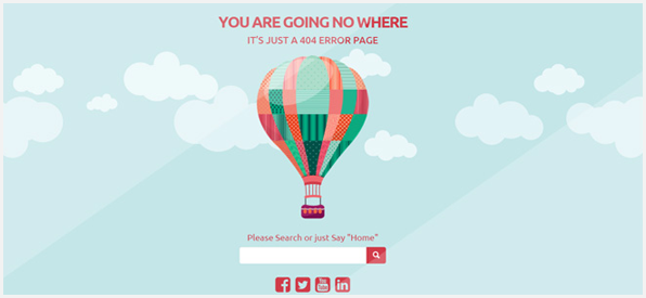
However, you could also include a search bar like the one below, so that people can search for something to do next.
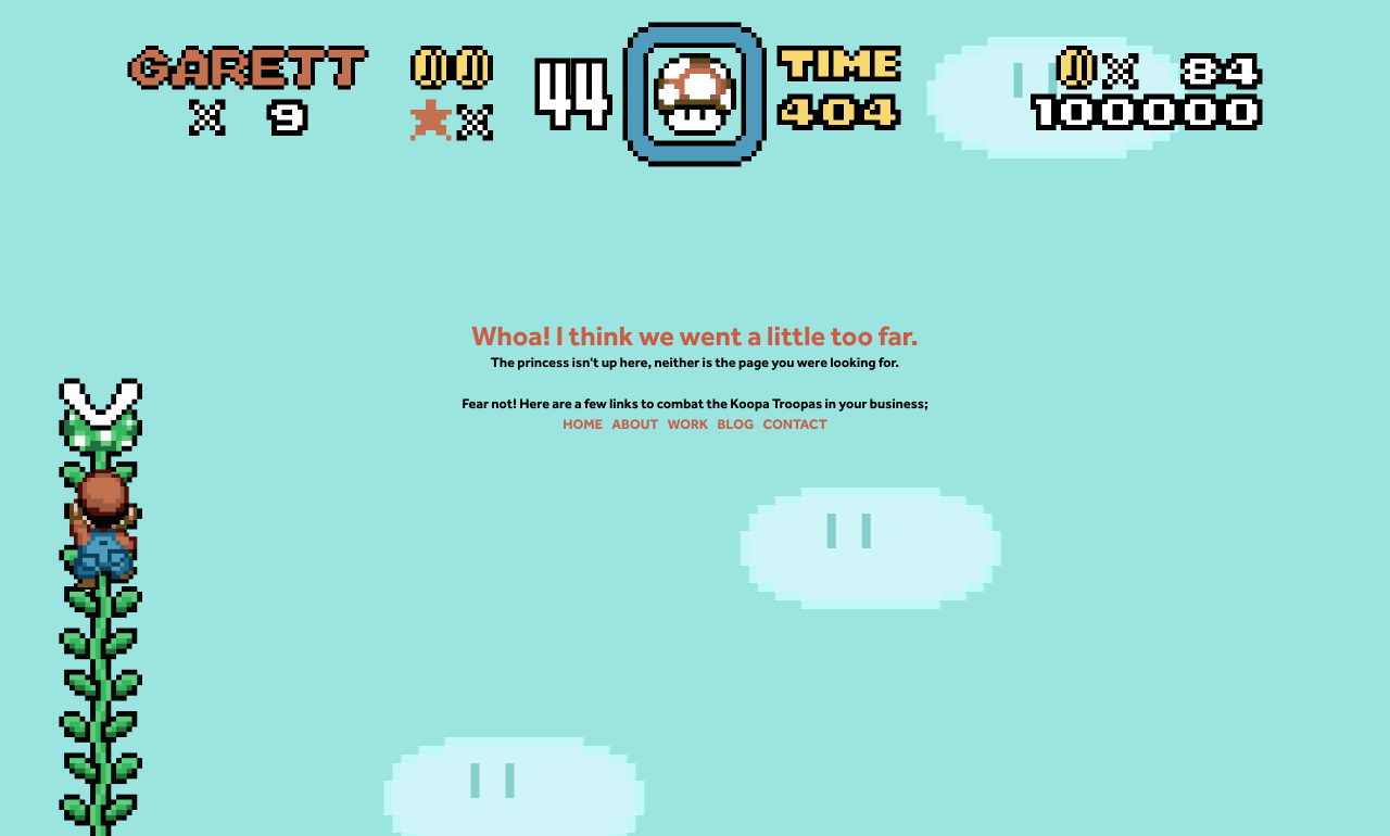
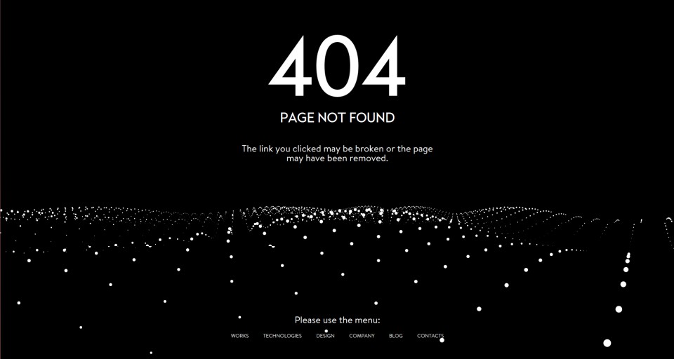
But ideally, I like the ones that introduce the full-fledged navigation bar there, so people can do what they can do from a regular page on the website. Here’s an example of that –
So the basic idea is, keep people busy (and not bored) when they have to wait, and make them smile to compensate for the problem.
Positivity all around!
Keeping things positive is a general rule of thumb for designing any website. Create only those things that evoke only positive feelings.
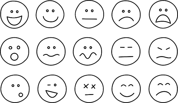
This can be as little as smiley faces, check marks, thumbs up signs, more green color, love sign and so on. Little things matter, you know!

You could also associate positive and warm feedback with desired actions on the site. Take as an example –
○ Use a green “add to cart” button with a smiley (demonstrated later)
○ Show a charming smiley face giving a thumbs up after completing a task.
○ Use a progress bar and text like “almost there”, “one more step” in multi-page forms
○ Show green check marks for rightly filled out form fields.
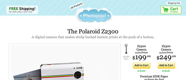
Look how Photojojo spreads positivity. Their shopping cart icon turns into a smiling face along with getting green when something is added to the cart. Won’t that feel nice and comforting?
Simple stuff like these could make the entire shopping experience more pleasant.
So, what’s next?
Look, if you think whether it’s worth to take all the effort to make your website design a little more interactive and user-friendly, let me tell you that you can never go wrong by taking care of your visitors – after all, they’re the heart of your website.
So take the effort to make your website more enjoyable to your visitor, and you’ll definitely gain back.
So tell me in the comments,
What is that one simple change in design that you could make right away to improve your users’ experience on your website?

