Whenever your visitor has a question to ask or wants to reach you out for any reason, the page they’ll be looking for your ‘Contact Us’ page.
That visitor might be your potential customer who has a query about your product or service, and if he or she goes unanswered or cannot reach you out, you are likely to miss out on some revenue.
While ‘Contact Us’ pages does not really have much things to talk about, still there are some little things that can ensure the best possible ‘contact’ conversion, means the people that came to the contact page, end up actually contacting you with their query so that you get the chance to convert them as clients later.
I myself had some bad experience with some particular contact pages, where the contact form was not working, the emails provided were not functioning and it was not convenient to use that page.
To make sure your potential customer does not have such an issue with you, here are a few tips that you can follow.
Table of Contents
Ensure That The Core Things are There and Functioning Right
Contact Form
Every other contact page on the web has got one thing in common, which is a contact form.
It’s basically a simple web form that has some boxes to fill up like your name, website/organization (if any), your email, the reason of contact and an open box to express yourself. This is what a simple contact form looks like:
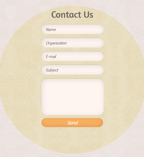
Keep your contact form simply when you make one, don’t try to do anything out of the world here, if you take my advice. Ask for only the basics that you need to get back in touch with the contractor or to understand why he/she is reaching you out.
- Name*
- Email*
- Website/Organization (If any/Optional to fill)
- Subject*
- The Open Box*
That’s how simple you should keep your contact form, as I have shown in the example.
Also, don’t forget to mark boxes that are optional or must to fill. Often many webmasters forget to mention optional things, like a website, which many people don’t have.
So those people don’t have any other way but to leave the form since they think they’re not qualified to contact because of not having any website or coming from an organization.
You don’t want your customer to feel this way.
Oh, I almost forgot, you can give the freedom to the users to choose how they wish to be contacted (like email, phone). Customers can choose the option depending on which they use most frequently and by which you have the better chance to contact them.
Something like this –
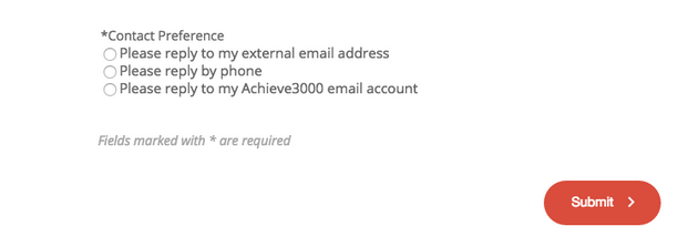
Also, don’t forget to integrate a captcha into the bottom part of your form. This will help you to avoid spam queries or automated contacts.
How to Create a Contact Form in WordPress:
Since WordPress is the most popular CMS these days, I thought let me give you guys a quick tip to create great contact forms without any hassle.
Creating a contact form in WordPress is a piece of cake with Plugins like Contact Form 7, WPforms (which has both free and paid version). Just install those from the WordPress plugin directory and you’ll understand the rest.
If you don’t, here’s a guide for you.
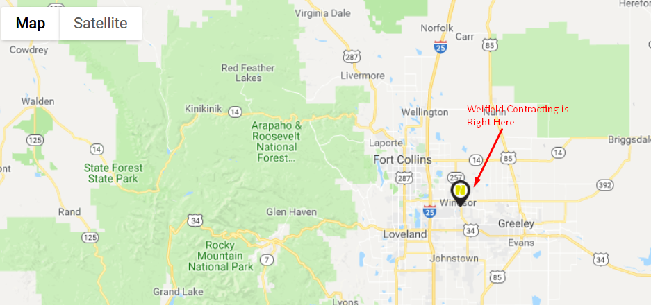
Your Contact Information (Email, Phone, Address)
Aside from the contact form, you need to provide other ways to contact like email, phone number, office address with maps, etc.
Make sure you’re providing working emails and phone numbers, and your office address hasn’t changed since your last update, and also you have a clear instruction to find your office.
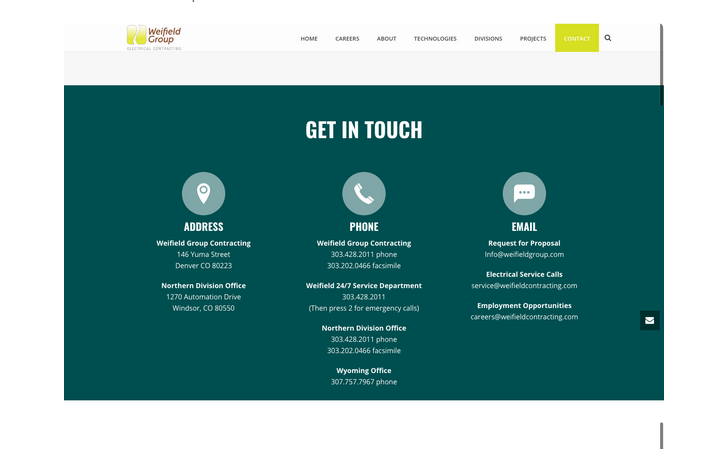
This is how it should look like –
There’s another catch in this screenshot above. See, they have dedicated numbers for different category of queries and they’ve clearly showcased that here, also numbers of their different offices.
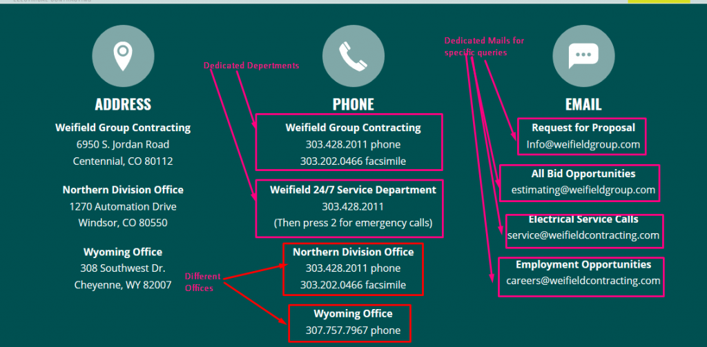
This is a good thing to do as it removes the hassle of sorting incoming queries right of the bat. So if you have such options available actually, don’t be too lazy to showcase them here.
Also, don’t forget integrating a Google Map of your office/offices. This makes it easy for people to find your office and have an idea where you’re located at.
Additional Things You Might Like to Have There
A Funny Illustrated Picture or a Catchy Picture of Your Support Team
You can use attractive images to get the attention or bring liveliness to your contact us page.
That picture might be a funny, creative illustrated one, or a convincing one with some words, or maybe smiling pictures of your support team. Let me show you what I’m talking about –
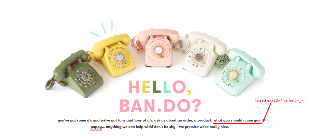
Bando has a nice illustration of telephones ringing one-by-one and they also have some convincing words there, which surely has convinced me to call them up and know what should I name my puppy!

Or you could do it in the Legwork way too.
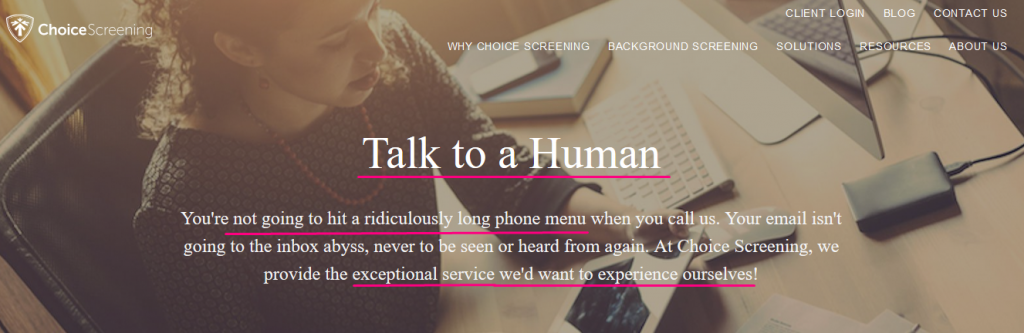
I also love the way choice screening did it. They’re not really funny here, but they have the perfect word choices here that right of the bat will convince someone that they’re about to contact a good support team.
For another thought, if your support team members aren’t really shy to show their face-off, you can have an awesome photographer click their smiling photos and actually show people who they’re about to talk. This definitely helps in building the connection.
An FAQ Section to Answer Commonly Ask Questions Right of the Bat
If your support team has had enough answering those same little easy-and-obvious answer questions over and over again, for million times now, you better create an FAQ section in your contact page.
This will save time for both your visitor and support team, and increase the efficiency of your support team since with the extra time, now they can concentrate more on solving critical problems that can’t be answered in a line.
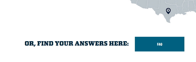
If you already have an FAQ page in your website, you can just link to that through a clear viewing button instead of answering FAQs again here, as Yeti did –
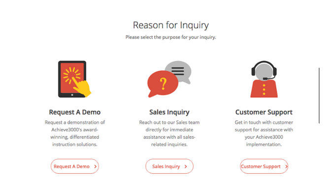
You May Want To categorize Things
If you’ve got sections in your support team that specializes in different aspects, you might want to categorize things right off the bat to avoid sorting later.
This saves time for both your support team (not having to sort the stuff) and the user (thus getting faster replies).
Here’s how you can categorize things –
You can Include Testimonials About How Fast you Response
This increases the confidence of the customer that they’ll get contacted. To get those testimonials, you can ask for feedback from the users that you’ve already served.
And integrate a couple of screenshots of that in the page to assure the users about your response.
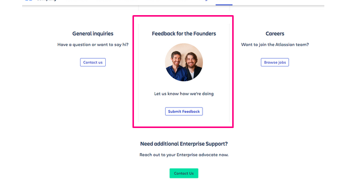
You Can Give People the Chance to Give Feedback About The Founders
Many times people visit the contact page not because they’ve got a question, often they’re overwhelmed by the performance of the company and want to thank them.
Why miss the chance to hear some good words about you and your company? I bet as a smart founder you won’t.
And this is how you don’t miss that chance –
Have a Call-to-Action Button
Several times people change their mind standing on the contact page. Maybe they’re too lazy to fill the form or write an email, or they have got their answer from your ‘FAQ’ section that you provided on the page (if you followed my tips).
To get such people back to the website, consider having a Call-to-Action button to something that you want them to do. Maybe you tell them – ‘Not feel like contacting? Read the blog instead’ and place a button underneath linking to the blog.
Or you can redirect them to any other page, as per your need.
You Can Have a Quick ‘Messenger’ or Other Chat Button
As I said, some people are too lazy and impatient to fill the form and wait for a reply (even I’m lol). People like these might have contacted you if you had an easier and instant option there, like a Chat button.
If you don’t have a chat facility set up already, you can link your Facebook Page’s chat button here.
Though I suggest arranging a live chat option because a number of people that are lazy and impatient are too damn high these days and you’ll lose them as a potential customer if you don’t give the instant gratification.
In fact, live chat buttons are happening to work better than traditional contact system these days and most of the websites have one today. Here’s an article for you to make my words stand to you.
Wrap – Up:
That’s pretty much it. If you’re still with me, you now have more idea flow for contact us page that 95% website or business owners, I bet. But what matters most is execution. That’s up to you.
I suggest keeping things simple though. Wait, am I sounding like a hypocrite to you? Giving such a lot of ideas yet telling you to keep it simple?
Well, you don’t have to implement all, I discourage you to do that as well. Consider your needs, your business nature, your audiences nature and them implement the ones you need.
It’s up to your creativity to keep things simple yet elegant and functional.

