Email Marketing, across all marketing channel, has the highest ROI, yet many marketers fail to take full advantage of it. That’s because they do it poorly and their email campaigns are not greatly optimized to bring the best possible result.
In one of my last articles, I talked about the importance of email marketing for e-commerce and other business owners and the basic steps of setting up an email campaign.
The steps were –
- Building up an Email List
- Choosing an email marketing platform
- Crafting a perfect email
In the previous article, I tried to give an overview of these steps and tell you the basics. But these steps themselves demand a lot more explanation because they have so many aspects to themselves.
So I’ll be doing a series of articles, each of which is dedicated to one particular step that elaborates on that particular topic and explains all the ins and outs. There’ll be articles on –
- Building the larger and quality subscriber list. (Part 1, Part 2)
- Choosing the best email marketing platform.
- Creating a perfect email that gives you the best open rate.
- The best ways to avoid spam folder and reach inbox every time.
And there could be more…
So in this article, we’ll start from scratch, which is building your first subscriber list which is both qualitative and quantitative.
…Let’s get started.
Table of Contents
Building A Rich Subscriber List
The first and foremost thing you need for a successful email campaign is you need to have people to mail to. That’s why a big enough list of subscribers is the first thing that you should look to get.
Here are some ideas that’ll help you to leverage your resources and build a qualitative subscriber list out of it –
Idea #1: Use Popups that offers upgrades to that content!
I don’t know whether you like popups or not, but the fact is, they work. Popups are a very old-school process of collecting leads that still works pretty fine, and that’s why you’ll see a pop-up almost on every quality website you visit.
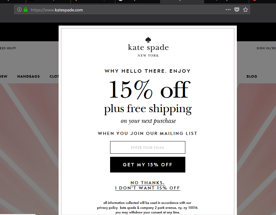
Here’s how a simple popup looks like.
Now, don’t everybody use pop-ups? It’s not a special thing really.
Pop-ups usually provide a conversion of 3-5%, which is good, but nothing mind-boggling. Could you leverage the power of pop-ups to get some mind-boggling results?
Seems like you could. Here’s how –
The old-school practice of pop-ups on blog posts is, they’ll offer one common download as the bribe (maybe a pdf or something like that) to every blog post they appear on.
This honestly, does not have the same juice as they used to have before. People really do NOT care about your random report of pdf for which they’ll consider exchanging their personal email for.
Some website owner tends to bribe one related resource to every post on a category, which seems like a better practice, but still not the best thus far.
So then, ask me, what’s the best practice now?
The Content Upgrade.
Means, bribe your reader something that enhances the value of that particular post they’re reading right then.
It’s a basic 3 step process –
Step 1: When creating the post, do NOT give everything away. Keep some surprise awaiting.
Step 2: Create a pdf or infographic with those crucial points.
Step 3: Add an option to get that resource on that particular blog post. (obviously after opting in with email)
If you want to implement this process in your existing blog posts, replace the first step with these 2 steps –
Replacement Step #1: Find a page that’s performing well for you already.
Replacement Step #2: Find ways to add value to that content, and the rest is like the main process.
(I told you to select only your best-performing pages because you do not want to implement this process to every other post on your website unless you have a whole lot of time.
This process takes time, as you’ll have to find holes and find solutions to fill them as well, which you’ll give away through pdf or infographics.)
These are few content upgrade resource examples –
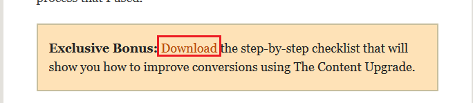
And when I click “Download”, this appears …
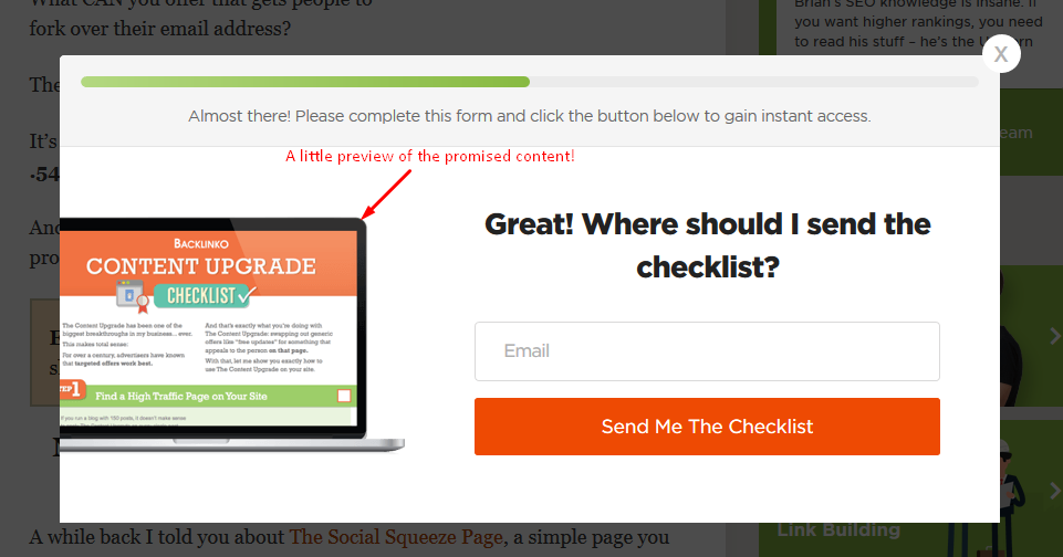
Note this point. Brian Dean of Backlinko put a preview of the promised resource. That’s can be a plus to assure the reader.
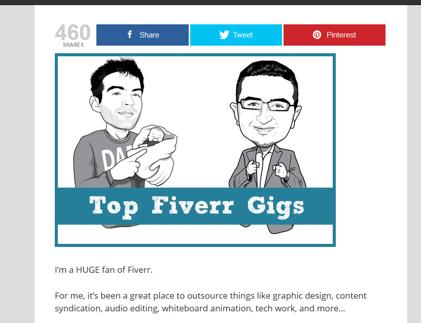
Take a look at another example. Kim from Buzzblogger posted this article a long time back (probably she was the first to introduce the content upgrade method).
She wrote about what you can get done on Fiverr for cheap and made a document listing exact Fiverr Gigs to get those done.
But wait, she didn’t give it away right of the bat. She wrote the article in such a way that the readers have a thirst to find those exact gigs Kim was talking about. And that’s where Kim played it smart.
She gave this “important” thing away in exchange for the email here. No reader would like to leave the article unfinished reaching the bottom of the article.
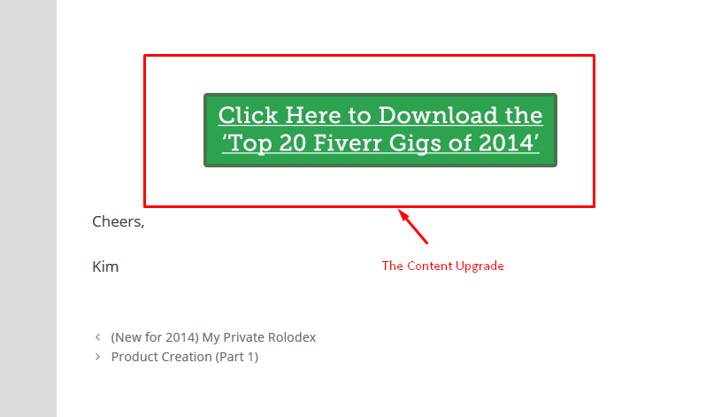
So she placed this ‘content upgrade box’ at the finishing so that readers can’t help exchanging their email to get the document and finish the content with satisfaction. Ain’t Kim smart, huh?
Plot Twist: Does the content upgrade pop up means you should skip generic pop-ups totally? Probably not. Because the pioneer of ‘content upgrade pop up’, I mean Kim herself, still uses generic pop-ups as well 😉
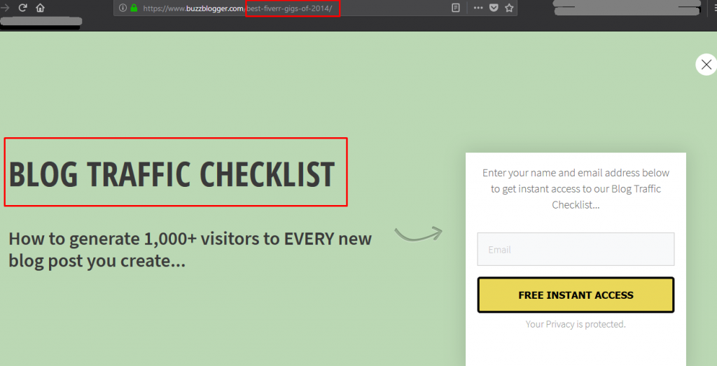
But, look at those marked red boxes. This is what I personally do not like about Generic pop-ups. They’re not relevant. Kim’s post is about Fiverr gigs, but the pop up is offering me a ‘blog traffic checklist’.
Nevertheless, they get you some result anyway, which might be not significant.
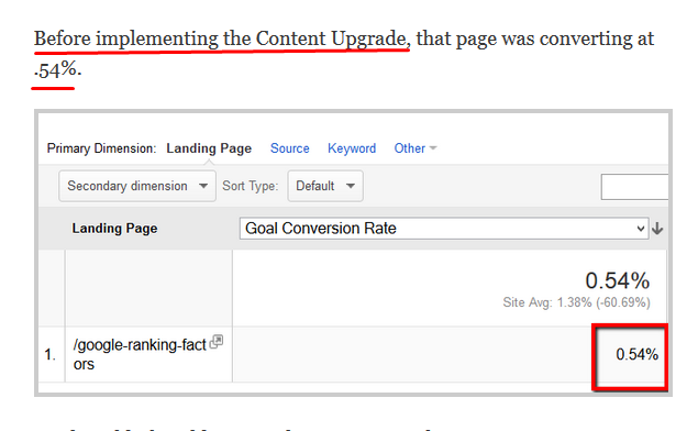
Brian Dean showed that he was getting a conversion rate of 0.54% from generic pop up.
But this is what happened after the content upgrade pop-up.
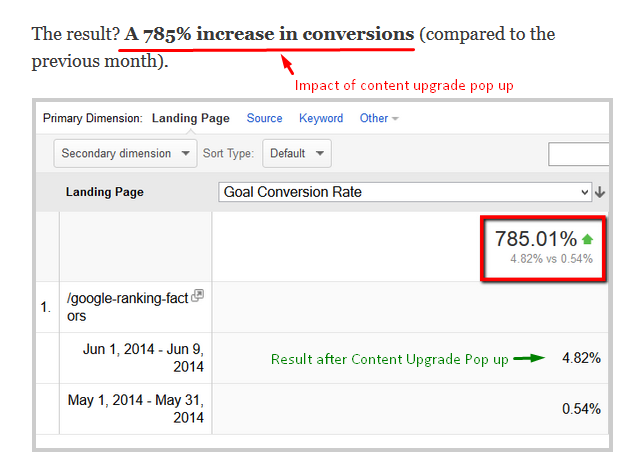
However, why would you leave the 0.54% anyway? If you’ve got a good number of readers, 0.54% means a decent number of emails as well.
So, what have we learned? That we should leverage the power of both generic and content upgrade pop-ups.
Now, since content upgrade pop-up is kind of a new thing to many, let’s elaborate this a little bit about how to get the best out of it.
#1. Find a Content, Find the value-adding scopes
When you’re looking to add content upgrade pop-ups to your existing content, this step applies.
If you want to efficiently use your resources, you should start from the top performing pages of your site to get a subscriber boost right of the bat, which may work as motivation to keep this going.
Finding your top performing page is not a big deal anyway. Head over to Google Analytics and then Behavior –> Site Content –> Landing Pages. You’ll find something like this.
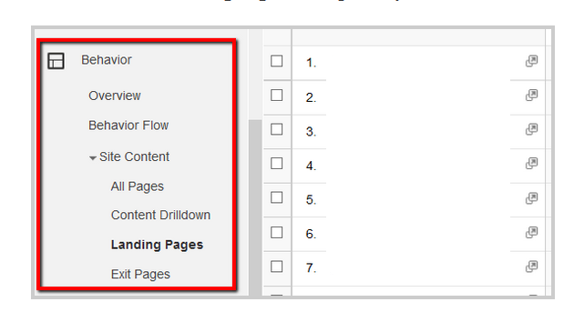
Start with the number 1.
If you’re creating a new page, you don’t have to do this process.
Anyways, if you’re creating a new page, or implementing content upgrade in an old one, you need to have something up in your purse to deliver later, something valuable that your readers will crave to have.
The things you might consider giving away as Upgrade to a content:
- A set of bonus and exclusive tips. (Give hints how much valuable things can be here in the original content. Intentionally miss something and tell them where they’ll get it)
- You may offer a downloadable PDF version of the content.
- Consider making a video tutorial out of your post. Or dive deeper into one particular section which needs such, if you can’t cover the whole post.
- A visual guide to your post. That could be an infographic or a mind map.
- Link to your interview with an expert on the field on your post’s topic.
- For an e-commerce site, a perfect content upgrade could be a free product guide or hands-on review.
And many more…
Be creative here.
One thing I must emphasize that you have to give your audience a hint that the content upgrade is really a thing, and it has got something valuable, some ‘upgrades’ in it. That’s what will drive them to put their email into the subscription box.
Look how experts do it –
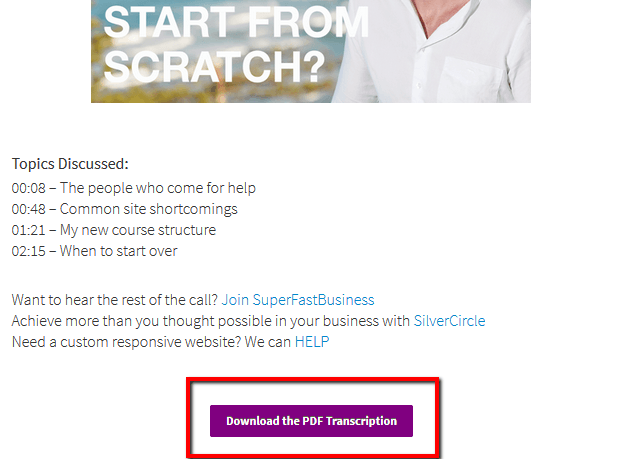
He gave away the text transcripts of his podcasts here. This was a great value adding scope that he found out, which I was talking about, addressing as one of the most crucial parts.
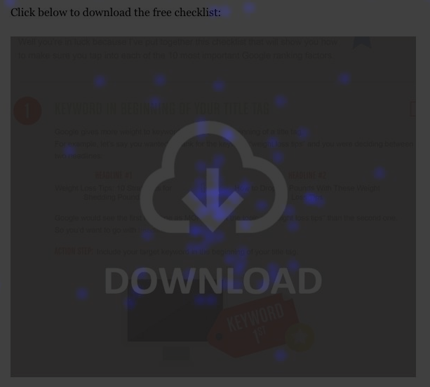
Now, How to get the transcripts? Click the purple box. What happens after doing so?
This. A reader will click the Download button and will have to enter the email where they want this pdf to be dropped.
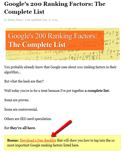
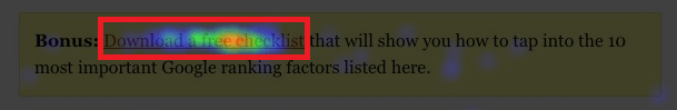
Look at another example here. Brian Dean wrote a post about “Google’s 200 ranking factors” that created a lot of buzz in the SEO world, as you can see it had over 32,000 shares (wow!!).
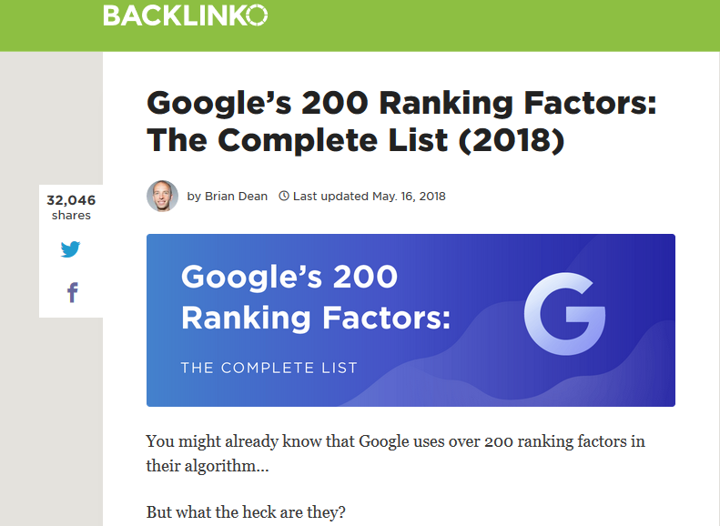
Now, what would be an ideal content upgrade to this article? You tell me.
Well, me as a reader, would love to get a short checklist to all the factors to crossmatch if my website has it all or not. Since it’s a long post, it’d be very tough to crossmatch with the post.
As Brian is smart, he knew exactly what I wanted and handed that to me in exchange for my email.
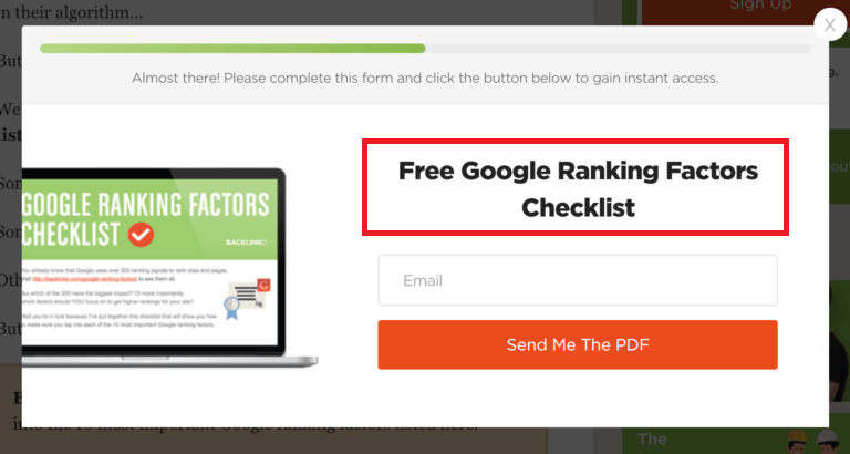
So be like Brian, give your audience exactly what they’d love to have. Otherwise, content upgrade popup won’t do much good for you.
#2. Create your Content Upgrade resource in a professional manner
Look, you kind of made your reader input the email, to satisfy their thirst to learn everything that you had to share.
So, they’ll look for every reason to opt out of the email just after getting the content, but you won’t give them any…
The quality of your first email (I mean the quality of the content upgrade you provide them) will decide whether they’ll stay or not.
Your job is to wow your subscribers with the very first email and there likely to stick with you for life. (You know the saying about first impressions…)
Most importantly, you have to make them feel that giving you their personal email was worth it. You have to make them think to themselves “Hey, this was pretty cool. I’ll make sure to keep an eye out for their next email.”
For this, you have to put effort.
…and money.
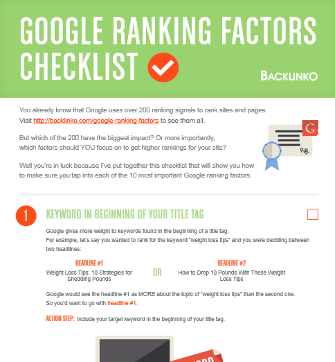
Brian put over 5 hours (the effort) after his original article, just to create a short checklist, which kind of looked like this in draft…(as Brian put it online himself)
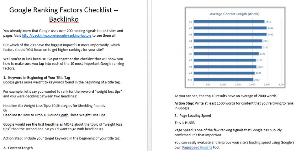
Which he turned into this, with a professional graphic designer (the money)…
And the response?
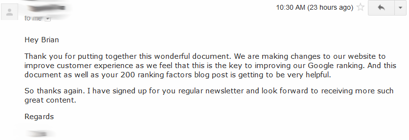
That’s what happens when you ensure quality. And this applies to that content upgrade as well, not the main content only.
One thing which you must not do is, taking the content upgrade material for granted. Some be like ‘okay I got the email, now let me deliver them anything’.
You’ll be leaving money on the table if you do this because the subscriber will find that tiny unsubscribe button. 😉
So don’t lose your trophy just after winning them. Deliver them good stuff.
#3. Set things up to Give Your Resource Away
Just the way the quality of your resource is important so is the way how you present it to your audience. I talked about structuring the content in such a way that people understand that there is good stuff in the bonus resource.
That is shaping their mind within the main content, which is important.
So is the pitch to tell them to download the resource. In fact, Brian Dean says that it is 10x more important than the resource itself.
You yourself do not get convinced with pitches like “sign up for our newsletter” and “download our whitepaper” etc., do you?
Why would your audience be so with such lame pitches?
To make things more clear, you really need to sell your Content Upgrade. And the price the reader would pay is his/her personal email. The sales pitch and positioning and set up has to be good to earn that price.
Let me demonstrate you Brian’s example that’ll make you understand thing easier than by reading texts.
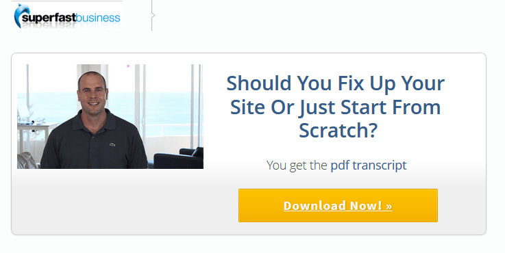
In the post titled “Google’s 200 ranking factors,” Brian added a YELLOW box like this.
…there’s a reason I highlighted the “Yellow” term, will demonstrate in a bit.
He added another download button, better to say an image at the end of the post.
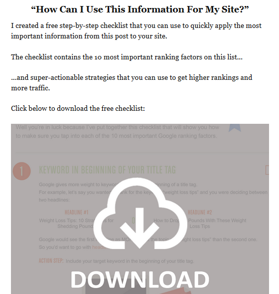
When someone clicks the image, this box pops up –
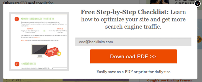
Now, notice that this box shows a preview of the document users gonna get, which I recommend using a little bit ago. To my sense, this can help to improve the conversion regarding the people that see the box and the people that actually put their email.
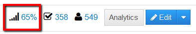
Looks like Brian just proved me right. According to his analytics, 65% of the people that see this box, enters their email and opts in. This number is pretty higher than normal, which I believe, happened due to that preview.
Anyways, coming back to the main point, the first three images show how you can set things up to put your free content upgrade away.
Oh wait, did I forget to demonstrate about that Yellow box?
You’re in for a treat, I haven’t. And the stuff is awesome, trust me.
Just putting the link in a ‘Yellow’ box can bring you a lot more emails. That’s because the color yellow itself is an attention grabber in our everyday life which happens to be true online as well.
Yellow boxes in a web page grab a LOT more attention. Don’t trust me?
See these images below that Brian shared to show the heat map of this page.
Yellow Box that contained the link:
Huge download image that also contained the link:
You can see how much of people clicked the Yellow box comparing to the huge download image.
This happens because people’s eyes (and cursors) tend to naturally gravitate to the yellow box. It’s a psychological thing, I guess.
I highly recommend you to use a yellow box to give the content upgrade away because that’ll help to maximize the number of clicks and gather more emails for you, ultimately making your content upgrade giveaway more successful.
Now tell me, weren’t you in for a treat? 😉
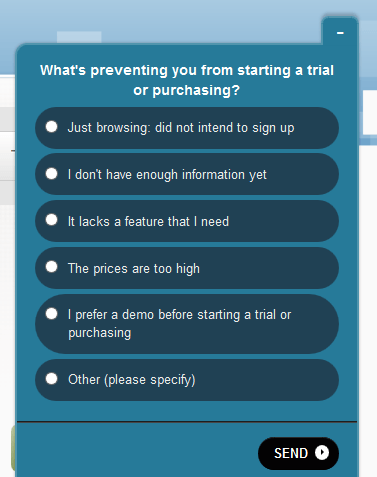
Idea #2: Utilize the power of Qualaroo to build your Email List
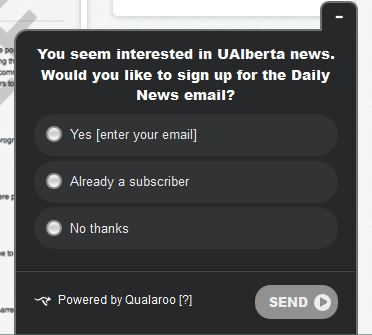
If you do not know what Qualaroo is, It is a survey tool. It asks questions to live visitors on your site at any given time. Here is how it looks-
Now, this is a very popular Live surveying tool and many people love it for that. But I got other ideas to make you love it. In fact, it’s not me, it’s the University of Alberta that got the idea.
They used Qualaroo in an innovative way to help it build them a bigger email list. Before the hack, here’s how their daily news opt-in page looked like –
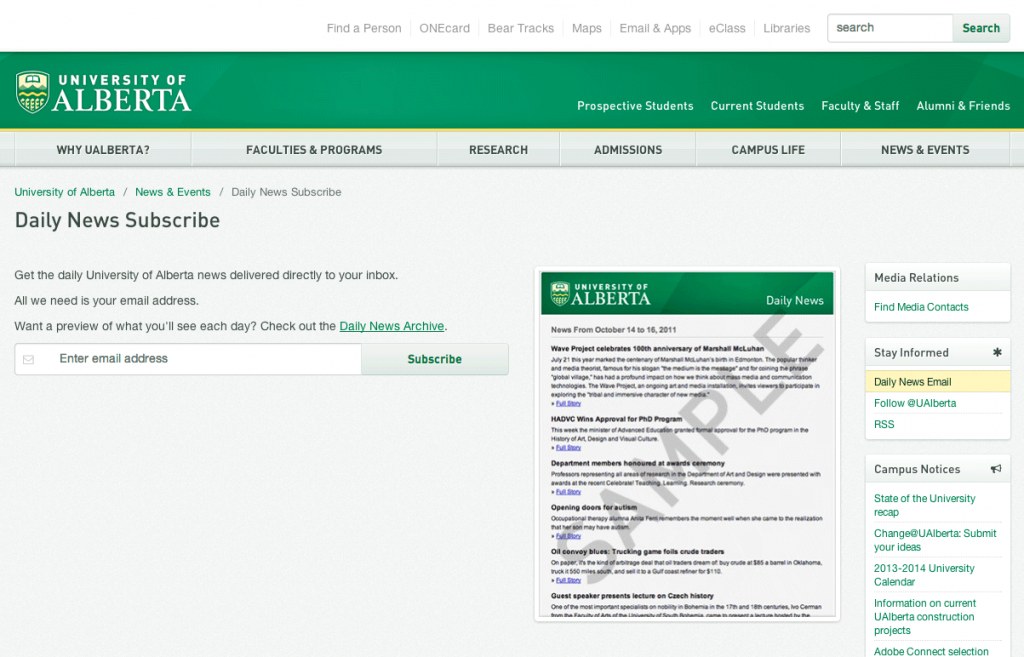
Nothing fancy here right? This page used to get them 1-2 email at most every day.
Now, the admin of the website was okay with it, and had other ideas at the same time too. Since it was a university website, most of the subscribers were faculty, students or staff.
So he knew the number of subscribers he can get is limited within that university’s people.
But, he noticed that there were other people coming to the website through search engines too. That because the posts that he published had few terms that get searched.
Those people from search engines would come, read, and leave. They’d barely subscribe. To make them subscribe, he came up with this innovative Qualaroo idea.
Before I tell you how they did it, I want you to know that it worked great for them and increased their daily subscriber opt-in numbers by more than 500%.
So, here’s how they did it…and how you can do the same on your site to boost your opt-in numbers.
You saw how a typical Qualaroo form look like right? They changed its purpose completely and made it look like this –
They took it one step further, and designed it in such a way that people were able to subscribe through the Qualaroo form directly, not having to go to the main ‘subscribe page’ that I have shown above, and subscribe from there.
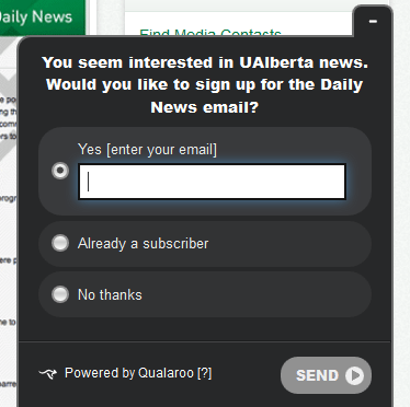
This made things effortless for people which prevented lazy people to just leave the process in the middle.
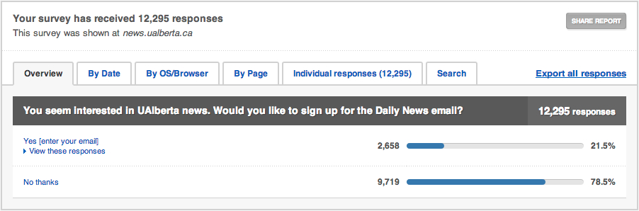
Now, exactly how effective it was for them?
Amazingly effective, in short!
From 1/2 people a day, they boosted the numbers to a respectable 12/15 people a day, without making any other single change to anything. That’s like more than 500% increment without any serious effort!
Here’s how much response the survey form has got after the change, which brought them these many subscribers –
Now, this is definitely not a short-term result provider only. It keeps performing in the long run too. They kept this experiment as a permanent call-to-action and here’s the result they got over the period of a year –
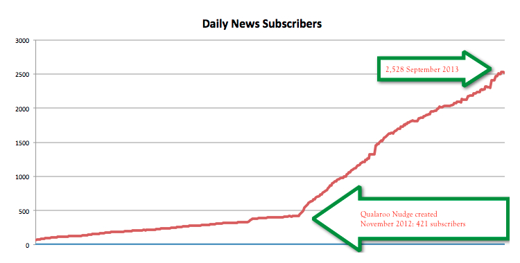
You can see that they got 2107 subscribers in 10 months of sticking to this call to action, where they used to get roughly 400 subscribers in a year.
A little hack is getting them more than 500% increment in subscribers, awesome!
Idea #3: Optimize you Confirmation Page
First off, do you use confirmation page?
Many do, many don’t.
Many don’t because they’re afraid of their potential subscribers falling through the crack in the confirmation process.
Many times they forget to confirm their email, many time the confirmation email gets delivered to their spam folder.
Now if you are a guy that want to, or have to use confirmation process yet don’t want to lose potential subscribers in the process, I’ve got good news for you that’ll help you with your desire.
You should actually optimize your confirmation page that was always NEGLECTED.
How does a typical ‘neglected’ confirmation page look like?
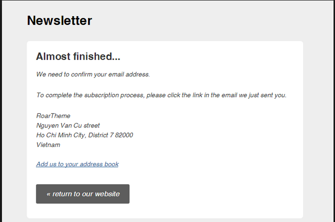
Something like this right?
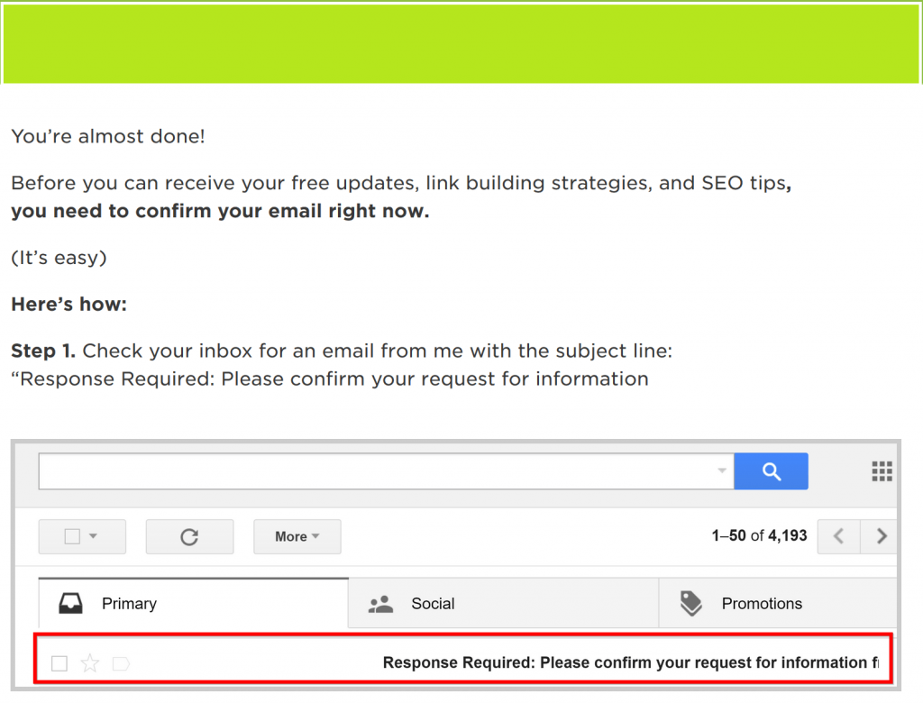
…This is how a properly optimized confirmation page looks like –
Why this page is optimized and why it performs better than other non-optimized confirmation pages?
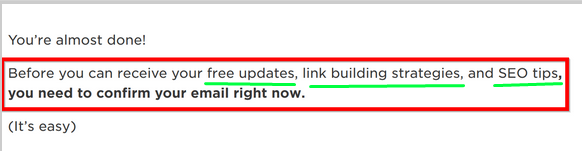
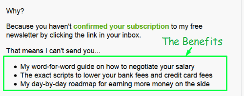
First of all, the users get reminded about the benefits they’ll get from subscribing. This keeps them motivated and solves the problem of people “changing their mind”.
While most people will say something like “Confirm your email to opt-in” and such, this pitch works way more effectively as it reminds them why the wanted to subscribe.
…And, they end up confirming.
Then, there’s a strong and highlighted call to action here that tells the users to confirm the subscription right away.
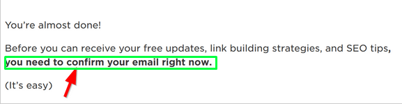
This creates a big difference because, it’s now or never. Means, when it comes to confirming email subscriptions (and many other things), if they do not confirm now, they’ll never do.
So this call to action influences them to subscribe right away which leaves a big impact on the number of people that confirms your subscriptions.
In fact, the guy Ramit Sethi who teaches how to get rich, took this call to action one step further. He included a sad face of his in the confirmation page along with a timer, and then explained that he’s sad because that subscriber hasn’t confirmed his/her email yet.
…And finally tells them he doesn’t want to be sad anymore, so the subscriber knew what he/she has got to do.
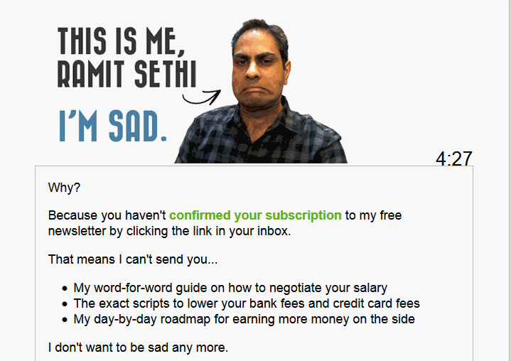
And, Ramit also confirms my point of reminding the subscribers the benefits of subscribing.
Finally, the confirmation page we’re talking about, walks you through the process that a subscriber needs to do to confirm the email.
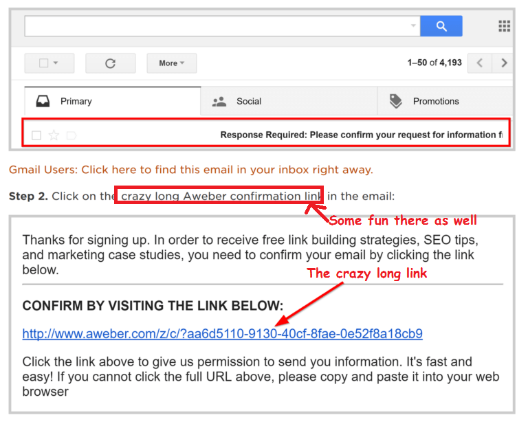
No matter how many email newsletter that subscriber has opted-in previously, it reinforces again how to do so in this particular case.
Also, already tells them how helpful and supportive person you are. This definitely creates a positive impression about you to them and they’d probably like to stick with such helpful of a person.
To Close for Now:
For now, not forever. I’m not yet done with the awesome tips of creating a better, larger, qualitative subscriber list.
Till I keep breaking the keyboard with more tips in the next part of this article, I want you to take action to actualize these tips now on your website.
Also, take a minute to tell me what you think of the post.
The next parts will be published soon, Stay tuned!
Don’t forget to subscribe to our blog for next parts….

