Having a website for your business was more of a choice a few years back, but now it is a necessity to sustain your business. Website Design Malaysia companies are working earnestly to deliver high-quality web-based solutions to make the businesses built their strong online presence.
Even if you have the website designed with the required features make sure it is aligned to the latest trends and technologies, so that it doesn’t get outdated. This will make your website look more modernized and trendy.
The website is more of an online representation of your business that reflects your business persona and also elevates your business growth.
Here are some of the pro tips on the latest web design trends of 2020 to follow and implement.
Table of Contents
Dark Mode
Dark mode has been the most used trend of 2020 and is here to stay for long. This plain dark background enhances any simple design and makes it look more powerful. This style gives a more sleek and elegant look making other elements pop out.
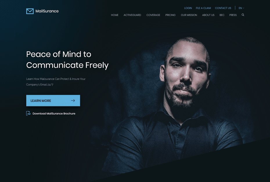
Apart from the look and feel, it reduces battery consumption and light pixels, making eyes stress less. This trend is not restricted just to websites even apps and mobile phones are using this theme for its ease and classy look.
Tips: To use this theme for your website add it with minimalistic elements and neat graphics. You may also use glowy neon typographic to make it more appealing and vibrant.
Minimalism
It is the most classic web design trend loved by both web designers and users. The minimalistic approach adds elegance to simplicity. This can be achieved in ways like bare minimum text, linear color palettes, merest graphic elements arranged in a clean way.
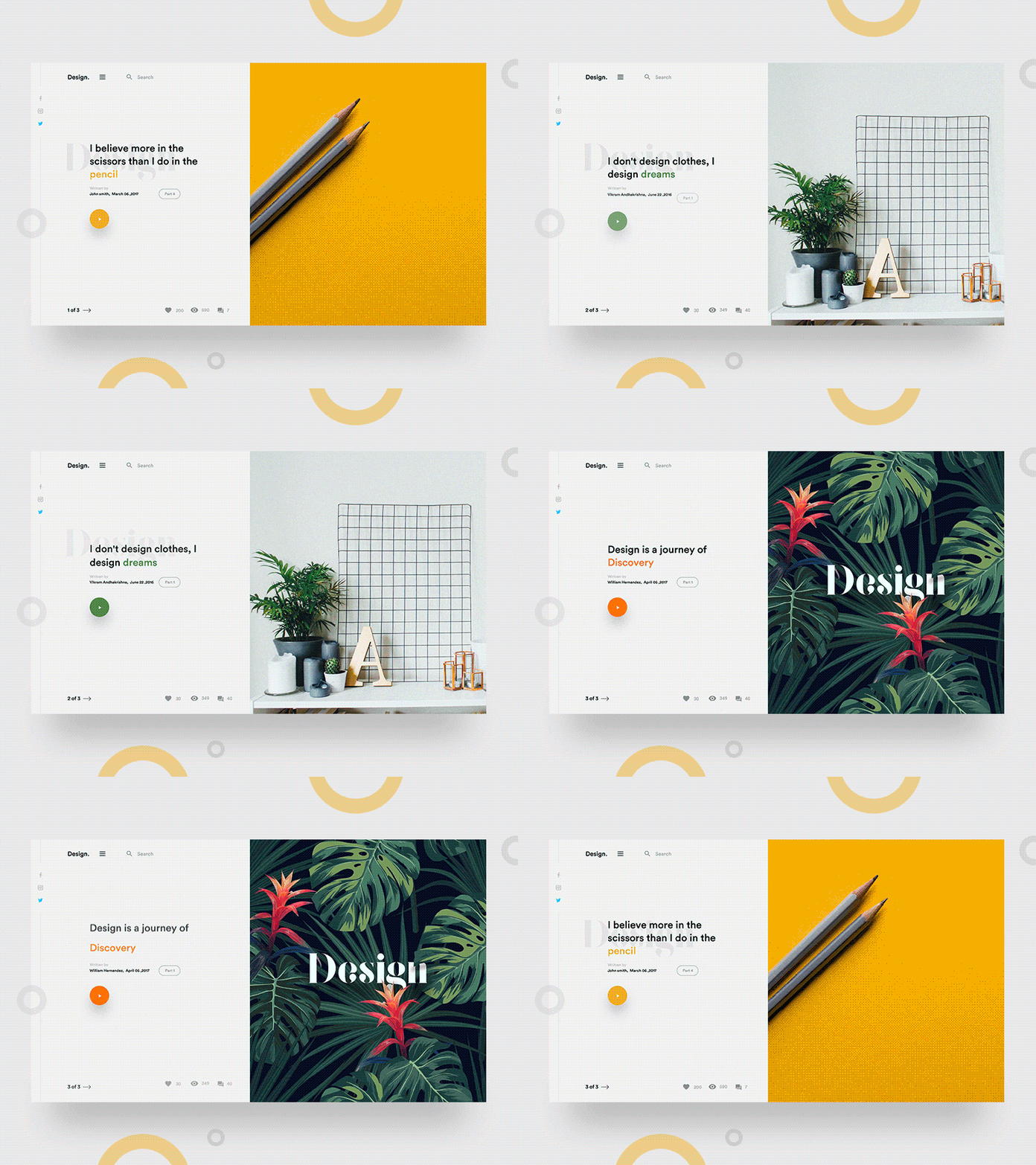
This design helps the user to explore the website with ease rather than figuring out where to click next. This also enables the user to focus on the important information displayed. You may use a quality image or interesting video to reduce the text content thereby delivering the same message making it look more intriguing.
Tips: Minimalism is all about simplicity, so make sure you make the navigation easy for users to understand. Avoid unnecessary elements keeping it neat and clean.
Black & White
Black and white these two poles apart color brings the most aesthetic touch to your website. In order to make it look more everlasting, you may add the grayscale with a narrow spectrum.
You may also add high-quality illustrations to brighten up the dark theme.
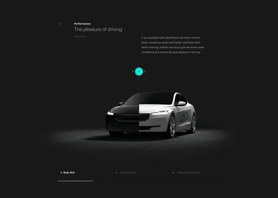
Tips: When using a black & white theme with grayscale for the website make sure you use two to three shades of gray to lighten it up.
Luminous color Scheme
If you have come across the isometric trend in web design then you will see how luminous colors are used to add vibrancy to the page. It adds a futuristic modern touch with the glowy neon colors. The best way to make this more eye-catchy is by coupling it with darker shades that makes the design pop out and more attractive.
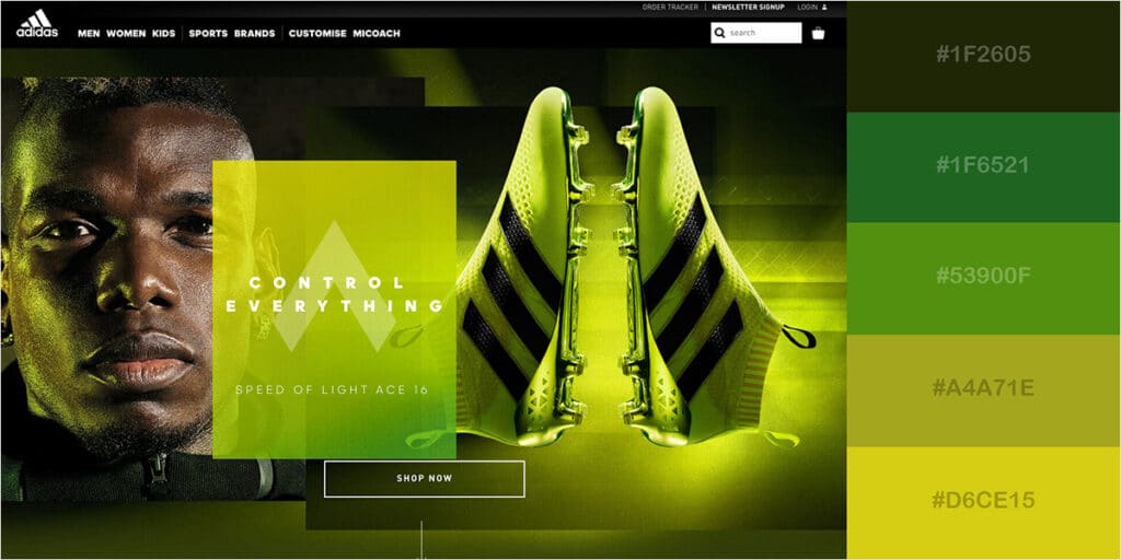
Tips: This design trend appears to be more appealing with a darker or minimalistic theme framing a bold appearance to the website.
Hand Drawn Elements
No matter how advanced the technologies are any kind of human-centered approach to the page will make it stand out. Hand-drawn elements like cartoon illustrations, handwritten lettering, or scribbling, drawn icons adds a personal touch to the design.
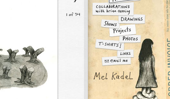
For any creative business website, this is the best way to showcase to your audience how natural and imaginative you are. This kind of design adds positivity and soulfulness to your website.
Tips: This design do bring authenticity to your brand but not all business might need this. This goes very well with business in the creative fields and, make sure the design has the artistic look that reflects your creativity.
Bold Typography
When you talk about clean UX design it also means clear text. Web designers are into all-caps, bold fonts, monochromatically colored, or transparent text styles in order to add a legible typography design to the web page.
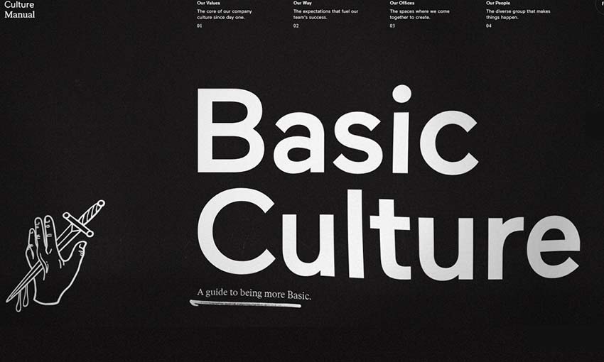
If you are someone who likes cursive style text to add an artistic touch to the website be aware it is very hard to read. Users like simple typographic which is easy to read and understand.
Tips: Bold and large typography style is very much user-friendly but it should be sized suitably to fit in every platform like mobile phones, tablets, laptops.
3D Elements
This design is sure to entice any visitor when done correctly. It adds a fun and exciting element to your website by creating depth to the design.
For visitors, it gives the pleasure of realism which works great for e-commerce websites. This lets you present the products in 3D style for the customers to get a real feel.
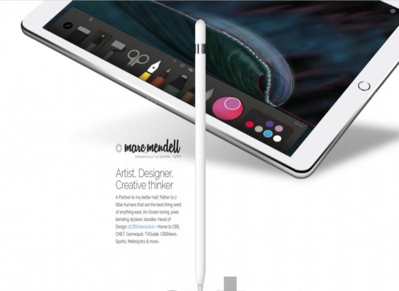
Tips: 3D designs are quite tricky for implementing, never overdo it as it might look chaotic and also is very heavy on website loading. Keep it moderate and clean for the visitors to enjoy the real feel.
Shadows, Layers, and Floating Elements
This style can be used in two ways one with 3D elements other with simple imaging. When you add shadow, layering to 3D elements it gets boasted and for simple image design, it brings the dazzling effect.
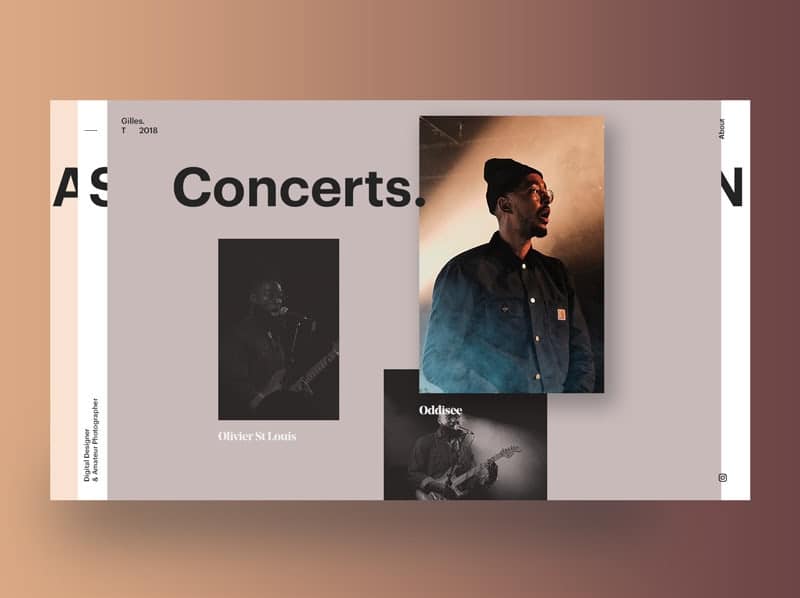
If you are not into 3D elements you may use the layering technique to add depth to your design. Also, for a website with too many elements like image, text, graphics all these can be presented well and clean with the layering technique.
Tips: Anything that is too many on your website and also unavoidable this design trend is a savior of course.
User Triggered Animation
This design trend makes your website more interactive with the users. Either you are using the layering style, or typographic, or float all these can be actioned by users making it more captivating.
Any click or hovering can bring transition and changes to your web page making it look more attractive and also interactive.
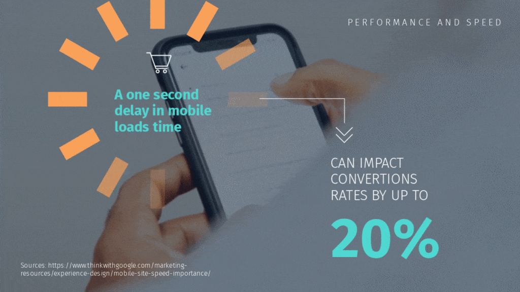
Tips: Never overdo with user-triggered animation it might end up looking crowded and confusing. Implement it intelligently in a simple yet enticing manner.
Gradient Effect
Gradients were hugely used in past and are back again to give a stronger look to your website. Using a multicolored gradient to text and background adds playfulness to the design. If you want to have a sleek yet cutting edge design combining multiple colors to create contrast and illusion this will win the game.
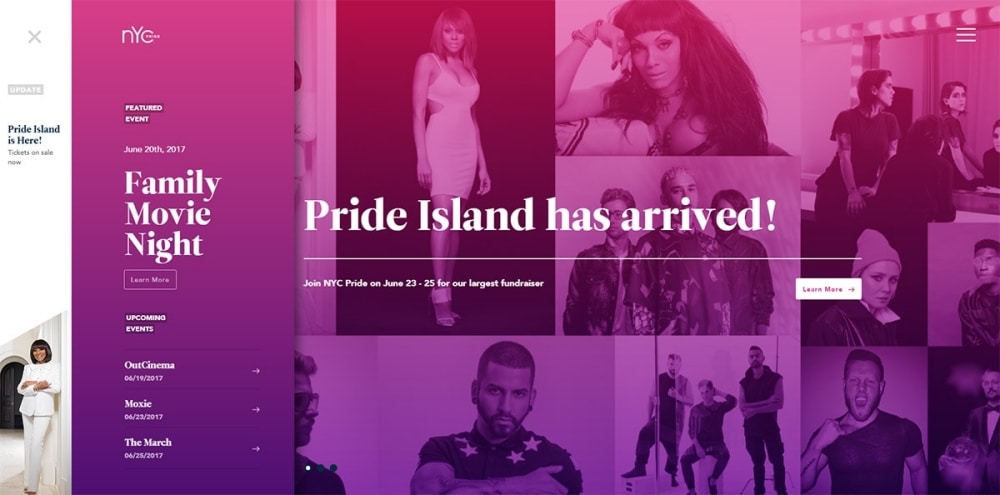
Tips: Gradients are cool but don’t make it go boring, try to avoid monotone gradients.
Videos or Text Only
Video undoubtedly is one of the most effective media to engage customers. If you have something more to convey to your audience try using video for your website. Video has the power to create a movie-like experience to engage and entertain users thereby conveying the message.
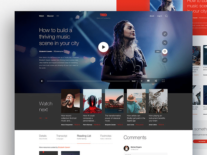
There is another simple style that is very much in trend, the use of big, bold typography with no images and videos with monochromatic color design. This is a bold and courageous experiment only with text in order to make it the most focused element of the page.
Tips: For videos on the website make sure it is short and sends the correct message. The same goes for text only as well if you are just using bold big text make sure it is shorter in length. Don’t add to too much texting with the larger size. Even for videos also it should have the proper size and doesn’t make the website lag.
Wrapping Up
With so many trends and tricks, there is a pool of options for the UX designer and the business owners to choose from. Though there are plenty of choices these designs and trends need quite an effort and brainstorming for the web designers to present it in a rightful manner.
In Malaysia, website design price range is widened up due to many features and trends inline to choose from. For designers, no matter which trend you are working on, make sure it is aligned to the business and delivers the best user experience. Business owners make sure the website design must reflect your brand’s true essence.
