Now that you have marked your online presence with an eCommerce website you are all set to change the online marketing game. Having a website for your business is just the beginning, time to gear up to make the business progress for high revenues. After all, this is what the primary goal is for getting an eCommerce website done. To make your business elevates with higher sales and revenues all you need to concentrate now is on the conversion rate. Ecommerce website design varies from business to business, so is the Malaysia website design price depending on the online store nature and the trends applied. But, the goal remains the same higher conversion rate.
Table of Contents
Let’s see what this conversion rate is all about in the eCommerce business?
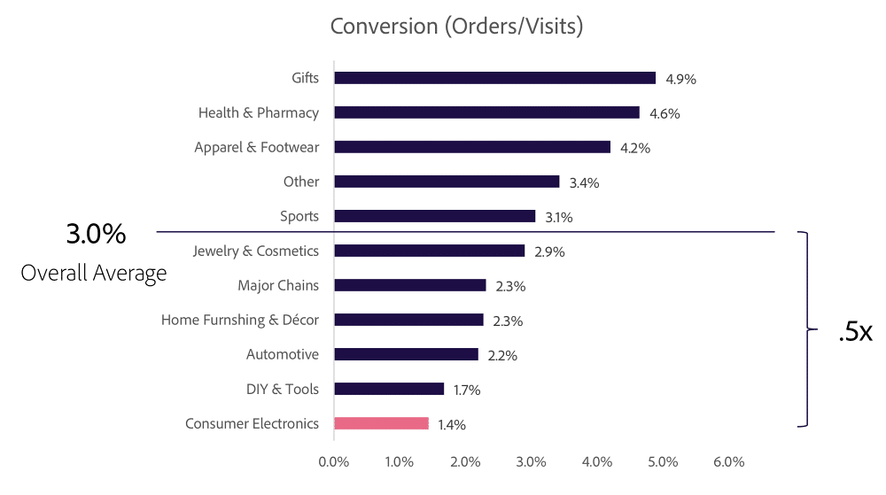
Different countries have varied conversion rate, but, the average conversion rate considered worldwide is around 1 to 4 percent. The conversion probability completely depends on how the website is optimized. The website design should be as per the business need and also take care of the user experience to drive the user journey from landing page to make payment page. For say the below statistics shows the conversion rate for different Ecommerce sectors/segments worldwide.
How do we achieve that?
Optimizing your e-store with all efficient strategies and trends would help you increase the conversion rate. To make this easy to understand we have listed some of the most productive tips and tricks to help you to make your eCommerce website more dedicated to your business and delightful for users.
Stay consistent, attractive, and paired with the color scheme
Be wise and judgemental while choosing color palettes for your website. It should be enticing enough to attract customers, compelling them to complete the customer journey by making a successful purchase.
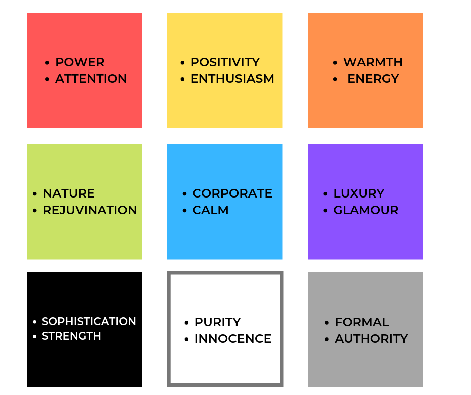
It is always good to check on competitors’ websites but don’t forget to use your judgemental power to decide what works for your business best. For better guidance on color palette combination, you may check on color.adobe.com, they have a color wheel for you to mix and match and experiment with different color combinations.
Another important tip, use bright captivating colors for CTA buttons to draw customer attention and compel them to make the purchase.
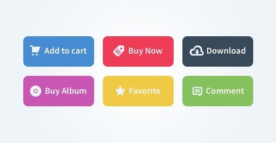
Be Clear and Firm with CTAs
Emphasize on CTA button make them bold and clear for customers to act on. Different web pages will have different CTA buttons like a ‘Landing page’ or ‘About us’ page may have ‘Read more’, and product page have ‘Buy now’ and ‘Add to cart’ buttons. Add elements or motion to draw customer attention to these CTA buttons. Click on these buttons means customer journey progression and a high probability of sales.

Invoke Sense of Urgency in Customers Mind
Researches show creating urgency in customers mind increases the conversion rate by 32%. If you are a loyal visitor of Lazada and Shopee you will see in times of SALE they add highlighting elements like ‘Countdown Button’, ‘Countdown Timer’ to make the shopper speed up with the purchase process. You may introduce this kind of elements on your site to create urgency. Also, bring some changes to your web page button name like from ‘Shop here’ to ‘ Shop now’, correct phrases can induce urgency in the minds of shoppers.
Simple One-Click Checkout Process
When the customer has made his mind to make the purchase, it’s the checkout process which is highly crucial to make it a successful sale. Streamline your checkout process and make it a one-click checkout to reduce the reversion chances.
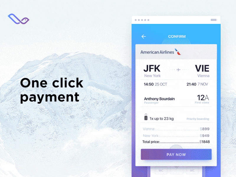
Ask for minimum data from the buyer while purchasing so that he or she doesn’t get irritated to share too much information and leave the process in between.
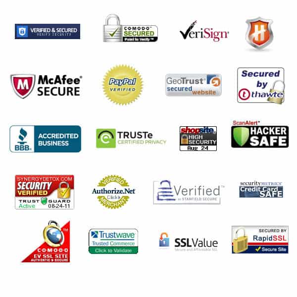
Another tip would be adding trust logos in the checkout pages to ensure security for customer purchases and transactions.
Green Bar SSL for Security
Every eCommerce site has a payment transaction linked to it. If the website has an SSL certified bar on the URL, it adds a sense of security from the shoppers to proceed with purchase and payment transaction. Many users avoid sites that are not secured. So, boosting your website’s security certification will surely make it easier to increase the conversion rates.
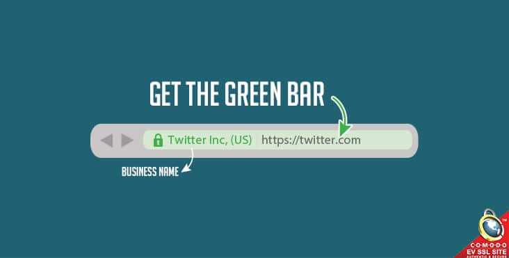
You can get SSL certificate from here.
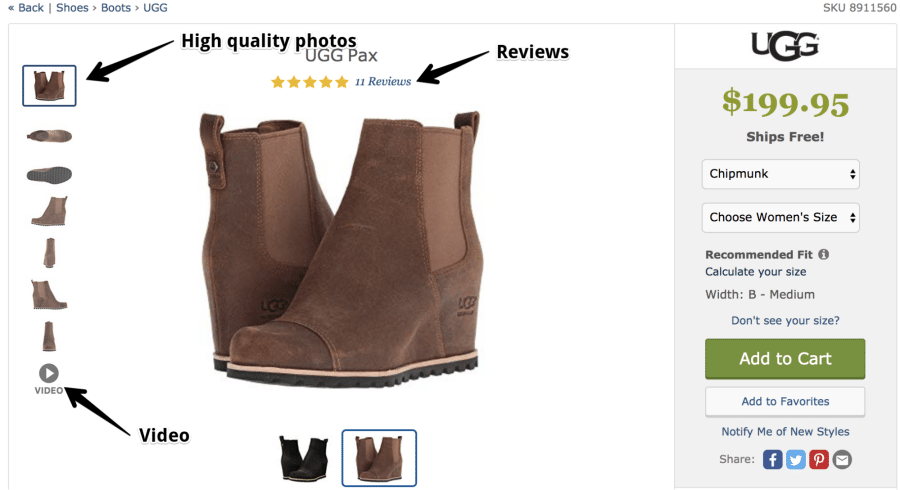
Image Selection
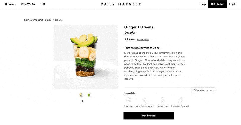
For eCommerce site images are key for the shoppers to decide on their purchase. Very few people go by the content of the products, the majority are concerned with the images of the products. Add high-quality images, as many as possible from all possible angles, add zoom out zoom in features for the shoppers to view the product more closely.
Images have a massive impact and are the driving factor among the shoppers to click on check out.
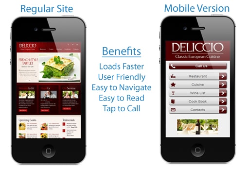
Mobile Optimization of your Site
Around more than half of the web traffic comes from mobile access. If your website is not optimized from mobile platforms, you are sure to lose out on tons. The best way is to get an app for your site, as it increases the chances for users to access your app, as it is way convenient and easy for them. Be it a website or mobile app make it responsive and fast on all platforms.
One add-on tip would be to use a progress bar to highlight the steps for the checkout process and how far the customer has moved.
Keep Checking on Consumer Reviews
In an eCommerce site, product reviews are another driving factor for purchase. So, make it easier for the customer to see and understand the reviews. Segregate the reviews as per dates, quality, comfort, pricing this makes it easy for the customers to read through the reviews.

Also, if your customer is making purchases don’t forget to ask for their review and feedback on their purchase just like Shoppe and Lazada. Reviews add authentication to the products and also help customers to compare different products before making their mind.
For Product Pages make ideas transparent
The major objective for the product page is to make shoppers click on ‘Add to cart’ or ‘Buy now’. Adding a visual hierarchy to the design of the product page will help you to achieve the goal.
It is all about processing information on how the progress on the page occurs. Make the progression path clean and simple by avoiding distracting elements on the page and highlighting the CTA buttons well.
Wrapping Up
Web development in Malaysia is progressing with the demand for the eCommerce online store from many businesses. The web developers are experimenting and working hard to bring on the latest trends and strategies to their designs making the business earn more revenues.
Always keep in mind before you analyze your current conversion rate well before implementing these tips. Check on what your eCommerce site is lagging in and then decide what to apply. Not all tips and tricks are applicable to every website, so scrutinize well before adopting new trends and tips.
You are not alone in this process many businesses are struggling to make their website the best one to earn more revenues. For better support and guidance, you may always connect to a suitable website design Malaysia agency to serve your business with the best online marketing solutions.
Read more on: 11 Most Popular Web Design Trends for Business in 2021.

