If you are a web designer or a graphic designer or a loyal website visitor you know how much typography matters for a design. Recently we have observed, website design in Malaysia has been obsessed with Typography styles. And why not, it has the power to completely alter the look and feel of a website. As the website is the online representation of business, it’s the look and feel, that attracts the customer and make them stay on the site. So, while you are designing a website there is no way to go wrong with typography.
Typography is the art of styling text within the design to make it look more attractive thereby enhancing the overall design. Especially for web designing, you should not ignore this as it will make your website look more appealing to your customers.
Here are some of the typography tips for the designers that will make people go wow about your designs…
Table of Contents
Typographic Tips for Web Design
It is way easy to convey your words with emotions while speaking, as your tone helps you to do so. But when it comes to conveying messages or information through written text, it’s the correct typography that can add emotions to text.
Minimum Usage of Fonts and Size
The use of multiple types of fonts and sizes in a single content is a big NO-NO. Using excessive fonts and sizes will confuse and divert visitors’ minds. Many important messages might be overlooked due to this confusion.
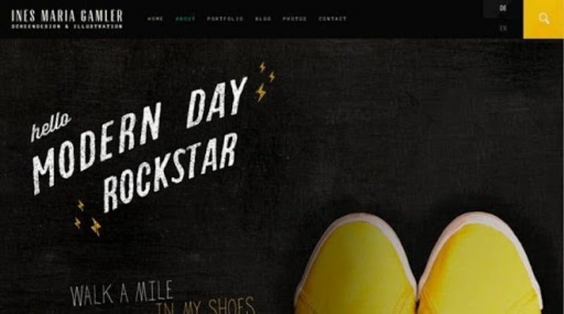
Try using a minimum of two to three different font sizing throughout. This will make the content look clean and clear. Also, while you are using multiple fonts in a single program make sure they pair well and complement each other.
Decent Spacing Between Words
Proper spacing between words is very much needed to make your design look tidy. You should understand where and how much spacing is required as per your content.

You can improve the readability by extending the main which will, in turn, increase the vertical void area between lines of content. There is a thumb rule of content spacing, the landing page should be 30% more as compared to other pages to make visitors understand your words better.
Maintaining Proper Line Length
Every line of your post should be of the same length which means the same number of words should be maintained in each line, except for headings and endings. This improves the readability score and makes the context much more understandable.
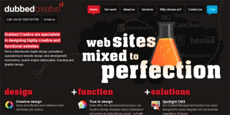
Every website should be mobile compatible, while you try to do so make sure the number of words in a single line allowable for mobile is a maximum of 40. This will allow your mobile visitors to pay attention and read through the site.
Use of Proper Font
The font you use is highly dependent on the nature of your business. Depending on the casualness, seriousness, and emotion of the visiting customers and your message you may select your fonts.
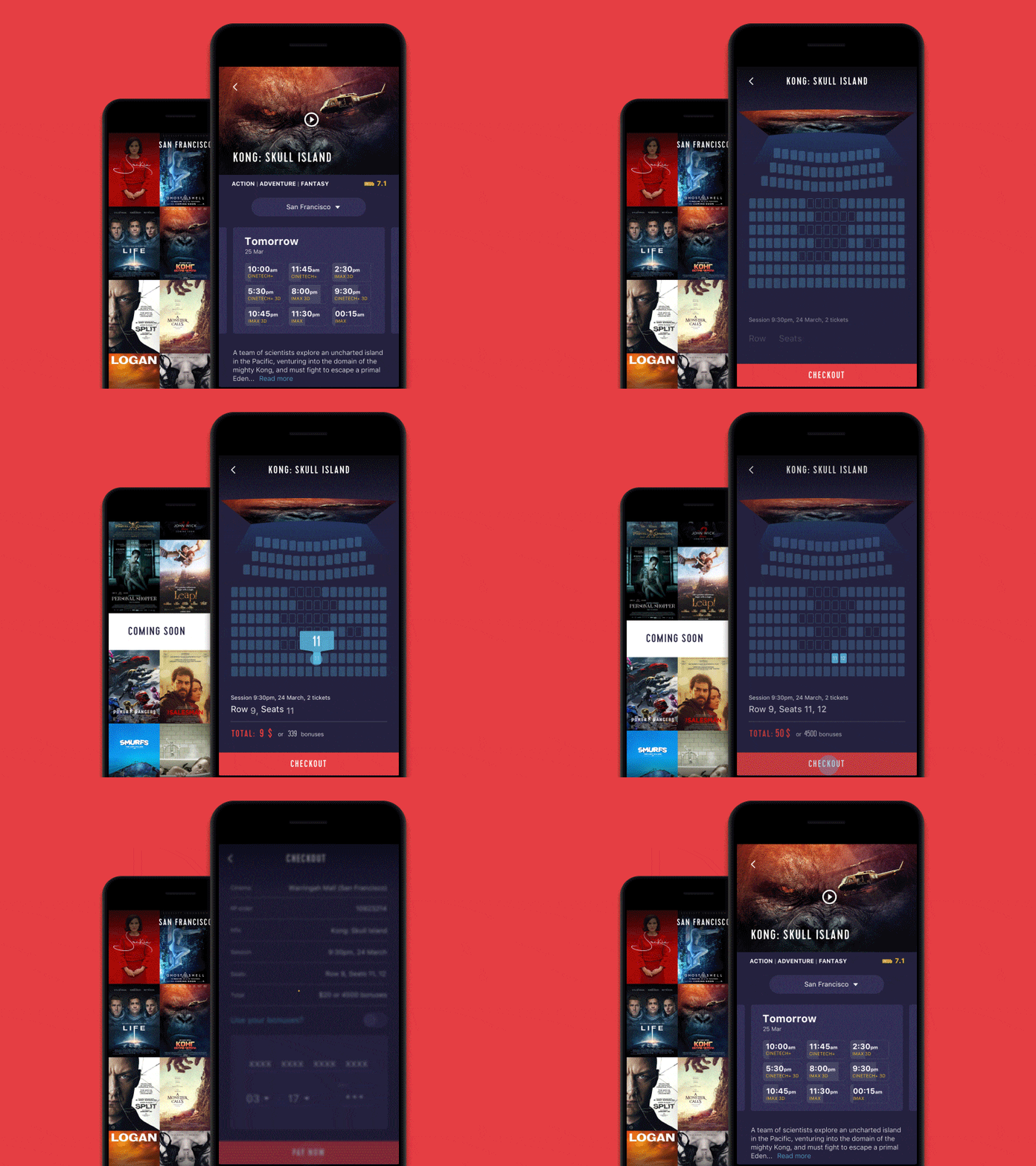
Remember many fonts appears differently on different devices, make sure to choose fonts that appear complete on all devices. Gotham is one of the most widely used fonts by web designers. It delivers the best presentation irrespective of platforms and screen sizes.
Keep Caps words out of the bay
Many designers make this mistake to write words in CAPS to draw visitors’ attention. Rather it would irritate the reader to see text all in caps. This is another reason for the low readability score.
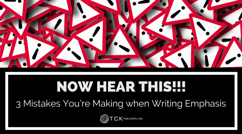
Making all words in caps will not spotlight your content and would also make it hard for the visitors to read and understand. Try to limit its usage and only use it where it is truly needed.
Choosing correct colors
For web designing choosing colors is not restricted just to text or background. The colors you choose for every element of the website might complement one another. Also, to add, the background color should be chosen in a way that should make the content text visible and prominent. Make sure the content in the site is easy to be read by the visitors in complement with the background colors.
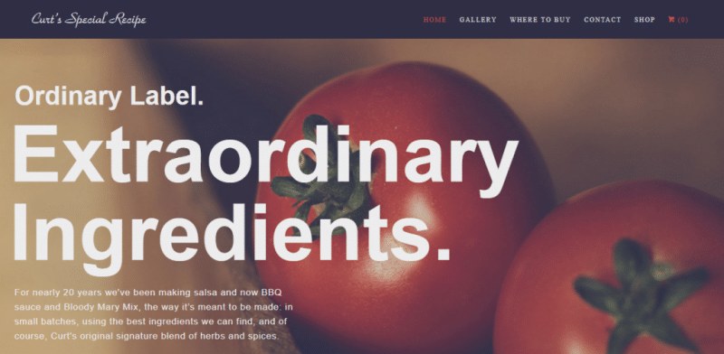
Another important thing is the background contrast ratio, that should be 4.5:1 which can vary till 3:1 if your text is large. Also, test it well on different devices and screen sizes to verify the entire product’s appeal.
Avoid text highlighting
Many designers use green or red colors to highlight a certain important section of text. This should strictly be avoided as there can be visitors with color blindness issue, this highlighting will make no sense for them. If you one to spotlight it use different bolder fonts or bigger sizes to make visitors note that section.
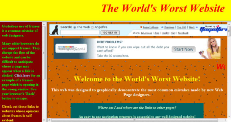
Your website content is for everyone so make it readable even all.
Font weightage
Different fonts have different weightage on different devices. Try and test your text style on different platforms and devices to check its readability.
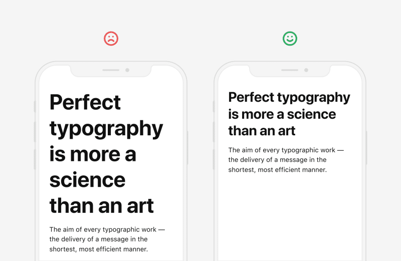
Many designers are fond of large and robust typography for the website, to draw readers’ attention. But it should be tested on numerous platforms’ goals to guarantee their understandability.
Wrapping Up
Correct typography is one of the key ingredients to make your website look good and appealing. Even if your website has a good amount of traffic, lousy typography may revert back to these visitors. This in turn will reduce the conversion chances. In Malaysia, website design prices are depended on features, usability platforms, functionalities, you may more or less compromise on something or the other, but never on typography.
Typography has the power to make and break a design despite the presence of other fantastic elements on the website. Also, you surely wouldn’t want your visitors to not read and understand the message you want to convey to them. It increases the readability score of your website thereby making it look more attractive and intriguing.
Read more on 9 Guaranteed Web Designing Tips to Attain Your Ecommerce Conversion Goals.

