Web design is rarely forgiving – You do a single thing wrong, users notice it.
You can take web design as an art, and it’s really wondering how easy it is to mess it up. A little mistake can ruin the impression of your great looking and functioning website.
I know, web design is something that is tough to master. There’s a hundred thing that always are running through your mind – should I use this color? Does that look professional? But does that comply with our company theme?
Which font is the best suit – when I want to make it look joyful yet want to keep it well-readable?
But is that combination somehow distracting the design from main theme? Is the site still well functional, or does it just look good?
Urgh! It’s confusing and stressful, I know man. Been there, done that!
Let me tell you where the problem occurs –
We always talk a lot about how to make your website look gorgeous, how to make it more functional and so. We talk about what to DO, but barely we talk about what we must NOT DO.
Now you’re not the only one that faces this problem, even the pros are guilty of going through this.
So I’ve come up with a reverse checklist as web design mistakes
How’s that?
Well, with the checklists, we check to ensure – this? Done! that? Done!
With this reverse checklist I’m about to give you, you be like – this issue? Thank god, haven’t done! That issue? Great it’s not there.
Alright then, where’s the checklist?
Table of Contents
The fundamental rule is – you need to make your website easy for the users to navigate through.

You could get into that way by making your navigation bar complex. You should intend to keep it as simple as possible.
Now, what does a complex navigation menu looks like?
- having the menu at an odd place
- a non-standard style and including generic labels without proper description.
- a thousand submenus
You should avoid any of these practice, and aim to keep your navigation bar more functional.
I’ve visited some website where I find it hard to even find the navigation bar, imagine how frustrating it can be.
Navigation bar is more about functionality than about looks – you should remember that.
Don’t send your users on a wild goose chase when browsing through your site.
So What do we do?
-You may Design a horizontal menu having short description tags.
-Anything more than seven or eight labels on the top of the page is unexpected.
-Each of the main label should have one or two level of the drop-down menu, not more than that (unless it’s an e-commerce website).
-Ensure a clearly visible search box on the top section of the page
Complex and Unclear Typography
Good typography is something that makes it effortless for your users to read your words. A nice, comfortable typography can really create a charm in your contents.
Whereas, bad typography can make your readers frustrated, angry and wanting to leave the website. It really turns your users off, and they often leave the site.

How do you point out a bad typography?
It’ll use a random combination of different fonts, there’ll be excessive use of typeface, and it’ll have minimal space between the lines making the content harder to read – these all are signs of bad typography.
So, How to make your typography more user-friendly?
Use fonts with distinguishable letters and stick to one standard font. You may use one other font to highlight something, but make sure that font matches well with the base font.
Also, Do not abuse CAPS. Keep the typefaces simple. Have adequate breathing space between lines. You may limit the length of lines to enhance readability.
Select such a text size that is well readable in both mobile and desktop devices. Thus it should not be too small or too large.
Disabling Zoom on Mobile Sites
Multiple studies show that mobile devices are taking over. People now prefer surfing the web on-the-go rather than sitting in front of their desktop or laptop computer.

So alongside making your website responsive for mobile devices (which is such a must that I didn’t discuss), you should ensure that there’s zoom feature on for mobile devices.
Even after being responsive, sometimes text can be harder to be viewed from mobile devices, which may lead to the need to zoom and view.
So?
Simple, design to keep this feature turned on.
Your website should be mobile-friendly from all aspect, because a major share of your website’s traffic will be coming from mobile devices. So feature like zooming in and out from mobile display is a must to keep.
Free Web Design Softwares
These softwares, can be a good option for personal websites where no money is intended to be spended, or for someone designing a website with no skill of it whatsoever.

But for professional websites? A big NO!
Look these fancy softwares make web design look remarkably easy – just drag and drop – but at the back end code it adds dozens of lines, which ultimately makes the website slow and laggy!
And it can causes stack of errors in the long run and severely degrade the performance.
That is why for professional websites, these fancy ‘drag & drop’ solutions are suggested to be avoided.
What to do then?
Do I have to tell you? Go hire professional web design companies. If you have shortage in budget, research to find out the cheap yet good ones (yes they are there).
Too lazy to do that even? Consider giving us a buzz, our expert web designing team will help you do it in your budget.
Cluttered Pages
When you have too much in a webpage, it can be extremely distracting and frustrating.

This causes users to hardly retain any information, which is complete opposite to your main motive.
Look at this page. Don’t you think there’s too much banner accommodated in one display?
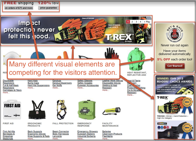
I get it. Sometimes you just have to input many elements in one page. But there’s a golden rule to do that without making your webpage look too cluttered.
Use whitespace to key out content.
No matter how many objects you have to put in your webpage, you should not look over the demand of white space in between them.
When there’s good amount of element in a page but they have enough breathing space in between them separating their entity, they look comfortable. But when they’re placed too close to each other, they look cluttered.
You may consider lengthening the webpage to insert enough white space in one display.
Take this article that you’re currently reading as example. Without the white space in between the paragraphs, what do you think how readable it would be?
The spaces have surely lengthened the article, but didn’t it make the article comfortable to read? It surely did – as it pointed out the objects in the sequence of this article.
Okay so how do you ensure non-cluttered web pages?
Already discussed – white space is your major tool here – embrace it wherever possible. Use minimalistic approach to design your website. Only keep what’s necessary, and cut down the unnecessary stuff.
Do not overhaul the pages with graphics or text or images.
Orphan Pages
Orphan page refers to those pages that has no easy way back to the site. Orphan pages are harmful because it increases the chance of your visitor to disappear from that page, as they have no easy way back to the main website.
However, orphan pages are not that common these days with the advent of various CMS platforms. But if you’re building your site not on any CMS, there could be chances of having orphan pages in your website.
So what do we do?
Identify and make the orphan pages not-orphan. Ensure they have links and buttons placed at the right place that takes them to the homepage or whatever page you want them to pass through.
If these sound unclear to you, consider hiring a web design company for this. Because it could be tough for you to scan a website with lots of pages to identify and fix orphan pages. You could try our web design expert team.
No Visible Contact Information
Not listing contact information at visible places is clearly a big mistake in designing websites. In this competitive internet with lots of alternative to almost every website, you gotta make it so easy for users to hold them in your website.

You may have contact information listed in your footer or somewhere so. But your users are too lazy and posh to look around for that. Thus, you gotta make sure the contact information is right there where the user might look it for.
For example, you’re listing down description and properties of a service. The user may like it and immediately they’ll look for your contact information to talk about that service.
Make sure they find that information right there, and they don’t have to look around for it. Or else you might lose a potential customer.
Hiding Things in Tough-to-Find Places
We all played hide-and-seek, and it was damn enjoyable and funny. But no, not in case of designing website.

We most often see mobile menus with three bars which when clicked, shows the actual navigation bar. Now, that is great and obvious for mobile devices, but not so for desktop devices.
I saw many websites that do this practice. They keep the navigation bar hidden between mobile menu icon even in desktop devices. They may look fancy, but not that functional.
Users are used to normal navigation bar in desktop devices and mobile navigation menu in mobile devices. So when they enter your website from their desktop, their eyes are looking for navigation bar up on the top.
And they’re definitely not expecting an icon with three bars which have the navigation bar hidden into it.
End result? They could not find the navigation bar in your website, and clicked the back button to exit.
So?
Stay functional, provide users what they expect. Desktop navigation bar is what they expect visiting from desktop devices, and mobile menu icon visiting from mobile devices. Stick to this normal rule.
If These Sound too Complicated…
Now, these mistakes could be deadly and you must not make them. However, if you think it’s too much to ask from you to solve all these problems by yourself, you may consider hiring an expert team.
I get it, not everyone is a web designer and not everyone have to skill and experience to look into these deep, subtle yet alarming problems.
So it’s wiser to leave it to the experts. Consider giving our expert team a buzz.

