Your website is like your storefront. This is the first thing people see about your business when they visit you on the internet, and makes their first impression.
Whether you’re an online or offline business, your website design has a lot to do with it. The aesthetics, functionality and other crucial factors of your website make an impression of your professionalism among your potential customers.
This goes a step further if you’re an online based business. This time, the experience a user has on your website can directly impact your sales/revenue.
So, designing your website for the best experience of users is a significant thing coming in 2019. Web design today, is considered as one of the most important parts of digital marketing strategy.
So, how web design can affect the experience of a customer in a real scenario? We’ll look at 5 ways here –
Table of Contents
1. Appearance
Obviously, the first thing web design have an impact on is your appearance. With web design you determine how your website looks, and that plays a significant role to establish a new users impression on your business.
Marketing experts usually talk about web design from two extremes:
- Websites looking like they were made in 1994
- Modern websites that look sleeker and adhere to modern web design standards and trends.
There are websites that fall between these two extremes, but they tend to represent the opposite ends of a spectrum.
You’ll find websites that look attractive, but maybe they were last updated in the last decade.
However, when we talk about designing a website in 2019, the goal is to follow the current and modern web designing trends.
When I talk about modern web designing trends, I mean these –
- Responsive design
- Parallax scrolling
- Clear Typography
- Eye-catching “hero” images
- Multimedia
Responsive design:
Responsive design means your website to be equally functional regardless of what device it is visited from. By that I mean when it is visited from a mobile device it will adapt itself to be functional on that device.
It’ll do the same when it is visited from a tablet or that kind of device – it should adapt itself to be functional on the comparatively larger display of tablet devices.
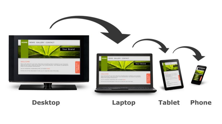
Look at this example here. The same website looks different when it is visited by different devices. When it is visited from a desktop or laptop device, it shows its full widescreen preview.
But when it is visited from Tablet or mobile device it adapts itself differently to be functional on those devices. This is what responsive design is all about.
If a website is not responsively designed, it will be tough to access from mobile devices to get the information what was intended to.
Now, why making your website responsive is such an important factor?
Because coming in 2019, many statistics show that almost half of the traffic on the whole internet is coming from mobile devices.
So if you don’t design your website responsively, you are going to provide a bad experience to 50% of your users. I’ll define that as a major crime.
Parallax scrolling:
Parallax scrolling refers to overlaying two visual elements on your webpage. They’re supposed to move at different speeds as someone scroll through the page.
The parallax effect has been around for years, but in classic video games. However, the web designers had decided to bring this effect in the web designing industry and since then it has become a major modern web designing trend.
Parallax designing uses multiple backgrounds that move at a different speed as someone scrolls to create the Sensation of depth.
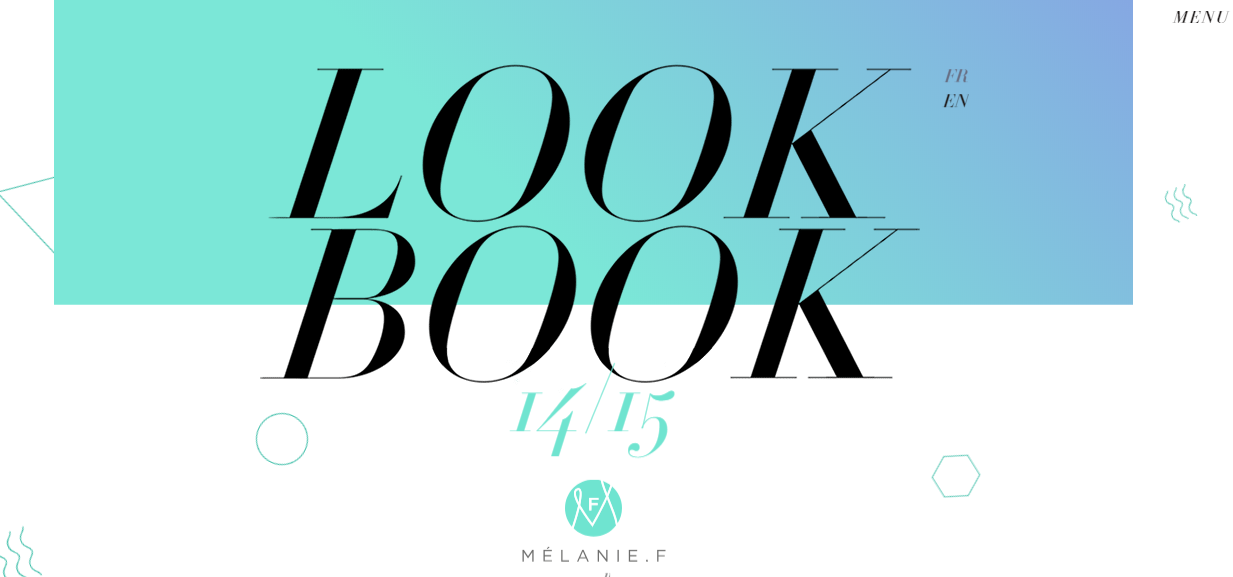
Check out the website of Melanie-F to understand better what parallax scrolling means.
Parallax scrolling could be a major tool of yours to keep your users engaged in your website so you can hold them longer.
Clear Typography:
Modern web designing is about keeping things simple and clean in this cluttered internet. The fancy and complex fonts from the last decade are no more welcomed in modern internet.
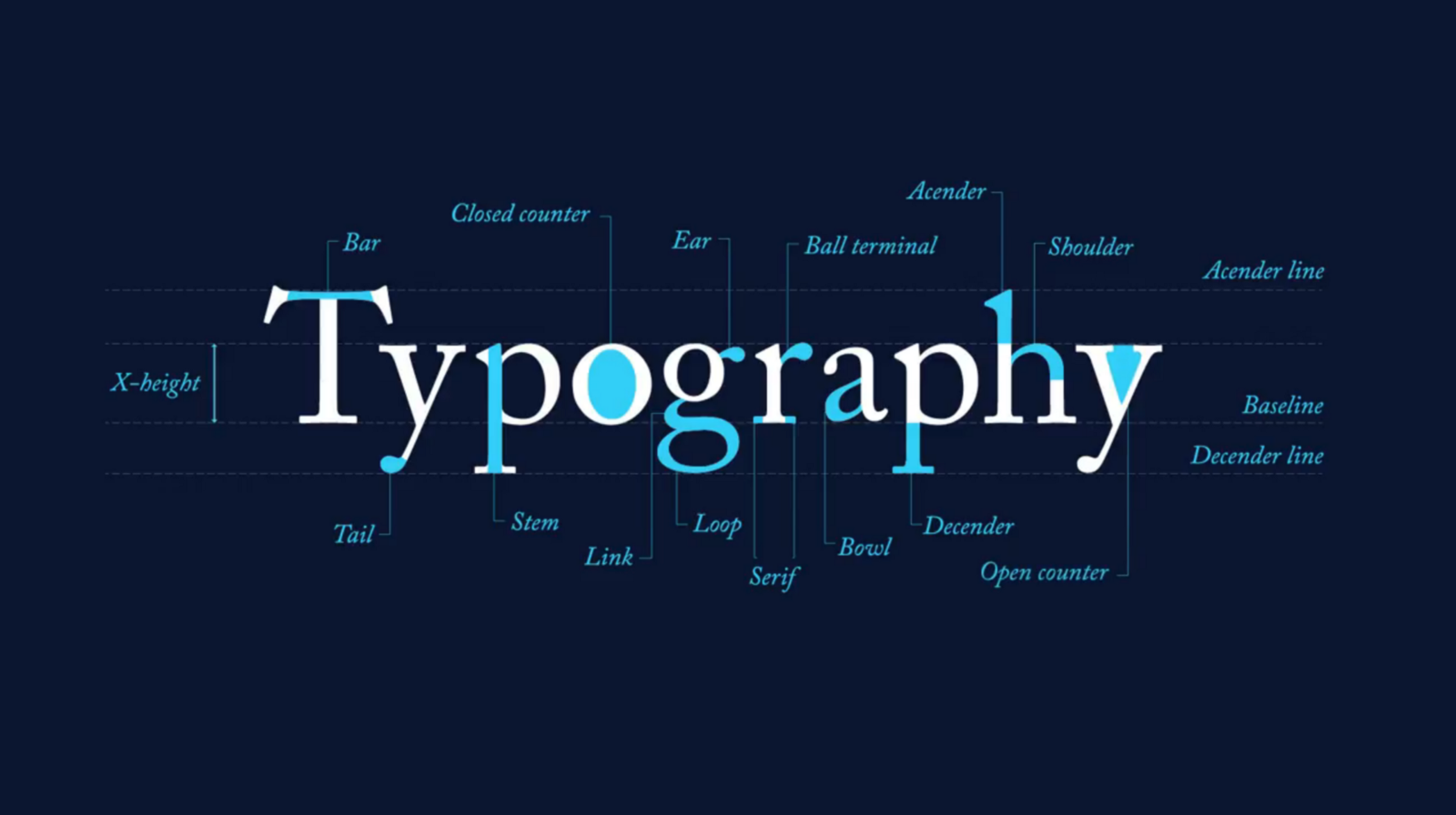
Users prefer simple and nice fonts that they feel comfortable to read. Sans serif is a very popular font among designers of the modern web design industry.
It is simple, nice to read, and it ensures that your users get the most value out of every sentence on your website.
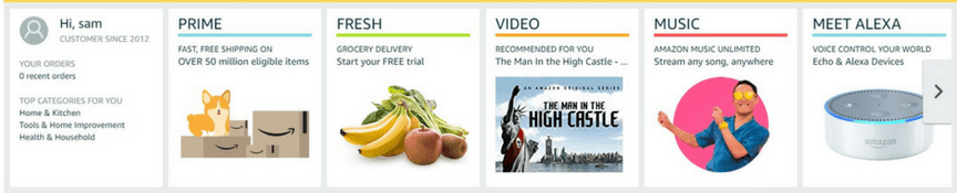
Eye-catching “hero” images:
By this, I mean The large and full-width images at the top of articles, also known as featured photos. These photos are intended to keep you a summarised visual representation of the text below.
People prefer visuals over text. No, you cannot replace the whole text of an article with images, I get it. But the featured photos gives the user a visual summary of words coming next.
So the users get to know what they are about to read before actually reading a single word. this helps to generate a connection with the article and the interested audience.
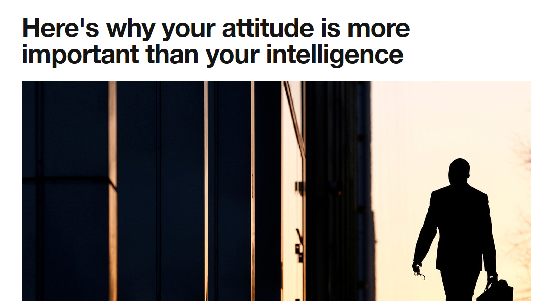
This is a demonstration of a “hero” image. this photo helps to connect the interested audience right away before they even start reading the article.
These photos also help to generate more clicks on social media and bring about a better click-through rate.
Multimedia:
Multimedia refers to videos, images and another visual element that helps to break up text and smartly educate your visitors.
The use of multimedia in your articles does not make it more engaging only, but also it makes the article a lot more appealing to look at.
Look, Nobody really likes to go through a Wall of text – it’s boring and no fun at all. You could insert multimedia like images, videos, infographic or any other form of it to make the article a lot more engaging and fun to read.
Alongside making your article engaging, scannable and fun to read, multimedia enhance the outer look of those as I said earlier. So you should consider using as much multimedia possible in your articles.
2. Professionalism
Professionalism refers to the impression you make with your website’s Outlook to your site’s visitor before they even read anything of your website.
You, straight away, want to make the impression that you are a modern and respectable business.
And that impression largely depends on how the design of your website represents you. There are several elements of web designing that contributes to the professionalism of your website.
These include –
- A culture page
- Photos of staff
- Customer results
A Culture Page:
This is such a page that mainly talks about your company’s approach to daily operation.
Are there Certain values at your company? does your company maintain certain traditions? Is there the trend to celebrate anything unique happened?
These are all great elements that you can add to your culture page which demonstrates what your company does besides work only. This makes a great impression that your company has a positive working environment and certain things that you follow.
Even your customers like to see your employees happy and you make a good impression on their mind with that.
Photos of Staff:
So as we were talking about employees happiness, smiling faces of your staff can also help you go a long way in reinforcing professionalism.

Or you can even showcase how hard they work at your place. Or maybe a quick break and Chit-Chat session within work.
No matter how you do this, at the end of the day, you are adding real faces to your business that shows you’re not just a brand name, rather a thriving company consisting of real people.
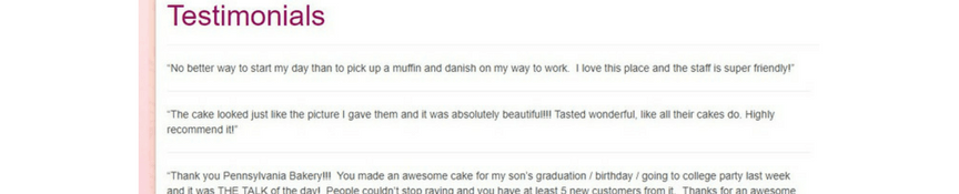
Customer Results:
Finally, the thing you might want to showcase is customer results. Take any way that you can quantify your work by – even if you have to say how many cars you have washed last year as your business’s operation – and highlight the information on your website.
Why do you want to do this?
Basically, to demonstrate how professional you are. It also shows that you care about your customers, you care about keeping records – and number overall creates a sense of assurance of result.
Your visitors will get the assurance that you’re a customer focused and organized business that produces result and values itself in terms of how much you can deliver.
However, there’s another very important element that web design can offer to showcase professionalism – and it’s essential for every possible kind of business – and that is –
3. Clarity
When a visitor comes to your website and easily find what they were looking for – that’s what I call a website designed with good clarity.
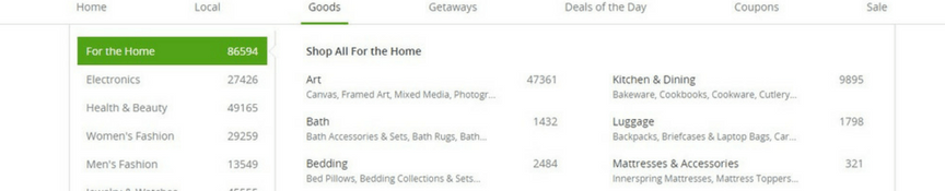
There are certain things that contribute to clarity, and navigation is one of the most important aspects of all of them.
It’s like giving the direction to your visitors to show them what is where on your website.
You want to categorize all your contents and have a clear direction set up to every category and subcategory so that your visitors can effortlessly land on the exact content they wanted, rather going through a via.
In other words, make your navigation familiar and intuitive to help your visitors know your website in a glance, and reach exactly where they wanted to.
In today’s website, navigation basically comes in 2 different styles: (not mutually exclusive)
- Drop-down menu
- Breadcrumb
Drop-Down menu is the menu bar at the top that you’ll see at every other website on the internet. This menu lets any user hover over the cursor at the menu titles of the bar and see the contents that the title contains.
Then, they may choose any on the content of a given category to land on that.
On the other hand, Breadcrumbs work a bit differently, and they can be there side by side with a regular menu bar. In fact, I’ll call them add-ons for better navigation, but they’re not a replacement of traditional navigation bar at the top.
So, the breadcrumb is a navigation style that was inspired by the story of Hansel & Gretel.
Whenever someone clicks a new page, they get shown the journey of categories and subcategories to reach that page. So the user gets an idea of how and why they’re here where they are.
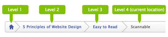
This navigation bar lets the user easily take a step back to explore more of a given category or subcategory.
And as I said earlier, breadcrumbs are rather a smart add-on for better navigation, but they’re not the replacements of a traditional drop-down menu at the top. So I recommend using both at the same time for a great navigation experience.
So what you do is you keep the navigation bar on top as usual, and when someone chooses a page to land on, you can show the breadcrumb on top of that page to show the journey, so they can quickly hover over on any step of that journey if they want.
However, there are other styles as well for navigation, but these two are the most popular and convenient navigation tool in the web design world.
If you want to check out any other style, I highly encourage you because web design is all about experimenting more and more to find out what works for you and what don’t.
4. Load time

Loading time means how long does your website take to load fully to display on your user’s device’s display. It’s also referred to website speed or website loading speed on some occasions.
Coming in 2019, it’s one of the most crucial factors for any website on the internet. First of all, it is a major Google Ranking Factor. If your website takes a lot of time to load, Google won’t give you good rank, no matter how great your content is.
On the other hand, Google loves a quick loading website and tends to rank it as higher they can by judging on the basis of content.
It’s even more important for good user experience, too. In fact, studies show that if your website takes more than 3 seconds to load, about 70% of people are likely to hit the back button and exit your website.
So coming in 2019 and further, website speed is a super important factor for user aka customer experience, and web design has a lot to do with it.
The design elements you use for designing, such as autoplay multimedia, extensive use of images, uncompressed images, unnecessary codes in backend could affect website speed largely.
So, what could you do from the web design aspect to minimize your site’s load time?
- Optimize image sizes, and use an appropriate number of them
- Remove autoplay multimedia
- Use white space to simply your design
So when we talk about images, you want to optimize or compress them to take as less space possible without harming the quality or resolution significantly. If you think if that’s possible or not, well the answer is yes – there are several tools and techniques to optimize images for web use maintaining the web standard.
And also, you want to consider the number of images you want to use. Too less images? Nah, that makes things less engaging. Too much of them? Again, Nah – that makes thing too cluttered and increases the page size making it heavy to load.
Next thing you want to do is you want to remove the autoplay media like audio and video. First off, it makes it heavy right of the bat for internet browsers to load the website as these media consume a lot of traffic.
Next, it irritates most of your consumers anyway. Reports tell that a bigger chunk of the people are likely to abandon a website where something gets played without their consent.
So for making best practices in both cases, use multimedia that require manual action to start, and in appropriate numbers.
Another web design trick you can implement to reduce the load time of your website is the more usage of white space to design your webpages.
Minimal looking websites is trending coming in 2019 and will continue further I believe as we want less clutter in our lives. Every other web designer out there loves to design a website from the minimalist approach nowadays.
And white space is the major key to that. The rule is, there’s more and more use of white space in your webpage – no text, image, video, animation, no nothing in there.
This helps to purify the page, allowing more breathing space, helps the user to focus on the content that matters, and obviously, reduces the page size helping it faster to load.
So win-win situation from both aspect. You should definitely give that a try then.
5. Conversions
The most important part of web design? Arguably, conversion!
After all, this is the thing your business depends on to thrive online. But how does web design affects conversion?
There are a thousand little ways where web design contributes to better conversion.
Among them, these 3 are the most impactful –
- Color
- KISS principle
- Faces
Color might seem like a generic term, but in web design, it refers to picking the right color combination to produce a color scheme that intelligently uses contrast to mark out the selling propositions.
So basically, you want to use contrasting colors to the base color for highlighting purpose. In fact, you should always highlight that you want to be noticed.
So if there’s a cool color like scheme black or deep blue on your site as the base color, you want to use warm colors like yellow for your call to actions and other things that you want to highlight.
This helps them to get noticed to your users and increases the chance to get clicked, which ultimately increases your chance to get a better conversion rate.
Coming up next, do you know what KISS principle is?
“Keep It Simple, Stupid”
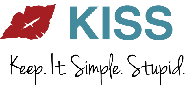
The idea is keeping things as simple as possible to focus on the actually important content which leads to better conversion, as per studies. You do not need screaming background or showy graphics or too vibrant colors to sell your business online.
Rather, you should have nice and organized, SILO based website that is easy to navigate and understand overall. These websites convert much better than complex websites.
Last but not least, Faces.
Look, when we use the internet, we lack human touch and the feel of liveliness. Yes, we are reading an article written by someone, means we’re actually hearing his words, but we can’t see that person in many cases, not a picture.
Studies have been conducted on this matter which establishes this as a fact, not my gut feeling only. Those studies suggest that human faces in websites, especially business websites help visitors relate and build trust in your business.
They feel comfortable knowing who’s behind all this. This helps your audience connect to your business.
So consider using smiling and warm photos of your and your employees, business locations and so, as that goes a long way in establishing trust, eventually get a conversion to earn you a new customer.
What do you think?
Do you think all these web design tricks could improve your customer’s experience? If you’re hesitant why not try them out and see by yourself?
Do you have your own web design hack in this regard that you want to share? Well, the comment section is open! Go write a comment!

