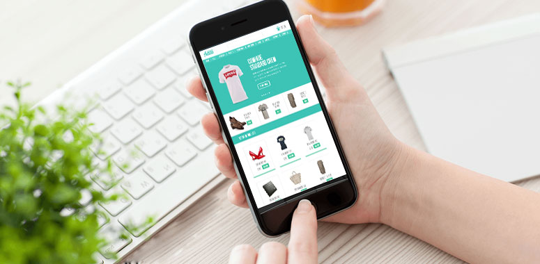
Mobile ecommerce is no longer the future – it is the present. If you want to maximize ecommerce revenue, you need to ensure that your customer’s online shopping experience is optimized for mobile devices. Ecommerce has become Mcommerce. With mobile phone and tablet screens getting larger and their resolutions improving, everything your user needs is in the palm of their hand. Let’s explore how you can tailor your store to meet the new demands of your customers.
Table of Contents
Mobile Content Consumption
Nowadays, people are actually reading (shock horror) on their mobiles. Technology habits are changing, and the latest smartphones are increasingly powerful and optimized for web browsing. Good mobile content should be a continuation of web content, not a second-class platform that frustrates with its lack of information. A bad mobile experience is bad for a brand.
Despite the need for clarity and succinct copy, it’s wrong to assume a ‘dumbed down’ attitude to writing mobile content. Ensure that your brand’s blogs, category and product descriptions maintain their quality. See your mobile readers as savvy content consumers. Give them the good stuff, but give them the option to have it as a takeaway snack if they want to.
Karen McGrane’s e-book on mobile content strategy has a lot of fascinating insights into mobile content and writing for mobile if you wanted to explore the topic further.
Social Media: The Key to m-commerce

Social networks are more than places of idle chit-chat and viral cat videos. Social media is one of the most powerful tools in your sales arsenal, as social feeds now provide instant information about products and also allow quick in-app purchases. It’s your chance to make your brand come alive.
Much of this social interaction happens on the mobile device we constantly rely on to keep us connected. Reaching for the phone to discover information has become a habitual part of our lives, and brands need to harness this by integrating with social channels.
If you haven’t already, you should sign your store up to social networks such as Facebook, Twitter, LinkedIn and Pinterest. It is worth doing research into where your target audience spends their time online and which social apps they use – your customer profiling should give you a good insight. The average order value on Instagram is $65, which is now above the $55 average of Facebook orders
Shift to Adaptive Strategy
There are so many content platforms and social networks, with smartphones and social posts differing wildly in their parameters. You need a strategy for how your content will be consumed across ALL different platforms and networks, not micro strategies for every social feed. This is known as adaptive content: content that will adapt to a customer, situation, device and network. Content that is smart and freed from design constraints. Content that doesn’t care so much about where it is, but about where it is best deployed.

Writing adaptive content is about breaking content down into blocks that can then be used by different platforms. Think smart, structured, and adaptable. Write in blocks, ideas and nuggets, rather than paragraphs and pages. Use structure and metadata to mark up your content for devices. Adaptable content success boils down to proper content auditing, user-testing, refining core messaging, and shifting content strategies away from older desktop-based models. Adaptive strategy should also help you maximize mobile conversions, by ensuring a more personalized and targeted mobile environment.
Appeal to Mobile User Priorities with Your Store’s Design
Information architecture is absolutely key for a mobile website. It’s important to give people key information quickly to make their journey easier, avoiding too much tapping and scrolling. Rejig information architecture to fit around user priorities. Prioritize this over fancy visuals or animations, as it will have a big impact on user experience and your site’s engagement metrics.

To Tweak or Not to Tweak: Does Your UX Work for Mobile?
Failing to provide your customers with a smooth UX on their mobile devices will only lead to a downturn in business, and could even damage your brand.
- Dodge the common mistakes of e-merchants past. These include
ecommerce sites that have too small text, content overlap, rely too heavily on flash, and use annoying popups - Small UX and UI modifications are sometimes all you need to rework your store for mobile devices. Consider adopting a sticky navigation bar that follows users as they scroll down a page, so that they can make a purchase at any point. Avoid placing calls to action below the fold
- Responsive designs automatically optimize your store for mobile devices, so that you don’t have to. If you are a smaller player, using a web creator like Shopify would be a good way to go to make use of responsive templates. If your site is really complex, then it may be worth employing a web designer to create a separate site for mobile users
The best way to maximize e-commerce revenue is by adapting your site to work well on mobile devices. Whether that is with a few modifications or an entire site and content overhaul, it will be 100% worth it in the long run. Check out our previous post on the deadly mistakes to avoid when setting up your e-commerce store.
How is your store’s mobile optimization going? Let us know in the comments.

