So, We were working on building a bigger and better email list through our email campaigns.
If you don’t get what I’m saying, that means you probably landed on this page first. From the title, you probably understood that this is the second part of a series of articles.
Since it seems like you haven’t read the first one, I’ll recommend going read it from here first.
For a little brief, this is a series of the article focused on creating an optimized email campaign. Under the section – ‘Building a bigger and better subscriber list’, we talked about some concerned tips in the first part.
We learned about the power of pop-ups and how to leverage its power to the most with ‘Content Upgrade’ pop-ups (this is seriously cool stuff, go check the article), we hacked Qualaroo to build our list and also learned how optimizing our confirmation page can get us 25% more subscribers.
As I told, I was not finished with awesome tricks, here’s the rest of those.
…Let’s discuss some more awesome tricks
Table of Contents
Building A Rich Subscriber List
Idea #4: Personalize Your CTA, Insert Option With Humor or Sarcasm in your opt-form
‘Join’, ‘Subscribe’, ‘Yes or No’, these are really mainstream and boring of a text for a CTA, really. It’s time to replace those boring texts with personalized CTA buttons for different landing pages.
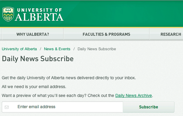
Remember this University of Alberta’s subscription page?
Look at the Call to action button here, that only says ‘Subscribe’.
Now, considering that subscription is about getting “Daily news updates”, couldn’t the CTA button say “Send me daily updates”?
Well, certainly it could, and it would’ve been more effective.
I know it doesn’t look like a huge deal to you or any person in the concerned brain, but it has an impact on our subconscious brain! (remember the yellow box effect? It’s similar)
(Hey, If you don’t recognize the yellow box thing, you probably still haven’t read the first part! You’re missing out. There’s awesome stuff there.)
This kind of personalized benefit-oriented CTA re-emphasizes the necessity to subscribe in our subconscious brain.
Now, the website admin of the University of Alberta website probably didn’t have the freedom to do such a thing, because I understand it’s a University Website where you have to keep things formal.
But, formal for your website, is too boring.
That’s why, I suggest you create personalized, humoristic, benefit-driven CTA buttons for every different opt-in form on your website.
I emphasize on two-point here, if you have already got.
Firstly, when there’s a chance to personalize the CTA button for a page, do it.
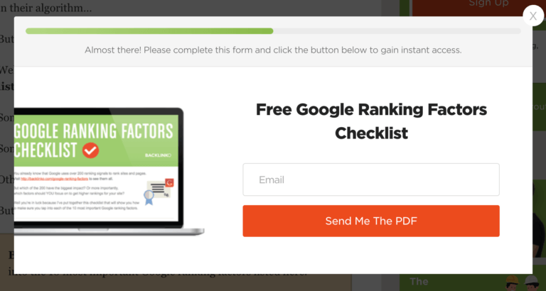
This opt-in form is about getting a pdf delivered by email, so it says “Send me the pdf” which is just what I mentioned, benefit-driven CTA button. It happens to be better than a CTA button written mainstream ‘subscribe’ in it.
When there’s not really any scope to personalize, replace the mainstream ‘Subscribe’ or ‘Join’ with enthusiastic, energetic word this time.
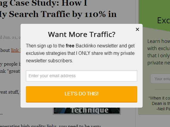
This “Let’s do this” button drives a lot more energy than a “subscribe” button, doesn’t it? It feels like something’s about to happen.
Little psychological hacks with the subconscious brain, but works like a charm.
What about Inserting options with Humorist text?
Well, this is the case when there’s the scope to say “Yes” or “No”, it’s not about replacing the only boring CTA with personalized or energetic text.
This mainly happens with pop-ups during reading a blog post.
For example, if you’re reading a post about ‘How to shred health’, you might see a pop-up rising after a while asking you ‘Would you like to get informed about our latest shredding articles?’
Now, a mainstream webmaster asking this question would design such pop up with only option, Yes (and enter email thus), with a ‘Cross’ button at the top right corner if the reader does not want to subscribe.
But you, the smart webmaster will not do that. You’ll get rid of the “cross” button, and add a text “option” to not subscribe.
If I were to design such a pop-up form mentioned above, I’d keep two options –
-Yes! I want to read the latest shredding articles! (and thus enter email)
-No, I’d like to stay fatass!
Now, nobody like to say “I’d like to stay fatass”, do they?
Again, hacking subconscious mind. The guy reading the text knows that I’m influencing him to opt-in and also knows that not subscribing to my newsletter won’t keep him fat, but still he won’t like to click “No, I’d like to stay fatass!”
It because such negative words about himself create an impact in his/her subconscious mind and he/she’s like to select the positive win-win option.
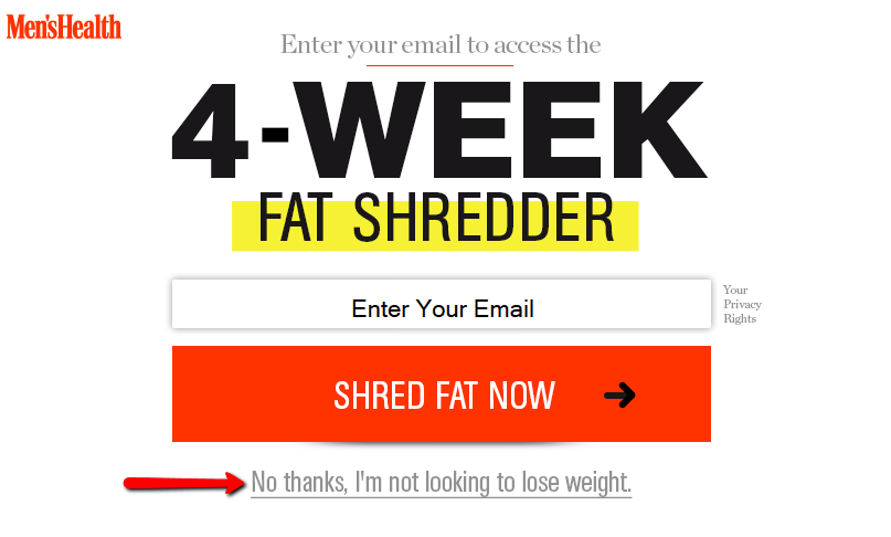
By the way, MensHealth.com actually asked such questions and here’s how they designed that opt-in form.
Here’s another marketing genius Timothy Sykes designed the opt-in form in his personal blog –
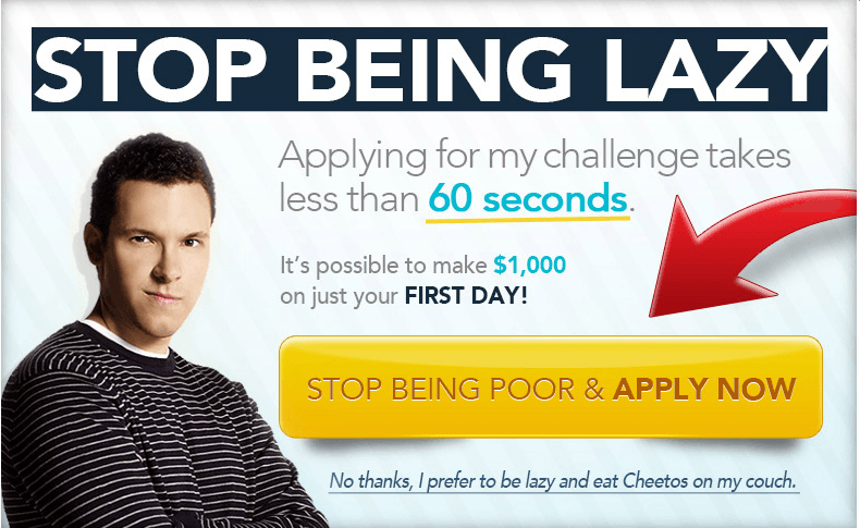
Trust me, nobody wants to “stay lazy and eat Cheetos on his couch” instead of “Earning a thousand dollar and stop being poor”.
As I said, little psychological hacks, but effective and effortless to execute.
Idea #5: The LPF Technique
LPF = Landing Page Funnel!
In simple terms, focusing on pushing readers to your best performing landing pages (lead generation) to get the maximum emails (leads).
What pages do you want your reader to land when they first visit your blog?
If you tell me that it’s one of your best informative blog posts, you’re WRONG from lead generation perspective.
If you really want to collect more and more emails, you should want the visitors to land on the pages that are designed to collect emails, Landing pages in other terms.
Wanting them on your informative blog post is okay, it adds them value. But if you care about getting more subscribers, you should design your site in such a way that they land on your best converting landing pages when they come to your homepage,
And this is the LPF technique, to push visitors to your landing pages.
There Are two steps to this technique.
- Identify your best performing landing pages.
- Create a funnel to push visitors towards those pages.
Brian Dean created this page on Backlinko that he tells got him a conversion of 21.7% which is pretty huge.

In this page, he posted a video as the main content and kept a subscription box there for people to get such more content. (Kind of ‘Content Upgrade’ trick from my last post)
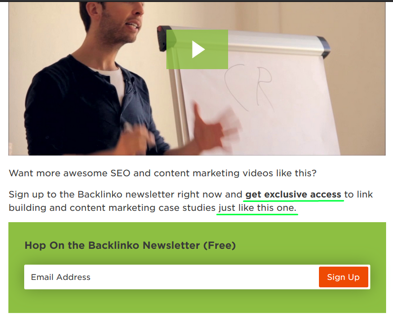
This combination gained him the huge conversion rate of 21.7%, means among every 100 people watching this video on this page, 22 people enter the email to get such more content.
Also, Brian mentioned that his typical “Newsletter Sign In” page also converts about 10%, which again is a great number to a naked subscription page.
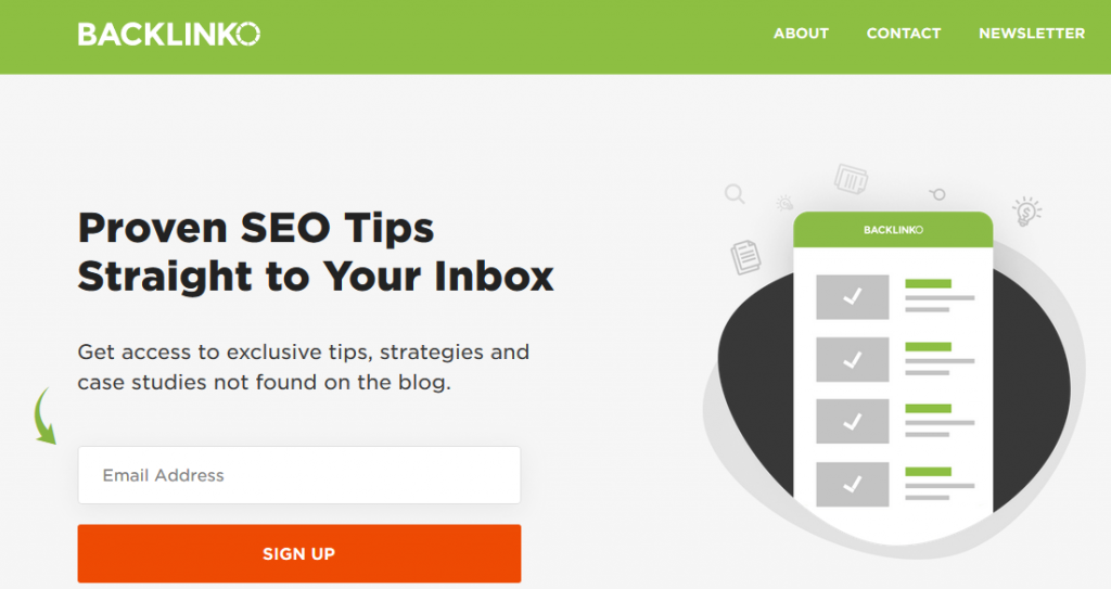
So, Brian Identified this two pages as the best performing landing (aka email collecting) pages. Step #1 done!
Then, what did he do?
…He did this.
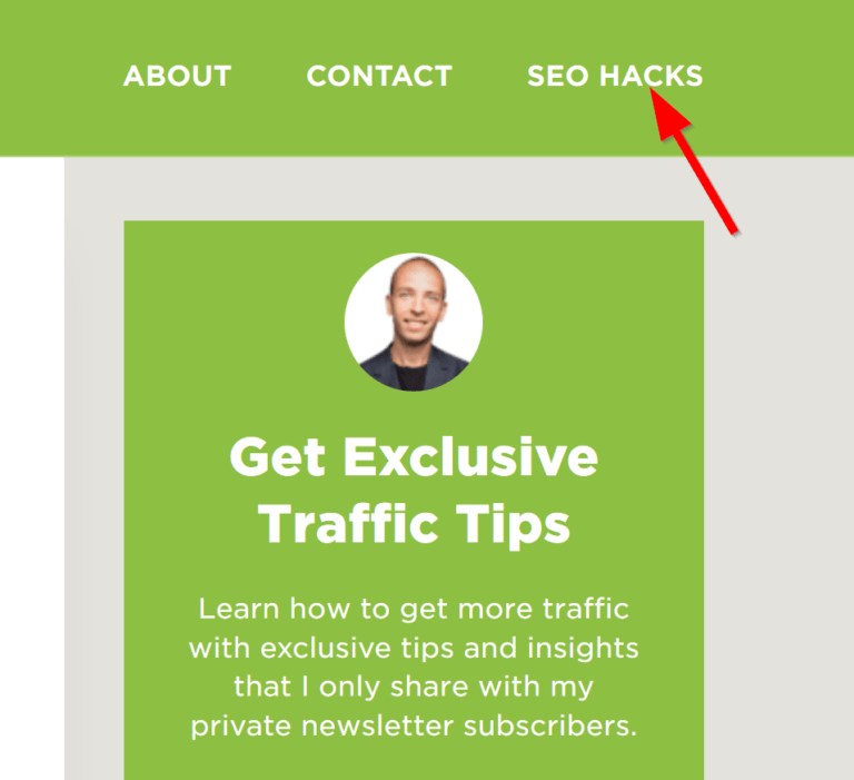
He put the link of that high converting page directly at the navigation bar, under the title “SEO Hacks”

Also under the “Popular Articles” section in the sidebar –
Taking things one step further, this is how he designed the homepage of Backlinko –
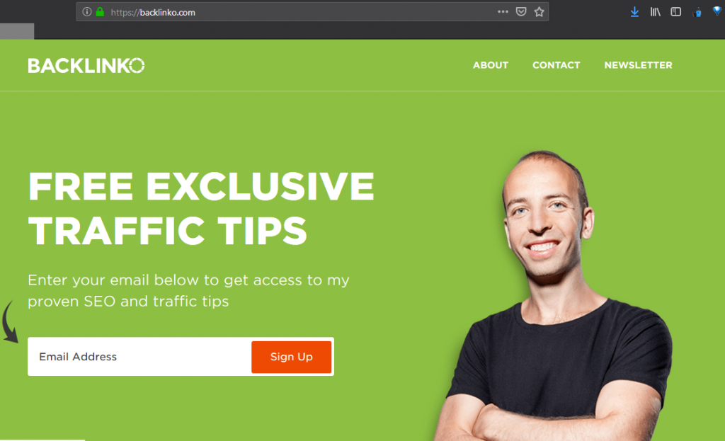
As you can see, Brian applied the LPF technique seriously and pushed the landing pages hard. He put his “SEO Hacks” page which converts at 21.7%, in the direct navigation bar, and the newsletter page converting at 10%, was made a section of the homepage.
In simple terms, he made his high converting pages easy to navigate for users – he made those pages more visible, so that more users visit them and Brian gets more emails!
Michael Hyatt, the pro leadership mentor, and an expert in marketing, also uses the same LPF technique.
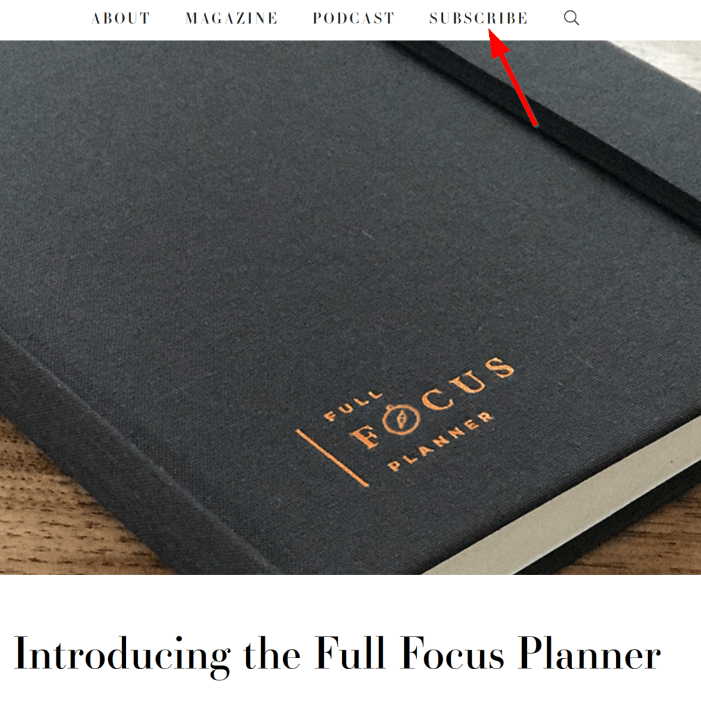
He placed his high converting subscription page in the top main navigation bar, which is the most visible area of a website, so it’s very easy for someone to find that page.
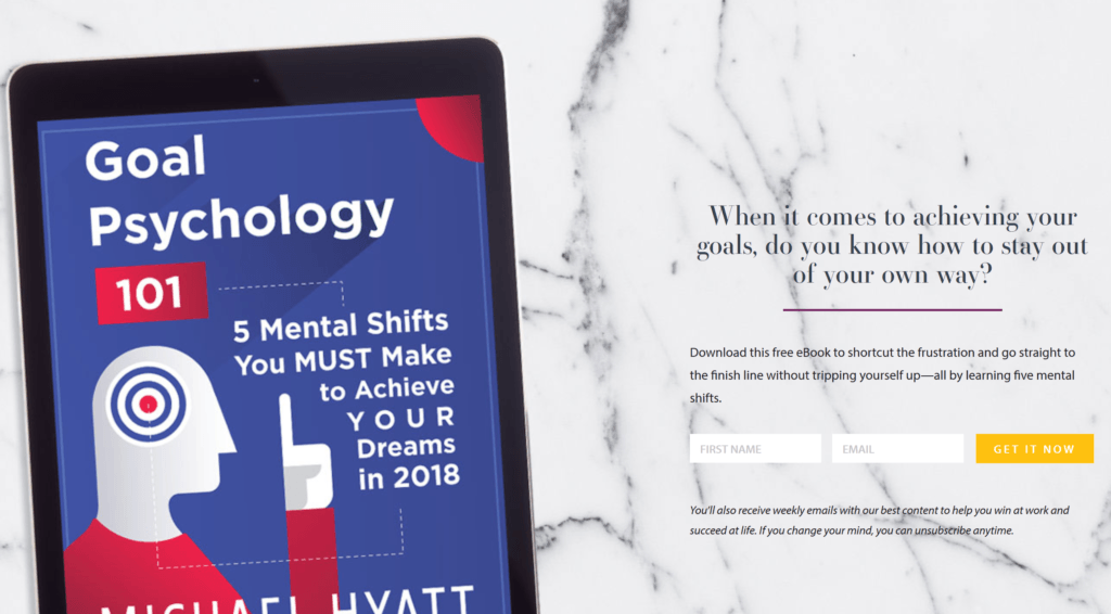
When visitors click the “Subscribe” page in the navigation bar, he takes them to his best converting landing page, looking like this
Seems like many experts believe the LPF technique, huh?
Idea #6: Play it Like Film Production Companies
Yes! You heard me right! (“read” actually).
Well, how much hype does the teaser of an Avenger Series’s movie create? A lot!
Millions of views it gets on YouTube and a lot of enthusiasm it creates among its fans. Many people decide right then that no matter what, they’re going to watch the movie.
Means, it makes many future customers right away with the teaser. It makes people make up their mind to watch the movie.
You probably starting to get where it’s going, ain’t you?
You’re going to apply the same trick on your website. You’re going to create a blog post teaser.
First off, what a teaser does?
It gives you a glance of what amazing stuff is coming your way, and sends you the subtle message to stay tuned.
We’re going to do the same thing. Whenever we create a series of articles, we’re going to announce at the bottom that the next article of this series is coming your way, so be in the list, to be the first to get the post delivered right into the inbox.
And then put a box to join the subscriber list.
See this example.
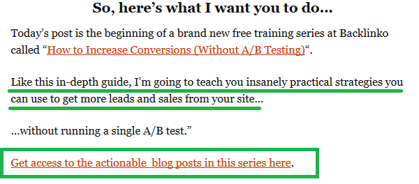
This box promises you that similar posts are coming in your way, and gives you the option to “Get access to actionable blog posts in that series”.
And when you click that link…
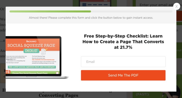
This opt-in box shows up.
Since this article that you’re reading right now is also the second article of a series, the first article has the same mechanism applied at the bottom of that post. A hint is given that there’s another part of this article that’s coming your way very soon.
Now you may ask, can I do this if it’s not a series of articles that I’m publishing?
The answer is, yes! We can do the same thing even if it’s not a series of articles that have any “next” part.
In fact, the example above itself demonstrates you that, as it’s not really a series of articles that the author is promising.
You just need to make sure that the next article is similar, and interests the same group of people.
And it’s better if you already know exactly which article you’re going to publish next. So you can announce exactly what similar article the reader may expect next.
This will help to connect a lot more people with interest in that topic and you’ll get more subscribers.
However, to make this technique work, you just need to make sure that the contents that you’re promising next have similarity in the topic.
Think it this way, the guy that has come along all the way to bottom reading a content, shows he has definite interest into that content’s topic. Now, if you promise another awesome content into that same topic, it’s highly likely that you’ll get his email.
Whereas, if you promise content from a very different topic, you’re very likely to miss the opportunity to grab his email.
After all, won’t you hate Marvel if you see unsimilarity in the teaser and the movie?
It raises another question though. What if you do not know the next article’s topic yet or next article is going to be on some other topic?
Go generic, like the example above. Do not mention anything then. You’d want to modify the above-cited example like below –
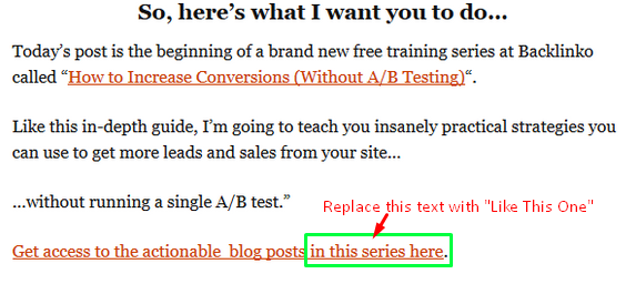
Blog teasers work great, as you know, “fear of LOSS” is a huge MOTIVATOR. Interested people would not want to “loss” the next article, that’s why they’d subscribe.
Idea #7: Turn Commenters into Subscribers
Now this one’s a very easy technique to get a lot more subscribers and probably the least effort demanding one among all these techniques.
Just do this.

With this technique, whenever someone clicks the box when they leave a comment, they automatically get into your subscriber list.
The email is mandatory when someone leaves a comment (marked with star* mark) and when someone ticks the box, means you’re getting their permission to add him in your subscriber list.
How well does this work?

This well. This little tweak earned 214 more subscribers within 2 weeks. Pretty awesome result for almost no effort.
Why does this technique tend to work so well?
That’s because, the people that have gone through the whole post and taking time to leave a comment to appreciate you or discuss something, it means they’ve enjoyed your post and they’re interested in what you write.
So they’ll take the chance to join your list with no added effort, not having to enter email in a separate page, they can opt-in just by ticking a box while leaving a comment.
In fact, commenters are very PRIMED to be your subscriber, they just need a little nudge.
Setting up the mechanism is not too hard either. If you’re a WordPress Ninja already, then it’ll take just a few minutes for you.
If you’re not, YouTube videos or other tutorials will help.
On second thought, you can get this done by any freelancer from Fiverr in as low as 5 bucks.
However, I must highlight the aspect that you MUST NOT pre-tick the box.
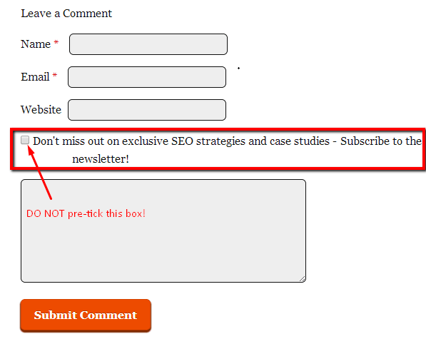
If you do so, you could face a legal action from EU, according to the GDPR policy.
If you don’t know what GDPR is, check this article where they demonstrated every aspect of it.
According to the GDPR, the user should only get opted into something upon his/her conscious consent. Means, if he/she really wants to join your list, he/she must consciously do something for it, here it’s ticking the box themselves.
If it’s pre-ticked, often many users misses it and gets subscribed to something without them really noticing. This is against the GDPR policy of EU.
So if you’re getting the mechanism set up by a freelancer, give him the instruction to not pre-tick the box, rather keep it empty and give the user to tick or not tick it, according to his/her consent.
Video Marketing is a buzz now. With YouTube being such popular, every marketer will tell you to be on YouTube to spread your words.
Let’s Discuss Rest in the Finishing Part!
Alright, let’s settle for these 4 awesome techniques for this part. When you put them to work, I’ve already finished the next and final part of this series. That will be published very soon.
Stay tuned and take a moment to leave a comment to let me know what you thought of the post.

