With the world turning digital so fast, website design Malaysia has also taken its fleet. The demand for having an online presence has become an essential part of every business. Web design trends are evolving every day and this year it has been a great experimental platform for the website designers to play with their extreme skills. Web designing this year is more about reinventing old styles and experimenting ceaselessly with new techniques. With the ever-changing web design trends, there are few existing popular trends that won’t fade away like the minimalism and colorful flat illustrations.
In order to stay in trend, you need to be in pace with the latest web design styles and techniques. It’s always the experts who can guide you better and give you an early prediction of which design is best for your business and which one is here to stay for long. You may always have a professional web design agency to look upon this. In Malaysia website design price does vary as per your business need and the website features. Before you approach any agency it’s good for you to have proper knowledge of the latest trends on web design which will give you a clear perception of what your business website will need.
Here we have brought to you some of the latest trends on the website designing straight from the expert’s suggestions and predictions.
Table of Contents
Dark Mode
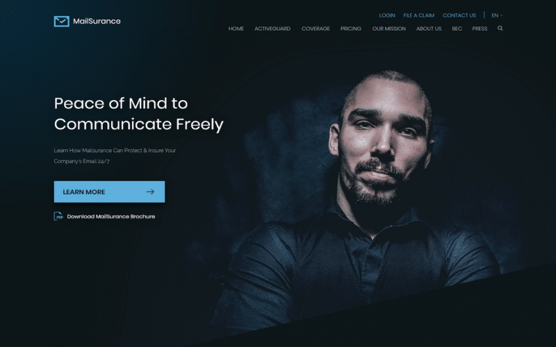
The dark mode is the ultra-modern way of web design style, that not just look good but also make colors and design’s pop out. This dark theme design has practical beginnings and is fit for OLED screens and also saves power. This has an extending screen life span and also looks very desirable on screen.
This design also outfits with other prevailing 2020 web design trends like the moody and dark color schemes with the neon flashes. The dark-colored backgrounds are just perfect to enhance the visibility of other accent colors to have a dynamic design.
Imperfection Adding Personality
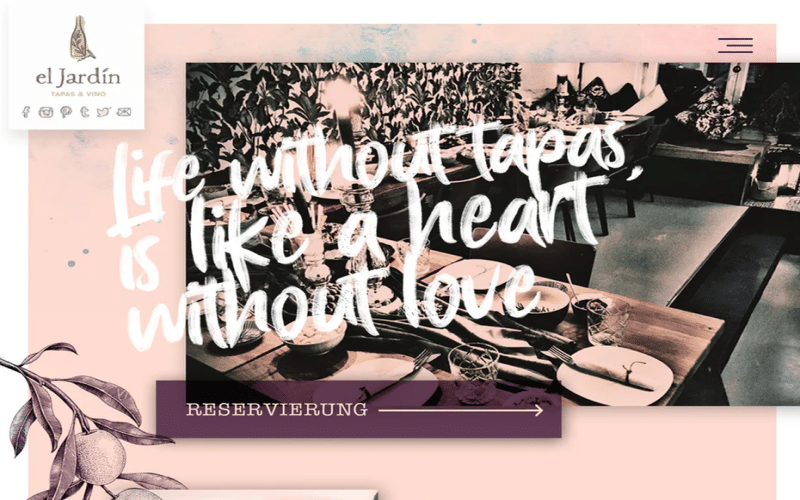
Being perfect is so boring, it’s the imperfection that catches attention. This is true for web design as well, imperfect web designs connect better with audiences. The hand-drawn not so perfect or maybe incomplete designs infuse emotion and humanity to the websites. Viewers are done with so perfectly designed websites, they are craving for some hand-drawn realness that gives life to the website and make it more appealing and eye-catchy.
This is the best way to showcase your brand’s personal self to your potential customers. Having unique styled hand-drawn icons reflects your brands’ transparency and honesty making you stand out of the crowd. It’s time to flaunt your scratchy crafts on your website and become the trendsetter.
Immersive 3D Elements
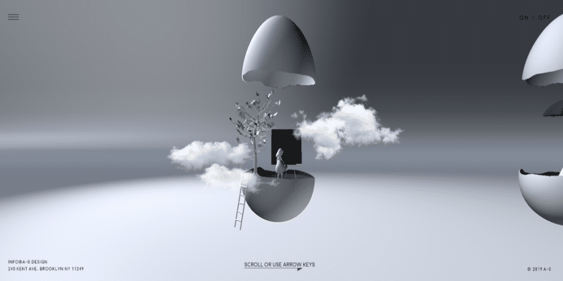
3D design be it on walls or website have always amused people. But, the use of this trend in web design was limited due to the lack of technology to implement this and also its high-cost burden. With fast technology growth, the use of this trend has become easier and convenient. As per Pinch Studio, new technology has been adapted for 3D design without the need of NASA-tier equipment.
Hyper-realistic 3D designs are the best way to create an immersive effect for the website, which is way more cost-effective than the VR technique. The 3D design takes up the whole screen and creates an encapsulating visual effect that makes the users stay longer on the websites. This trend is here to stay long beyond 2021 breaking the boundaries between digital space and reality.
Soft Shadows Layers and Floating Elements
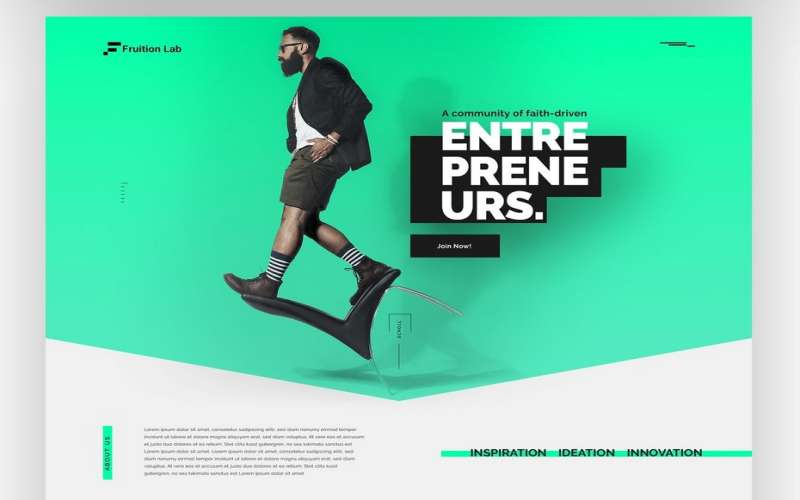
If you want your website to have some depth and toned effect this is the design trend you need to get. Your brand might not need intensifying 3D effect for your website, the soft shadow layering effect will do its task to add a 3D lite effect to your website. You may use it on graphics, text, photos to create a layered depth. Designers have plenty of options to play with this design by adding soft drop shadows and layering elements on top of each other for a unique creation.
Mix Photography with graphics
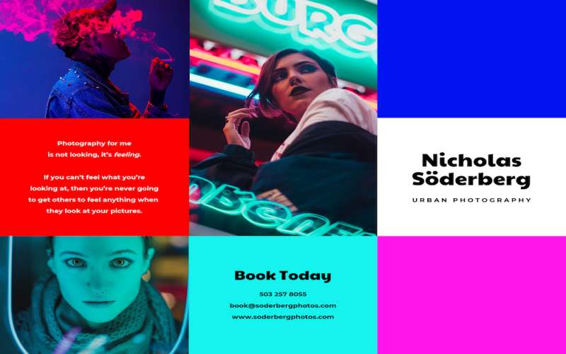
If you want to play with your creativity and make it wild try overlapping original graphics on top of real photos to create memorable visuals. You can easily turn a bland photo into a charming one by using the versatile collage trend or even some with photos. This can surely add a personality and style to your website.
Using this trend might be tricky make sure to match the illustration and graphic style with your brand’s persona. Make your design more playful and quirky adding geometry, characters, illustrations to it. People will surely sway by to interpret the sophisticated design of your website.
Solid Frames & White Space
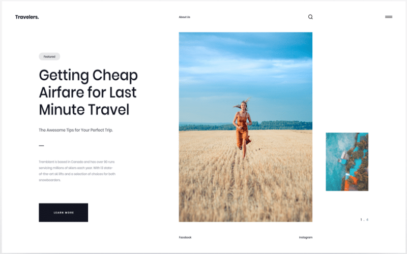
If you want to keep your design simple yet catchy than this is the one you should go for. Designers are now more into working with solid frames and structures using white space to make the design pop out. This is what they call clean framing to add stability and canvas to their designs.
In the coming years, we will witness this trend of wide frames and structures with background space more often giving the web design a solid visualization. Framing is about giving enough space for each element on the page to shine out. This trend makes your web design look much neater and organized prioritizing each element of the page thereby granting it a satisfying look.
Glowy, Luminous color schemes
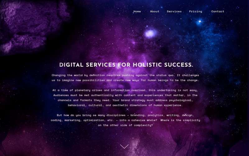
This is about daring experimentation with glow color pairings to make the web design pop-out of the screen. As we are heading towards 2021, we will see the use of neon colors and other saturated colors paired with darker backgrounds and timid shades to generate a glowing effect on the page. The duotone effect makes the web design look shining and bright, thus reinventing itself to create sharpness.
This is the boldest futuristic approach of web design to make the website looking striking and vivacious by the use of neon colors. With the many popular web design trends of minimalization and dark mode, the glowy luminous color scheme will surely make your web design shine out.
Ultra-minimalist navigation
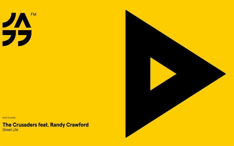
The minimalist trend is much more user-friendly, it eases out the difficulty of usability. It mainly deals with website navigation making it simpler for the users. This technique helps in accomodating small elements within smaller attention spans.
The less confusing and simpler the minimalistic navigations are the more time user will indulge on your website rather than figuring out where to go. Also, imagery is one of the important tools to attract users’ attention. Try using large-scale images and videos rather than texting much and directing users.
Wrapping Up
With 2020 coming to an end, the trends in website design Malaysia are evolving faster and there is much more to experience in the coming years. Building a good website for your brand is all about staying updated with all the latest trends and understanding your business and customer demand for the website requirements. The Malaysia website design price ranges differently depending upon the type, trend, and feature of your website you are willing to have. It is important to pick the correct one, not all trends might apply to all businesses. You need to understand which trend is fit to reflect your brand persona better. This transformation in the world of web design has given the web designers opportunity to explore and experiment on designs looking towards the future and also taking inspiration from the past. Web Design in 2021 will open up with a lot more surprises stay updated with the trends to be in the longer race.
